
Portfolio
Dot, the App / Cycle Technologies
Submitted By Maggie Winters
Description
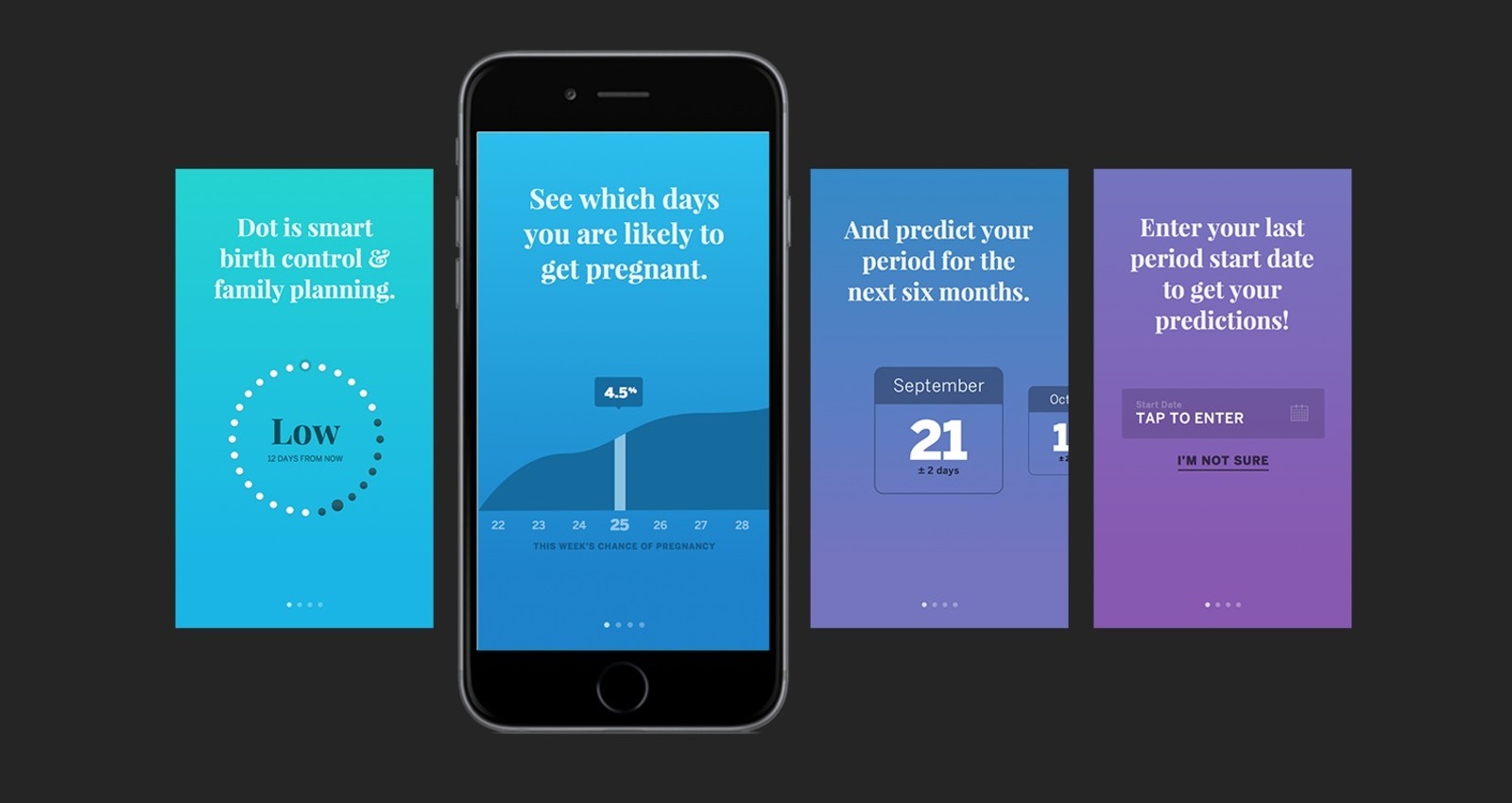
Cycle Technologies came to ISL with a mission: to bring their new algorithm, which was developed by the leading fertility scientists in the world, to market. The algorithm predicts a woman's chance of pregnancy each day of the month, using only the start date of her period, and is designed to be 97% effective. It's so effective that it can be used as birth control — we were intrigued.
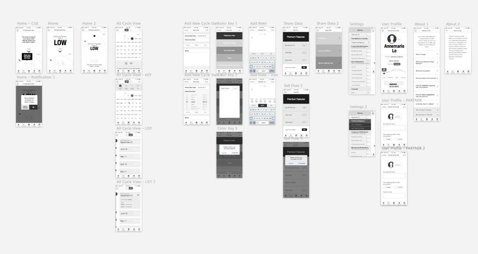
We researched, wireframed, and tested repeatedly before starting the design process, which gave us a strong foundational base for the app’s functionality (which we’d put together using interviews and client preferences).
It was crucially important that we didn’t design this app as a stereotypically “girly” app. We’d researched other period and fertility tracking apps and found that they were almost exclusively drenched in pink, flowers, and other design elements that many women and non-female menstruators don’t find appealing. We designed Dot completely gender-agnostic, recognizing that the app would be used by anyone who menstruates and is interested in tracking their period and/or fertility.
Objective
Our client’s objective was clearly stated as making the best possible app experience for their audience. While the app does have an in-app purchase option, all necessary functionality comes with the free version of the app so that anyone can access the DOT algorithm without having to pay a penny.
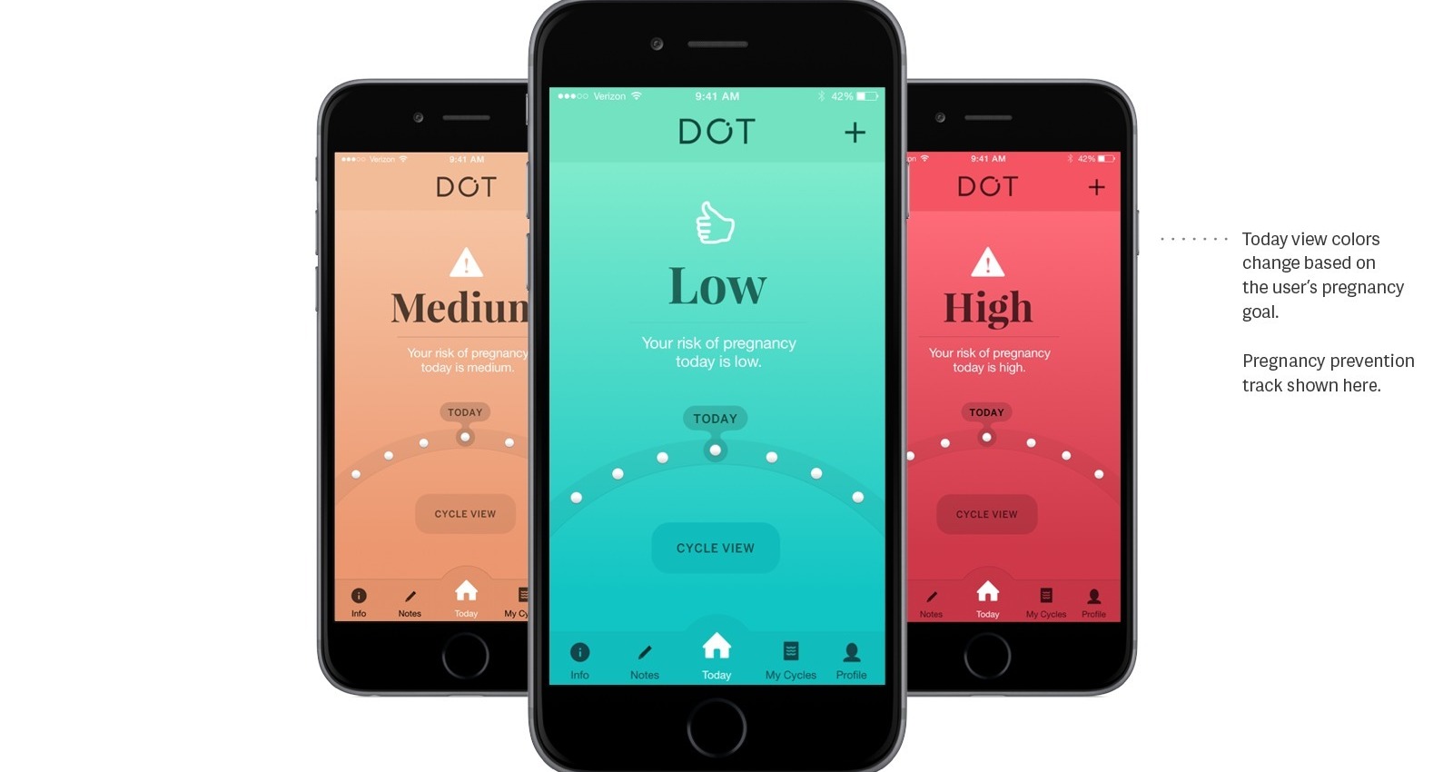
Our goal was to make the app so dead simple that a user could view the dashboard for three seconds and immediately know their fertility status for the day. We created the home, or dashboard, view to change color as the user’s status changed — the app could be set as a form of birth control, or as a fertility guide to encourage contraception. The dashboard view would glow green to indicate that they are safe to engage in sexual activity to achieve their goal that particular day, and would change to red for days that the user should abstain from sex if they’re trying not to get pregnant. To view more details, the user can see the detailed month view or their profile view, but we kept the home/dashboard view extremely simple and easy to glance at quickly each morning.
Technical Challenge
While there was an existing app called “Cycle Beads”, it was effectively a circular calendar visualization — and that was it. There were a group of dedicated users who loved the circular visualization, so we kept it for the new app, redesigning it so it'd be familiar to old friends and useful for new users.
Our team was quite small with a single developer, myself as the UX and visual designer, and our Creative Director making up the entirety of the creative team. We worked closely together to come up with a collaborative and highly iterative approach, leading to a friendly and usable interface.
Dot, the App
https://itunes.apple.com/us...
Client
Cycle Technologies
Agency
ISL
http://isl.co
Media
Interactive
Market
Health and Pharmaceutical Products
Credits
Creative Director
Zach Goodwin
Programmer
Thomas Degry
Designer
(Myself) Maggie Winters
Views
353
Other Work