
Alfa Charlie & The Breast Cancer Portrait Project
By Alixandra Rutnik on Mar 28, 2021
One Club Members design branding for breast cancer awareness non-profit
One Club Members Kimberly Gilroy and Reva Green, co-founders of San Diego Branding Studio Alfa Charlie, recently created a beautiful logo design and elegant branding for the Breast Cancer Portrait Project, a non-profit that teaches young women to learn and understand their bodies, as well as a platform that shares the personal stories and photographs of women who have battled breast cancer before the age of 40.
We talked to Kimberly and Reva to capture their design process for this inspiring and important initiative.
Breast Cancer Portrait Project is all about creating awareness for young women to know and understand their bodies. How did this project come to you?

Believe it or not, the Breast Cancer Portrait Project's founder Missy Peters and Kimberly met in kindergarten. It wasn’t until years later, when they both moved from Long Island, NY to San Diego, and on their own accord, they reconnected.
Taking on this project was a no-brainer. Aside from the personal connection, the mission and goals of the Breast Cancer Portrait Project — to create awareness that women under 40 can get breast cancer — was something we could fully stand behind. Alfa Charlie is women-led, and we believe design has the power to shape the world.
"Aside from the personal connection, the mission and goals of the Breast Cancer Portrait Project — to create awareness that women under 40 can get breast cancer — was something we could fully stand behind."
The women in this project could be us, our family, our friends, our daughters. When the opportunity came about for us to work alongside Missy to bring the Breast Cancer Portrait Project brand to life it was never something we questioned.
The logo for this project is simple and elegant. What inspired the branding?
We begin every project with a brand strategy. As we got to hear more of Missy’s personal diagnosis story, we became more aware of the passion and soul that the foundation is derived from, and the struggle that she and so many other women are facing. We learned about her vision for the project and how best we could position her brand visually to achieve her goals.
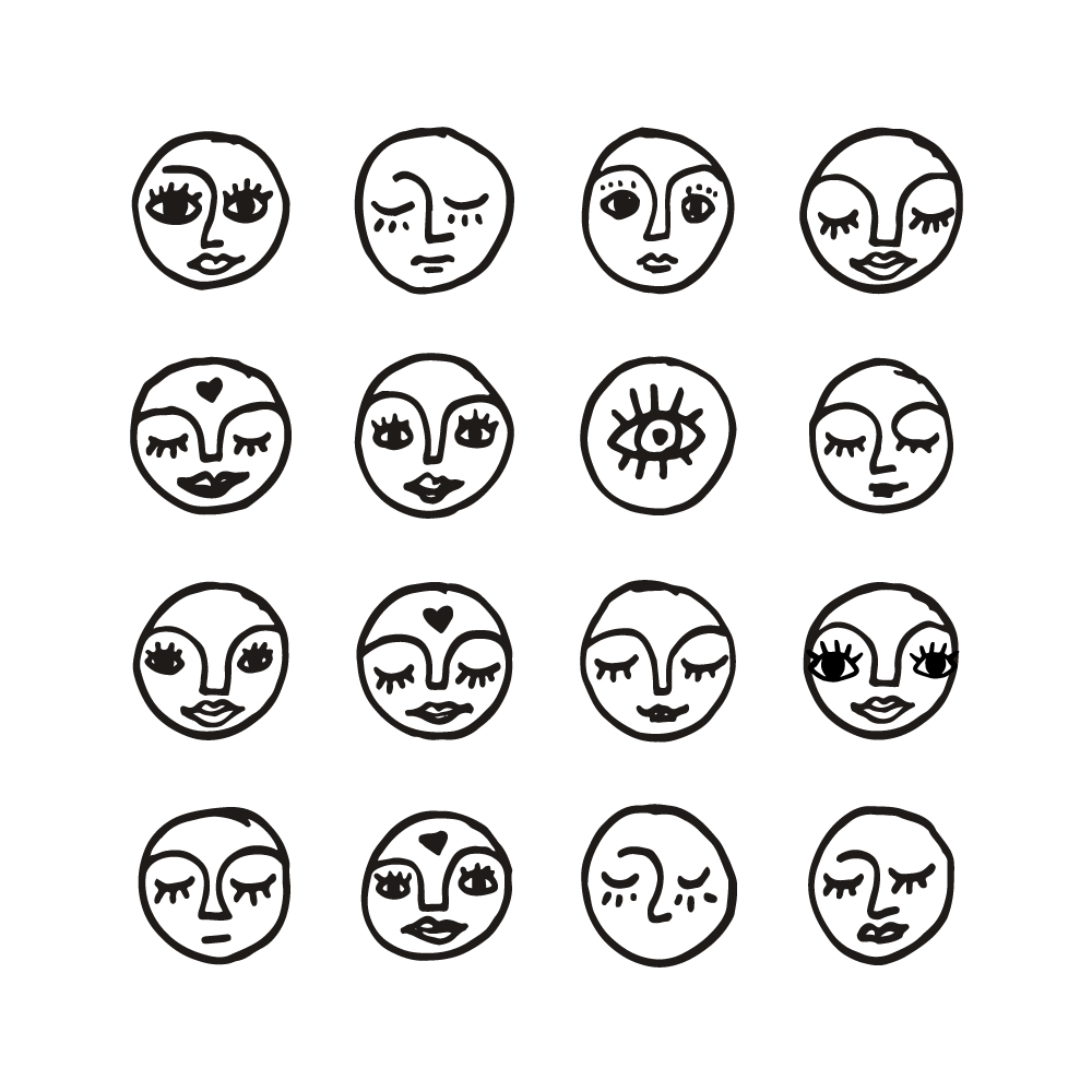
Our objective was to create a recognizable brand identity that compliments Missy’s style of photography and creates a safe and welcoming space for women to learn, share, and be empowered. Some personality traits that became a focal point were: approachable, artsy, feminine, authentic, elegant, and human.
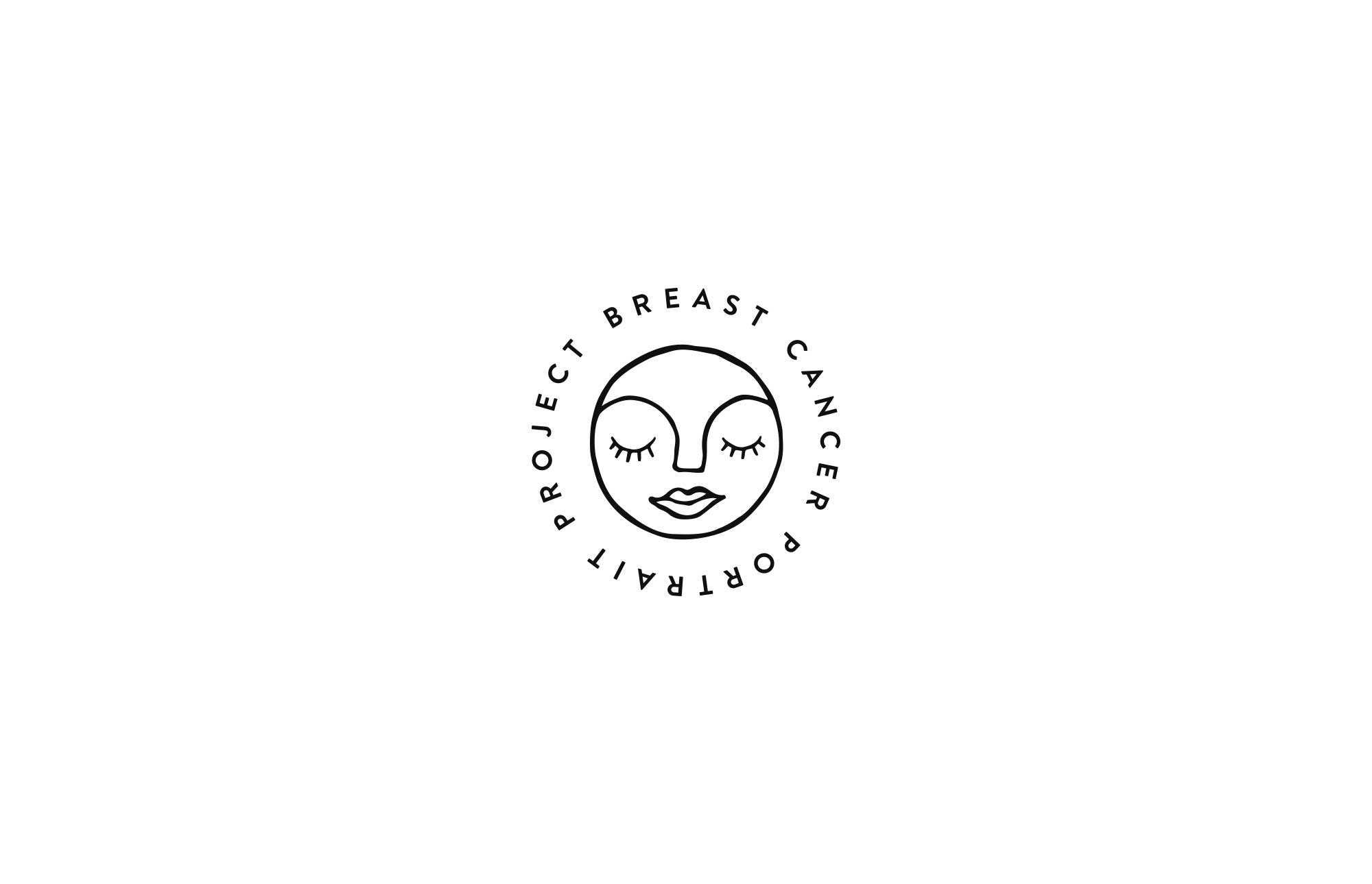
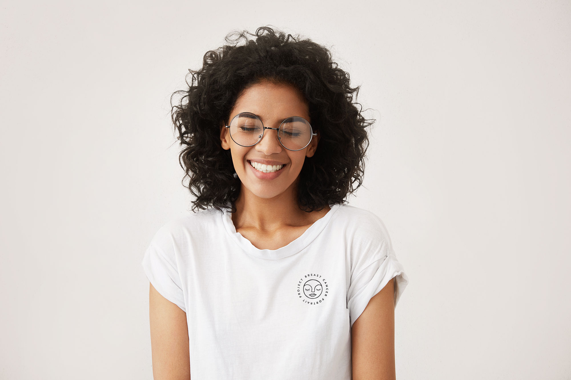
"The woman in the logo was inspired by one of Missy’s photographs of Yohana Flores and embodies the strong, stunning women that Missy so elegantly captures."
The woman in the logo was inspired by one of Missy’s photographs of Yohana Flores and embodies the strong, stunning women that Missy so elegantly captures. We went with a hand-drawn icon to give the brand a humanized touch and rounded all of the edges to promote comfort and ease. The woman’s face is a literal reference to the portrait project and a symbol of pure beauty. We call her Liv.
We presented this one concept to Missy and she absolutely loved it. No revisions.
How did the photography and storytelling elements inspire the web design for Breast Cancer Portrait Project?
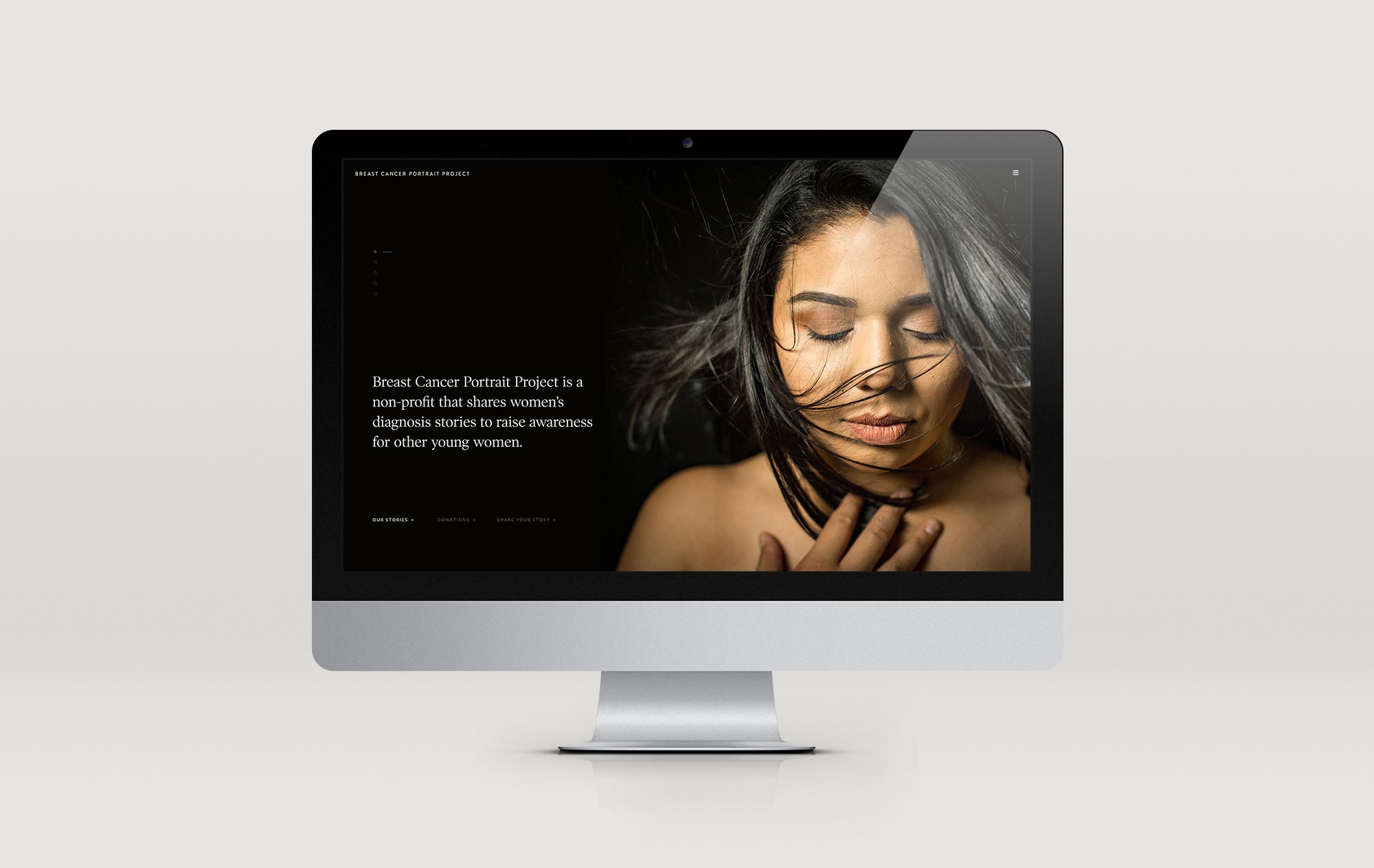
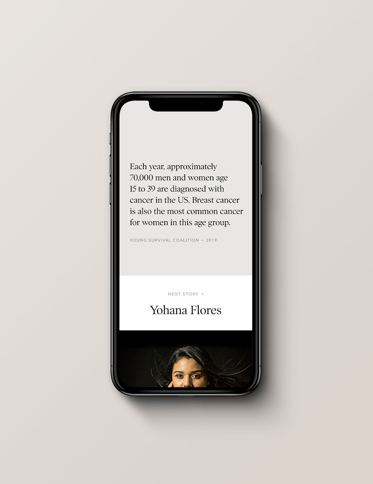
In addition to the logo design and style guide, we designed and developed a custom website for the Breast Cancer Portrait Project. When designing the site, we knew the photographs needed to be a focal point. Not only is the photography beautiful, but also as a grassroots organization, the women and their stories are the project. Too frequently young women (20-40) are told by their physicians they’re too young to have breast cancer, and each of these women proves that is just not true.
The foundation of this project is to share women's personal stories with breast cancer, so how important is the type choice?
We chose supporting typefaces that wouldn’t distract from the photography and purpose of the site. The heading font is a sleek and curvy serif that mirrors the beauty of the women and Missy’s style of photography. We balanced this font with a simple, sans-serif body font that is friendly and easy to read.
Are you working on any new brand identities at the moment?
We’ve got a few exciting brands in the works! We’re currently working with a chef in Seattle to expand her restaurant and catering business with identities for her pastry company and café (coming soon to Seattle!). We’re also working with a client on a brand identity for a new wedding magazine that’s going to press in October.
What is the most important thing when creating a new brand identity?
The most important part of any brand identity project is the discovery and strategy that is done before ever starting on the design. Over the years, we’ve crafted a process that ensures our clients are over the moon when they see their new brand identity because we’ve taken the time to really get to know them and their business.
"The most important part of any brand identity project is the discovery and strategy that is done before ever starting on the design."
BREASTCANCERPORTRAITPROJECT.ORG
One Club for Creativity Members get featured here on the One Club website and across our social media channels. Have a new project you'd love to share? An upcoming exhibition and you'd like us to help spread the word? Drop us a line at membernews@oneclub.org. We always love to know what our One Club Members have been up to, so don’t forget to send us your cool work!


Related


