ADC Awards
The ADC Annual Awards is the oldest continuously running industry award show in the world. Now in its incredible 102nd year, these awards celebrate the very best in advertising, digital media, graphic and publication design, packaging and product design, motion, experiential and spatial design, photography, illustration and fashion design all with a focus on artistry and craftsmanship.

Category
Food / Beverage / Beverage - Series
Annual ID
ADC101_PKG013B
About the Work
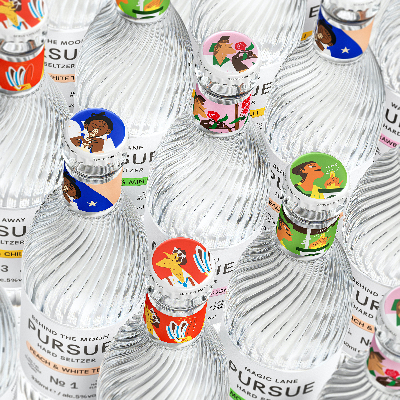
Château Picoron is an Australian-owned organic vineyard in Bordeaux, France. Home to some of the most prestigious wines in the world, Bordeaux has begun to lose its appeal, especially to new generations of drinkers. Falling victim to their very own self-imposed regulations, Bordeaux risks the extinction of their wine, and continuation of its ancestry. Picoron’s goal is to create a new and inclusive image for Bordeaux by shaking the conformity and snobbery of the region; making wines more fun, while honouring their legacy. Picoron celebrates Merlot’s past, as well as its future; exploring six different expressions of this grape across their wine collection. The word Merlot’s origin is hailing from the local blackbirds (Merle), who had developed a taste for the fruit. It was here that we found our inspiration for Picoron’s mascot; a blackbird. Used both as a logo-mark and as the brand’s storyteller, the blackbird chaperons the audience through Picoron’s world of wine.
Working alongside Picoron, we learned of Bordeaux’s incredibly restrictive winemaking regulations and constraints – many imposed by law – instituted in an attempt to preserve the specificity of the wine; enforcing the vineyards to adhere to their rules in order to qualify for Bordeaux’s appellation. Today, however, the greatest constraints are created by nature itself. Finding opportunity and poetry within restriction, we saw these constraints as an exercise in creativity and balance. Communicating the constraints whilst respecting the craft in a playful and fundamentally approachable way. We further advanced the notion of constraint by committing to use one typeface, Bourrasque, slanting 45° in both directions (speaking to past and future). Investigating the potential for restrictions within the brand’s copy, the product's names are palindromic – able to be read both backwards and forwards – providing an innate harmony and infinite symmetry to the identity.
Working alongside Picoron, we learned of Bordeaux’s incredibly restrictive winemaking regulations and constraints – many imposed by law – instituted in an attempt to preserve the specificity of the wine; enforcing the vineyards to adhere to their rules in order to qualify for Bordeaux’s appellation. Today, however, the greatest constraints are created by nature itself. Finding opportunity and poetry within restriction, we saw these constraints as an exercise in creativity and balance. Communicating the constraints whilst respecting the craft in a playful and fundamentally approachable way. We further advanced the notion of constraint by committing to use one typeface, Bourrasque, slanting 45° in both directions (speaking to past and future). Investigating the potential for restrictions within the brand’s copy, the product's names are palindromic – able to be read both backwards and forwards – providing an innate harmony and infinite symmetry to the identity.
2022 Awards
Total Points: 9
Bronze Cube
Credits
Design Firm
OlssønBarbieri / Oslo
Creative Director
Erika Barbieri
Illustrator
Jochen Gerner
Photographer
Anne Valeur
Related Awards