The One Show
The One Show is the world's most prestigious award show in advertising and design. For over 50 years, the Gold Pencil has been regarded as one of the top prizes in the creative industry. The One Show has a rich legacy of honoring some of the most groundbreaking ideas, created by some of the most remarkable minds in creativity.
Category
Branding / Identity System
Annual ID
OS22_DE059M
About the Work
Norsk helsenett (Norwegian Health Network. Hereby 'Nh') is a secure digital arena for all actors within the health sector, where you safely can exchange patient information across Norway. We worked with the team at Nh to understand the market and identify opportunities to do things differently, and transform the category into something new.
Channeling their new role, Nh will strive to be a pioneer, who contributes to substantial transformation in Health Norway. With a new brand strategy, we designed a holistic brand experience that communicates Nh’s bold promise and social mission: To connect the entire health sector of Norway.
The identity is designed to embody Nh’s brand attributes as a catalyst, activator and interactor. The design concept of “Connections” is implemented throughout the entire design system. It builds dynamic compositions that always underpins their social mission: To connect all of Norway's health services.
Following the concept of “Connections”, the color program is developed to an expansive palette offering a wide range of possibilities. The colors can be easily adapted to different target audiences. Ranging from formal and secluded to playful and expressive, Nh has been given a strategic color program that’s differentiated from its competitors, and breathes some fresh air into an otherwise predictable and outdated colour space of the public sector.
An agile but concise and strong typographic system, allows Nh to seamlessly adapt to any context or mediums. With an editorial approach at its core, the type setting perfectly adapts to digital surfaces — making it easy for everyone to consume important information and Nh will radiate a much more confident and refined brand character.
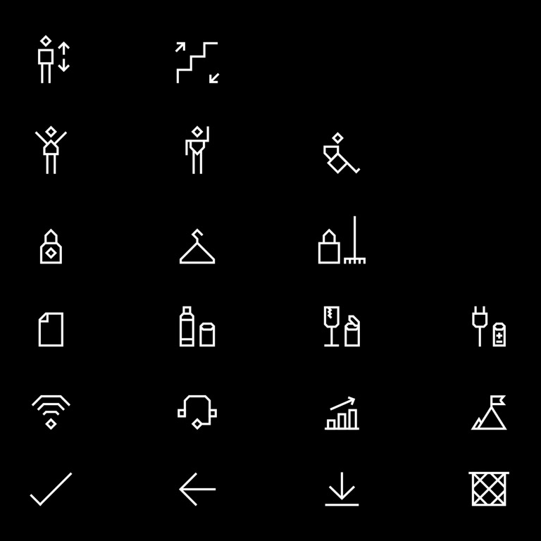
As several of Nh’s services are complex and difficult to explain with photography, a set of bespoke illustrations were developed. Balancing the pragmatic with the imaginary and humane, the different artworks aims to package complex information into something appealing and engaging. The toolbox furthermore feature a series of 128 custom icons meticulously crafted for Norsk helsenett’s digital services.
As Nh is downright dependent on stock photography, we developed a principle framework so all images are perceived consistent in style and can comply with the human warmth images add to the identity.
Channeling their new role, Nh will strive to be a pioneer, who contributes to substantial transformation in Health Norway. With a new brand strategy, we designed a holistic brand experience that communicates Nh’s bold promise and social mission: To connect the entire health sector of Norway.
The identity is designed to embody Nh’s brand attributes as a catalyst, activator and interactor. The design concept of “Connections” is implemented throughout the entire design system. It builds dynamic compositions that always underpins their social mission: To connect all of Norway's health services.
Following the concept of “Connections”, the color program is developed to an expansive palette offering a wide range of possibilities. The colors can be easily adapted to different target audiences. Ranging from formal and secluded to playful and expressive, Nh has been given a strategic color program that’s differentiated from its competitors, and breathes some fresh air into an otherwise predictable and outdated colour space of the public sector.
An agile but concise and strong typographic system, allows Nh to seamlessly adapt to any context or mediums. With an editorial approach at its core, the type setting perfectly adapts to digital surfaces — making it easy for everyone to consume important information and Nh will radiate a much more confident and refined brand character.
As several of Nh’s services are complex and difficult to explain with photography, a set of bespoke illustrations were developed. Balancing the pragmatic with the imaginary and humane, the different artworks aims to package complex information into something appealing and engaging. The toolbox furthermore feature a series of 128 custom icons meticulously crafted for Norsk helsenett’s digital services.
As Nh is downright dependent on stock photography, we developed a principle framework so all images are perceived consistent in style and can comply with the human warmth images add to the identity.
2022 Awards
Total Points: 3
Merit
Credits
Design Firm
Scandinavian Design Group / Oslo
Related Awards