The One Show
The One Show is the world's most prestigious award show in advertising and design. For over 50 years, the Gold Pencil has been regarded as one of the top prizes in the creative industry. The One Show has a rich legacy of honoring some of the most groundbreaking ideas, created by some of the most remarkable minds in creativity.

Category
Typography / Typeface Design
Annual ID
OS23_DE099M
About the Work
S TA R T I N G P O I N T
The new House of Communication of Serviceplan Group gives well over a thousand employees from a wide range of cultures, nations and communication disciplines a common home and is simultaneously an open meeting place for conferences, events and parties. It takes the principles of New Work to the next level and enables employees to work in ways that are as agile, flexible and interdisciplinary as possible. But how can you provide orientation to them and create a sense of identity in such an open-plan space concept?
I D E A
A typographic- and design-driven orientation and branding system that is just as creative and diverse as the people it was made for.
R E A L I S AT I O N
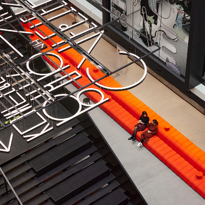
Building on the brand-icon and the square grid of the interior, a specially designed typeface, the ‘Service’, with four different alternatives for each letter ensures that nothing on the new campus is ever unifor m, but that everything is unified. Pictograms underpin the vibrancy of the typographic system, which creates identity and simultaneously offers spatial orientation. ‘Service’ is so flexible that it can perfectly brand any surface and every format. Floating word art in different languages illustrates that an open culture and internationality live and breathe in this space. Interwoven in a 130-metre-long and 6-metre-wide floating light carpet connecting the three buildings, the typeface reflects the groundbreaking and innovative character of the house itself.
The new House of Communication of Serviceplan Group gives well over a thousand employees from a wide range of cultures, nations and communication disciplines a common home and is simultaneously an open meeting place for conferences, events and parties. It takes the principles of New Work to the next level and enables employees to work in ways that are as agile, flexible and interdisciplinary as possible. But how can you provide orientation to them and create a sense of identity in such an open-plan space concept?
I D E A
A typographic- and design-driven orientation and branding system that is just as creative and diverse as the people it was made for.
R E A L I S AT I O N
Building on the brand-icon and the square grid of the interior, a specially designed typeface, the ‘Service’, with four different alternatives for each letter ensures that nothing on the new campus is ever unifor m, but that everything is unified. Pictograms underpin the vibrancy of the typographic system, which creates identity and simultaneously offers spatial orientation. ‘Service’ is so flexible that it can perfectly brand any surface and every format. Floating word art in different languages illustrates that an open culture and internationality live and breathe in this space. Interwoven in a 130-metre-long and 6-metre-wide floating light carpet connecting the three buildings, the typeface reflects the groundbreaking and innovative character of the house itself.
2023 Awards
Total Points: 3
Merit
Credits
Agency
SERVICEPLAN GERMANY / Munich
Design Firm
büro uebele visuelle kommunikation / stuttgart
Chief Creative Officer
Alex Schill
Matthias Harbeck
Till Diestel
Andreas Uebele
Creative Director
Michael Bakman
Designer
Anna Pfältzer
Lorenz Grohmann
Creative Director Copy
Lucien Kazuko Yokoe
Font
Gabriel Richter
Head of Corporate Real Estate Managment
Axel Schörner
Head Of Design
Benjamin Hug
Jörg Schmitt
Managing Partner
Carolin Himmel
Christian Sommer
Pictograms
Shiwen Sven Wang
Project Manager, Head of design
Anika Pehl
Nadja Ratz
Words Livinigrooms
Hannes Böhringer
Related Awards