Young Guns
Young Guns is a portfolio competition awarding creative professionals 30 years and under, including designers, illustrators, entrepreneurs, and more!
2020 Young Guns Work - YG Work
The origin of life
Agency Natsuki Isa
Client BioClub Tokyo

Description
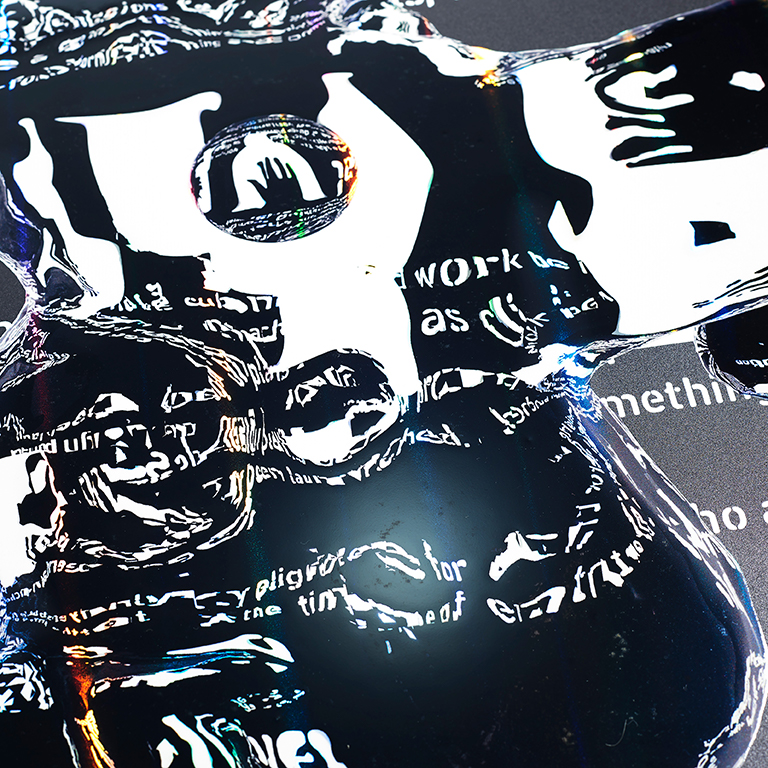
The Bioclub platform aimed to form the culture of biotechnology was started up with its base in FabCafeTokyo focused in the digital fabrication culture. The establishment has a bio-laboratory that can conduct experiments and research, becoming a place to deepen the discussion about the importance of innovation and interdisciplinarity in the bio-field, as well as measures on ethics and biosafety where rapid expansion is expected in the future. For the Bioclub to be widely recognized, we created a visual symbol made by programming and graphic design. The three types of "BIO" typography are inspired by the fact that a proto-cell, the origin of life, has a simple lipid membrane structure. The design was aimed to be derived not only from the aesthetic sense of the designer, but also exploring the possibility of a more organic visual with life by incorporating the laws and dynamics of nature and the physica world.
My Role was:
My company's CEO Kazushige Takebayashi and I were key person in this project. We did all of planning, made concept, art direction, designed typography, posters, promotional video and printing direction. To made these typography's shapes, I did art direction to programer. Adopted visual programming to the process, to utilize the laws and dynamics in nature and the physical world, and implemented the effects and fluctuations in the graphic which is impossible by manual work. Also printing direction was very important. I chose the aluminum paper that shined in rainbow colors at the viewing angle. And I adjusted print color separation very fine because I wanted to expand glitter on the poster.
2020 Awards
YG Work
Related Awards