

Awards
From the Jury Room: ADC's Publication Design
The ADC102 Publication Design Jury discusses all things print
The ADC102 Publication Design Jury discusses all things print
At the Strand Book Store in New York City, they have a table of books that are clandestinely wrapped in brown paper with a few words of what the book is about written on them. Maybe one cover has three words: Chocolate, Malibu, and Amorous. Would you pick up this book to read? The idea is to get people to read books they normally wouldn’t choose for themselves. And maybe stop judging a book by its cover…
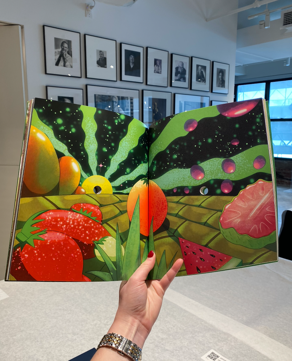
We discussed this fun book game with a group of brilliant designers who are on the Publication Design jury for the ADC 102nd Annual Awards. And of course, we talked about all the beautifully printed books, magazines, and editorial pieces they have been judging (yes, by their covers, but also so much more) and awarding Gold, Silver, and Bronze Cubes.

Luke Hayman – Jury Chair
Partner at Pentagram
Okay, so there are a bunch of things that are really spectacular. Some are sort of quiet and introspective or have gorgeous judgment in typography, paper, and color. Others are not as flashy. The techniques and bindings coming from China are always amazing, even though we’ve been seeing a lot of them over the last few years.
"Some are sort of quiet and introspective or have gorgeous judgment in typography, paper, and color."
They give less wow now, than when I first saw them because they’re less fresh, but they still do very well. And then there are some quirky odd things– one-offs– where someone had this idea and just took it all the way. There’s this amazing book with very thick boards and high gloss photographs, something I would normally not like, but it felt right for the whole experience of the book. And from the magazine side, Kindling is beautifully done, but not overdone.

Ben Denzer
Independent Artist, Designer, Publisher
It’s great to see things in person because so much of it is about physicality. Had I just seen an image of a book online, I wouldn’t be able to feel the page weight shift throughout the book.
When you’re making a publication and it’s going to be physical, it becomes rare and more intentional. In cover design, most people buy books on Amazon or some online retailer, so it gives you opportunities to do things digitally too. But at the same time, it’s going to be small and on everyone’s Instagram, when you want to be big. So there are all these constraints that come from different directions.
"When you’re making a publication and it’s going to be physical, it becomes rare and more intentional."

Kristin Fitzpatrick
Design Director at Town & Country Magazine
We've seen some remarkable entries this year, and two in particular really stood out to me. First, I love the message of the Margaret Atwood inflammable book. The idea started maybe two or three years ago when books were starting to be banned in schools, and they were calling for the books to be burned. So Penguin made a copy of The Handmaid’s Tale that could withstand 1700 degrees of heat. It’s an unburnable book they auctioned off for about $130,000, which then went towards literature and education.
"Penguin made a copy of The Handmaid’s Tale that could withstand 1700 degrees of heat. It’s an unburnable book they auctioned off for about $130,000, which then went towards literature and education."
The second one is chilling. A Latin American country had been taken over by a dictator, and a new constitution was written. Then he was overthrown, and the old constitution was reinstated. So one of the book publishers created a book where they sent pages from the old constitution to Latin American artists and asked them to draw over the page with blue pencil, which was used to redact and edit out culture that the old regime didn’t agree with. They also created illustrations and used words from the old constitution to create little poems, which I thought was really great.

Dennis Huynh
Director of Product Design, Editorial at GoodRx
It’s always great to see a piece of work in its physical form. You interact with it totally differently than if you’re on an app. The pieces that are really exciting are the limited or private press additions. It’s really exciting to see all the talent and creativity that people are putting out in how to display these books.
"The pieces that are really exciting are the limited or private press additions."
When it comes to judging print design, you’re thinking, “how are they innovating within the space? How are they playing within the form? Is the whole book cool? Or is it just the cover?”

Justin Long
Design Director at Vanity Fair
The tactile qualities are really nice on the entires. The tricky thing is that for some of the photo heavy books, as far as design, I’m not so sure what I’m judging, because it’s a little bit lighter on design and a lot more minimal.
But with those, what I’m looking for, especially coming from the magazine world, is pacing. Are they switching up the format, the formula, and the layout as you go through it? Or is it really just one trick?
Books that play with the format are nice because it’s interactive as much as a book can be interactive. It’s engaging. A lot of the work has really cool paper stocks and techniques that I’ve never seen before. There was a book that had a very raw matte paper with an almost silver ink that had a metallic sheen to it, which made it feel more luxe.
When I first moved to New York, I was freelancing, and this is when everyone thought printed magazines were going away and everyone was going to read a magazine on their iPad. So I had to translate everything digitally and build in interactivity, push buttons, and make things pop up, but no one wanted to read a magazine fully online. So, magazines aren’t going anywhere. I swear. Quote me on that.
"Magazines aren’t going anywhere. I swear. Quote me on that."

Victor Williams
Digital Design Director at TIME
It’s all intentional. We live in a thoroughly curated world, and I guess what I am sick of is the lack of curation or the lack of appreciation of curation.
Everything we encounter now is an unmediated firehose of information and images. And, in publication design, you go back to a completely curated experience. From the weight of the book, the size of the book, the scale, texture, color, and fabric– every single thing is curated.
"In publication design, you go back to a completely curated experience. From the weight of the book, the size of the book, the scale, texture, color, and fabric– every single thing is curated."
Nothing is valued anymore– it’s always about speed, clicks, and revenue, and it can be about those things. But you need to try to balance it with curation. We can create a walled garden for folks that can go in there and experience it, and say, “I know I’m in this world and now I can go somewhere else.”
Have you been following along during judging? Check out our Instagram & TikTok for daily updates from ADC in NYC and One Show in Puerto Rico!


 11_21_50 a_m_ - Camila Ordoñez Bozzi.png)


