.png)

Member News
Any Way You Slice It: ITALIC's Rebrand of Vito's Pizza
Jun 15, 2020
One Club Member Matt Titone takes famous LA pizza spot to a brand new level
One Club Member Matt Titone takes famous LA pizza spot to a brand new level
During lockdown, we asked our One Club Members to share their recent projects with us, and we received A LOT of great responses– We love to see what our members have been up to, so don't forget to send us your cool work post-quarantine too!
Matt Titone, Partner & Creative Director at ITALIC Studio and One Club Member has given a famous Los Angeles-based pizza shop an iconic rebrand. Vito’s new image is full of personality, representative of the man Vito himself. Matt is here to fill us in on the fun process behind the new design; after reading this interview you will defintiely be craving a slice.
This branding is fire — what did the brand look like before?

Thank you! There was basically no branding before we were hired– in fact, Vito didn’t even understand why he needed a logo! It’s funny because Vito’s was super successful and well known out here in Los Angeles even before the rebrand. They were even on the HBO show “Entourage” and widely known for being the best East Coast-style slice in LA. Not to sell ourselves short, but it sort of goes to show how branding is sometimes not the most important thing as long as you have an amazing product.
Anyway, the back story for us working with Vito was that he partnered with his longtime friend and LA restauranteur, Dave Reiss, who definitely appreciates and values good branding (as well as a quality product of course). Dave and his wife Patti Reiss brought us on for the rebrand, introduced us to Vito, and they were our main clients throughout the process.
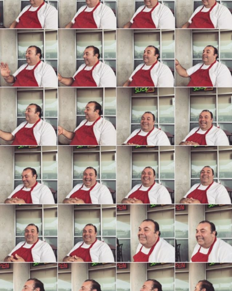
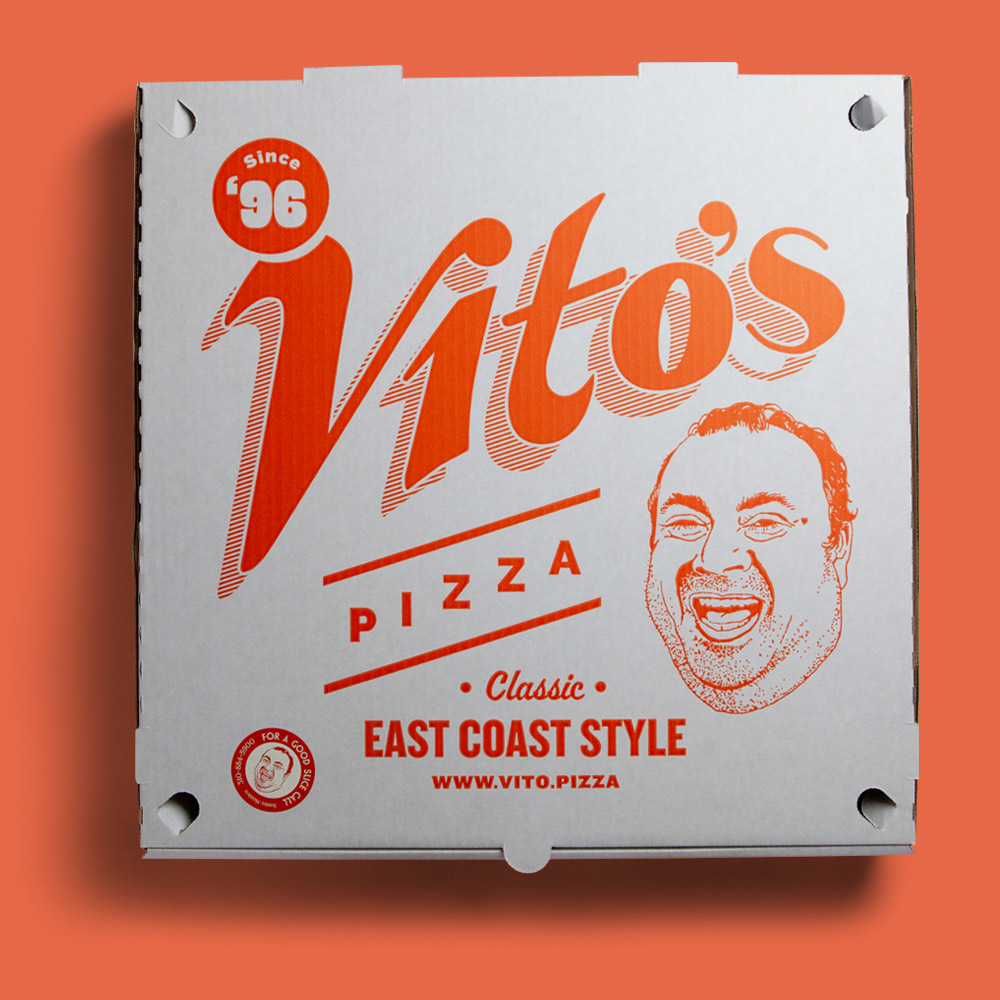
I will never forget our first meeting with Vito for breakfast (which turned into lunch in no time) at his original West Hollywood location. Vito is such a boisterous character and he wouldn’t stop cracking jokes and telling random stories — it was impossible to stay on topic. I just kept taking iPhone photos of all the funny faces he was making the whole time– those became the basis for the new branding, which features a jolly portrait of the man Vito himself.
How many other branding ideas did you brainstorm before settling on this one?
We are a very lean studio. The Vito’s rebrand was just done by myself and business partner, Ron Thompson. As far as the process goes, we typically present all of our clients with three very different focused design directions in our first round. Three options are sort of the magic number for us. Any less and the client will sometimes be curious to see what else we explored internally. Any more and the client will often become indecisive and try to mix and match elements from different options they like — a design smoothie is never good.
We try to get to know the brand as much as possible upfront before doing any design work. In this case, it was clear from the beginning that we needed to focus on Vito himself, not only because the pizzeria was named after him, but more so because of his larger than life persona.
"It was clear from the beginning that we needed to focus on Vito himself, not only because the pizzeria was named after him, but more so because of his larger than life persona."
For those of us not in Los Angeles, what’s Vito’s story and, most importantly, is his pizza delicious?
Vito has a pretty interesting story (as you might imagine). He is originally from Elizabeth, New Jersey, just outside of New York City, where he worked as an auto mechanic. He moved out to LA when his brother came here to be an actor. Vito was appalled by all the "traditional" Italian-American cuisine options out here, so he decided to start his own pizza shop. The legend and cult following pretty much grew from his first little location in WeHo. When Dave Reiss came on board as a business partner, they decided to expand the brand and open two additional locations; one in Santa Monica and one in Downtown LA.
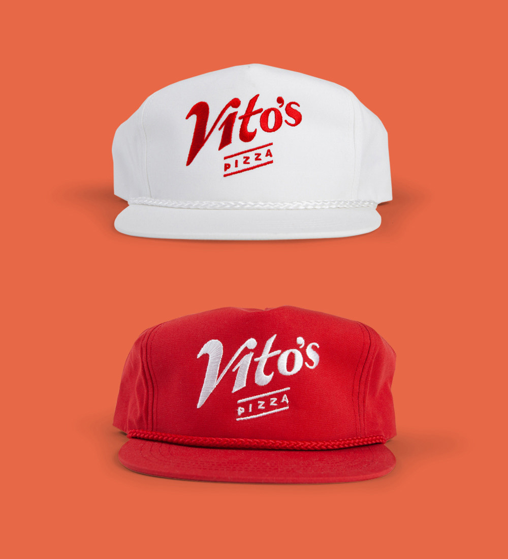
The branding we created for Vito’s was a hark back to classic, kitschy New York pizza-by-the-slice shops, but with a modern twist that also feels at home here in LA. Hand-drawn type, bold graphics, and of course a classic “marinara red” color palette are all parts of the new visual language.
And yes, the pizza is delicious. I am from the Northeast, so it’s the kind of pizza (and pasta) I was raised on. It’s not always the healthiest option, but it is great comfort food.
The rebrand includes a lot of Vito’s swag, which was your favorite item to create?
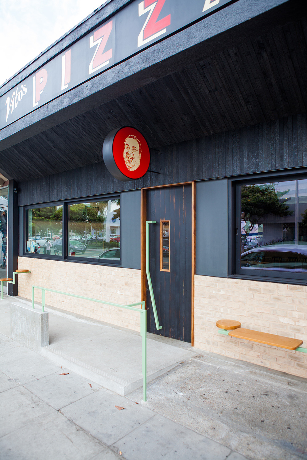
You know, it’s hard to say which elements were the most fun to create. We take a really holistic approach to design and branding projects like this one, so we are typically jamming on a lot of different deliverables at once, while also proposing other things that the client should do in addition to our original scope of work. For instance, with Vito’s, we were initially hired for the logo, exterior signage at the two new locations, and a new menu system.
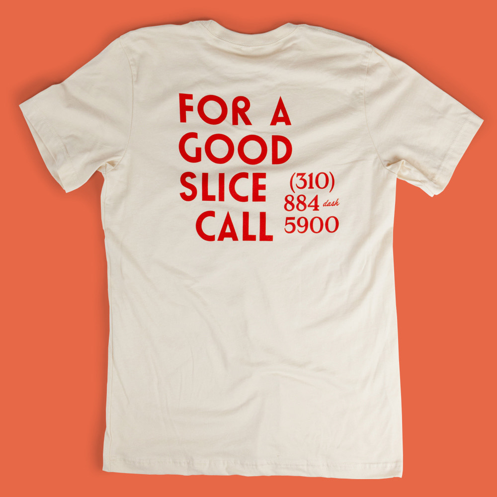
However, that quickly evolved into doing pizza boxes, stickers, hats, tees, aprons, painted murals, and silk-screened posters inside the locations. This was a fun brand to begin with, and as we got more excited about the different branding opportunities our clients also became excited and thankfully agreed to increase the scope of work and produce all the new things we proposed.
That all said, I cannot name one thing in particular that was the most fun. I loved creating the logo from the iPhone pic I snapped of Vito in that first meeting. It continued to make me laugh throughout the rest of the project every time I looked at it. I also really enjoy doing hand-drawn type and this was a perfect project for that solution to the logotype. The hand-painted signage and big neon sign downtown were also really fun to see produced and become part of the landscape of Los Angeles. Beyond that, I do love the pizza boxes. I get Vito’s delivered and to-go all the time, so I definitely get a chuckle out of seeing our work on a hot, giant pizza I’m about to destroy!
How has Vito’s new apparel been received?
People love the apparel! It’s so funny, the tees and hats weren’t even in our initial scope of work, but we knew there were already die-hard Vito’s fanatics out there, so swag items seemed like a no-brainer to us. They were just going to make the hats and tees for staff at first, but customers wanted them instantly, so I think they are always selling out of that stuff.
Are you working on any other restaurant re-designs currently?
We are not working on much at the moment, especially not restaurants as COVID-19 has pretty much decimated the whole food and hospitality industry in the past couple of months here.
That said, we did recently complete a big branding project for a new hotel here in LA with two new restaurants in it. One is a poolside concept called Caravan Swim Club and the other is the lobby restaurant called Scenic Route. Both are at the Hotel June, which is hopefully slated to open this summer. We are really proud of all the branding work we did for the property and cannot wait to see it produced and open for business.
One Club for Creativity Members get featured here on the One Club website and across our social media channels. Have a new project you'd love to share? An upcoming exhibition and you'd like us to help spread the word? Drop us a line at membernews@oneclub.org.
