.png)

Member News
Jason Naylor's 36 Sprays
One Club Member spray-paints the popular social media challenge
One One Club Member spray-paints the popular social media challenge
If you follow a lot of designers and other artists on Instagram, you've no doubt seen the phenomenon of 36 Days of Type on your feed. This popular activity lets these people express themselves on a daily basis, usually by reimagining and reinterpreting letters and words.
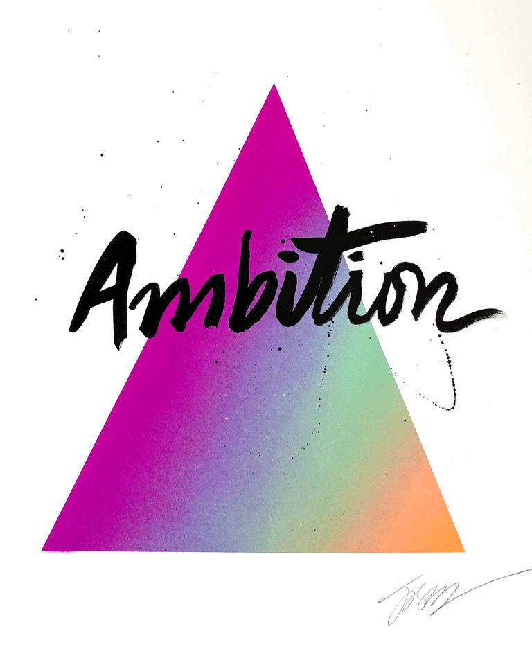
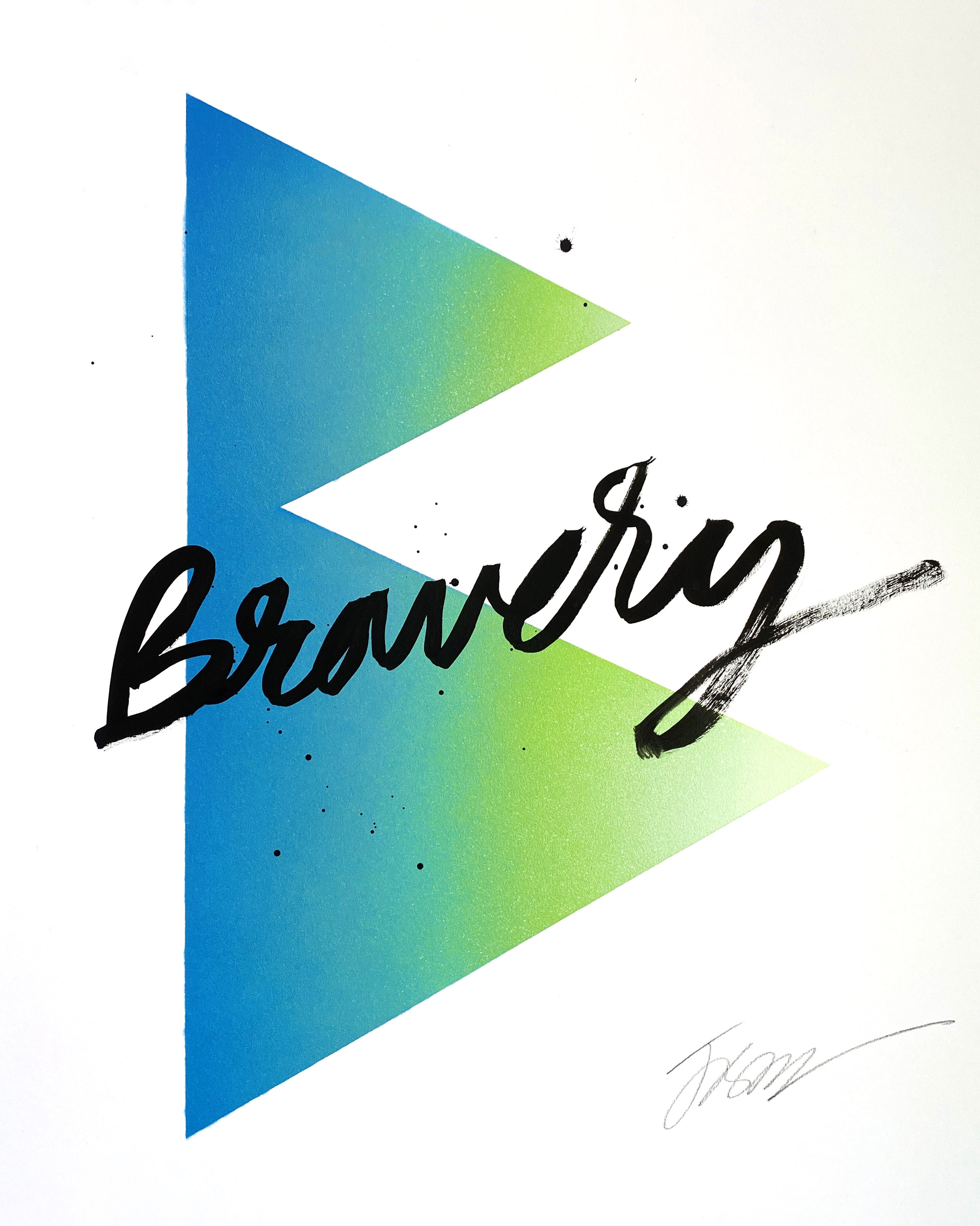
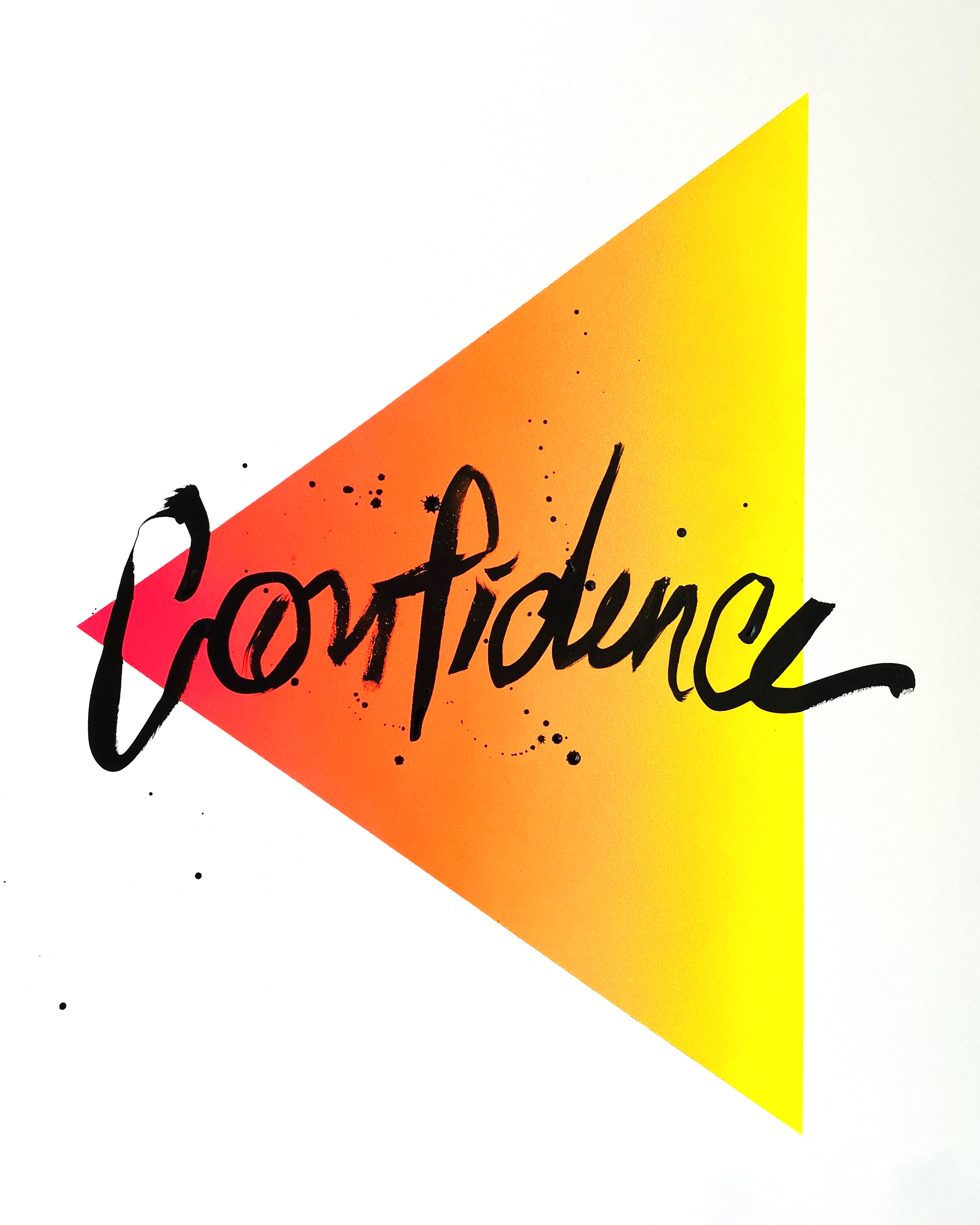
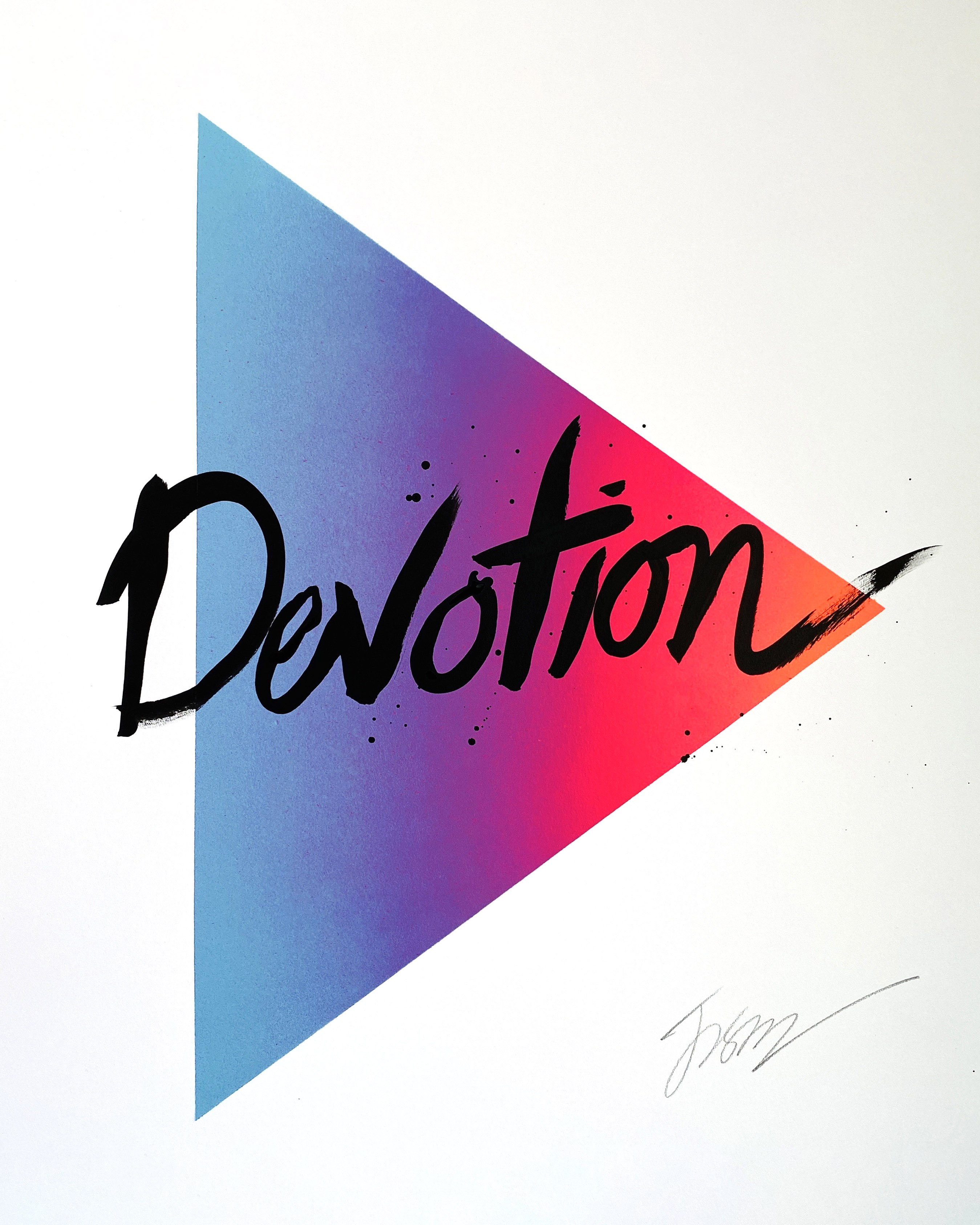
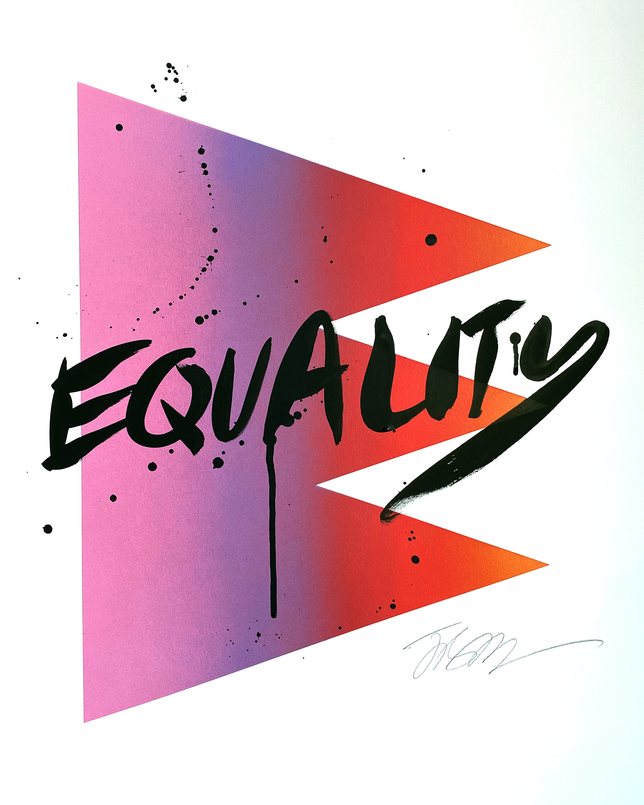
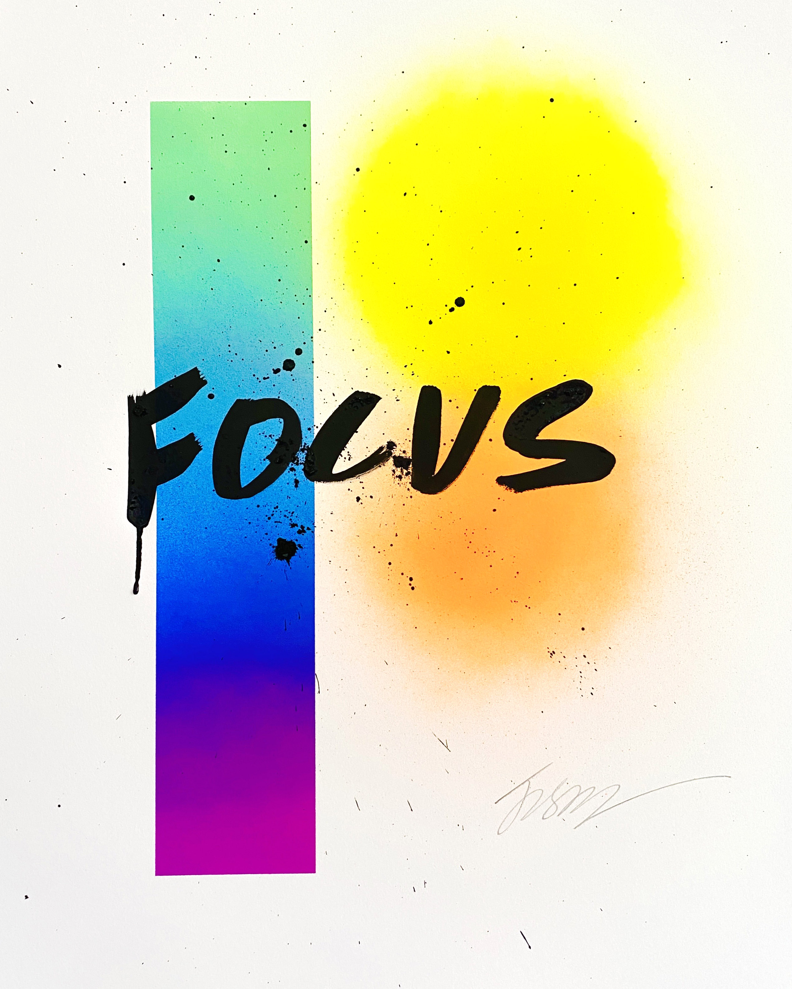
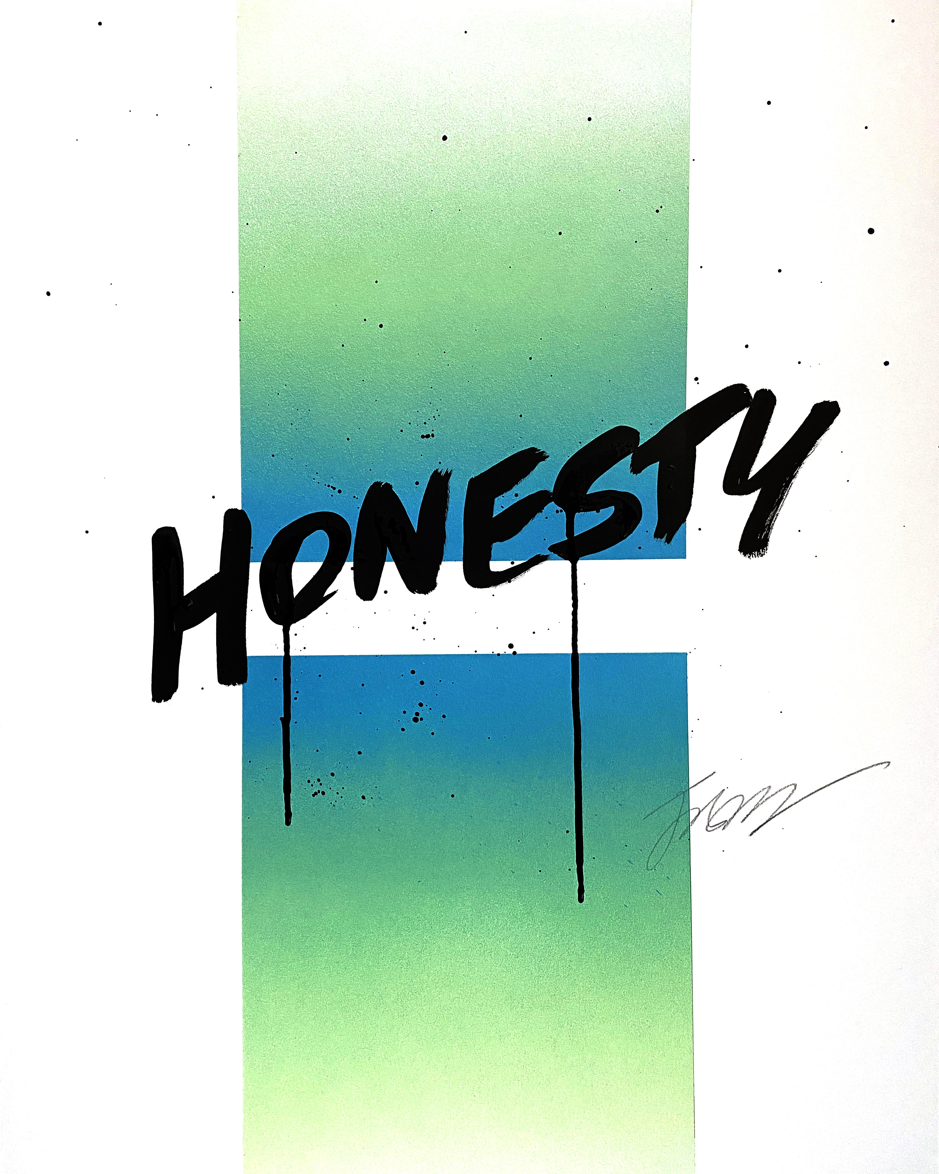
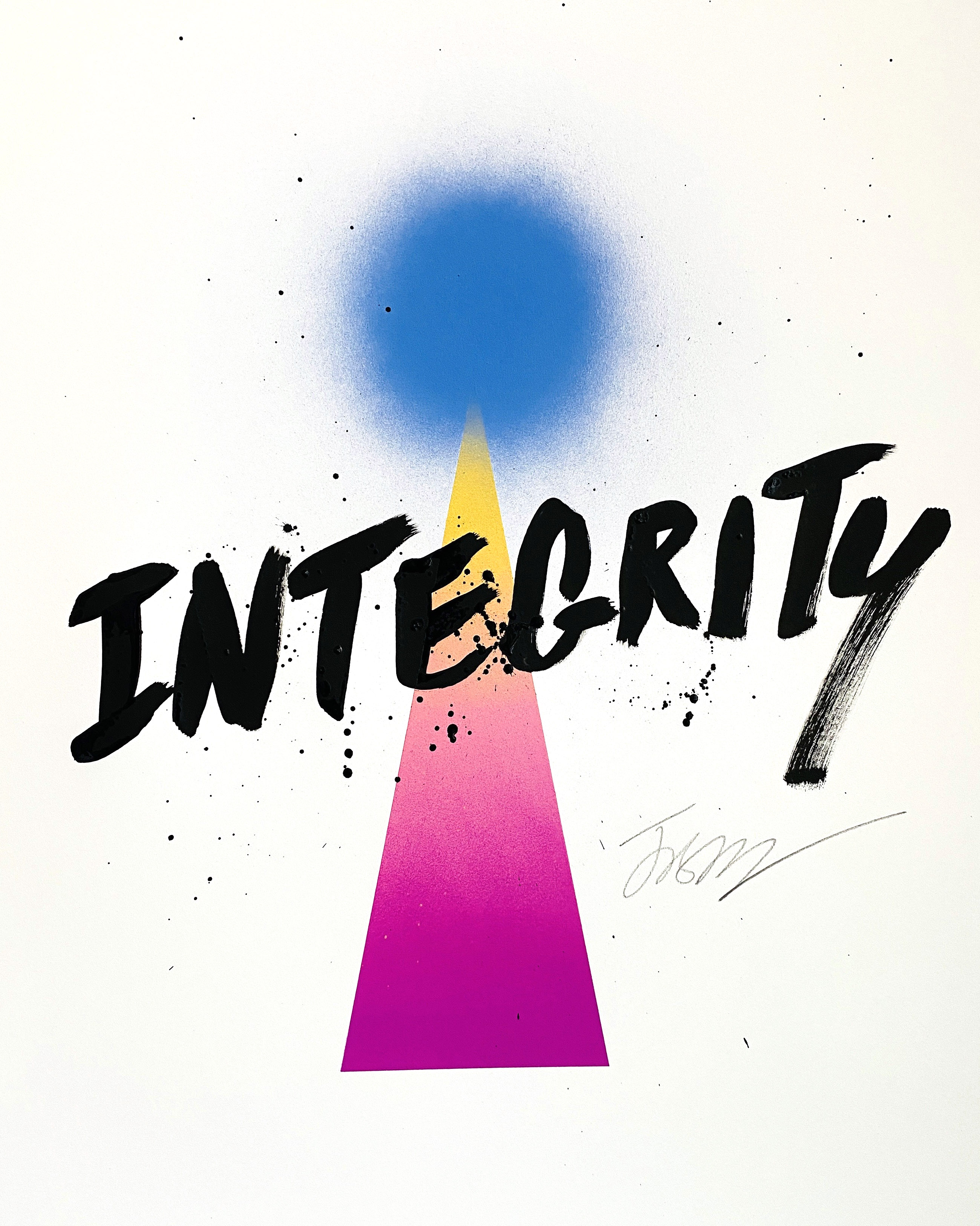
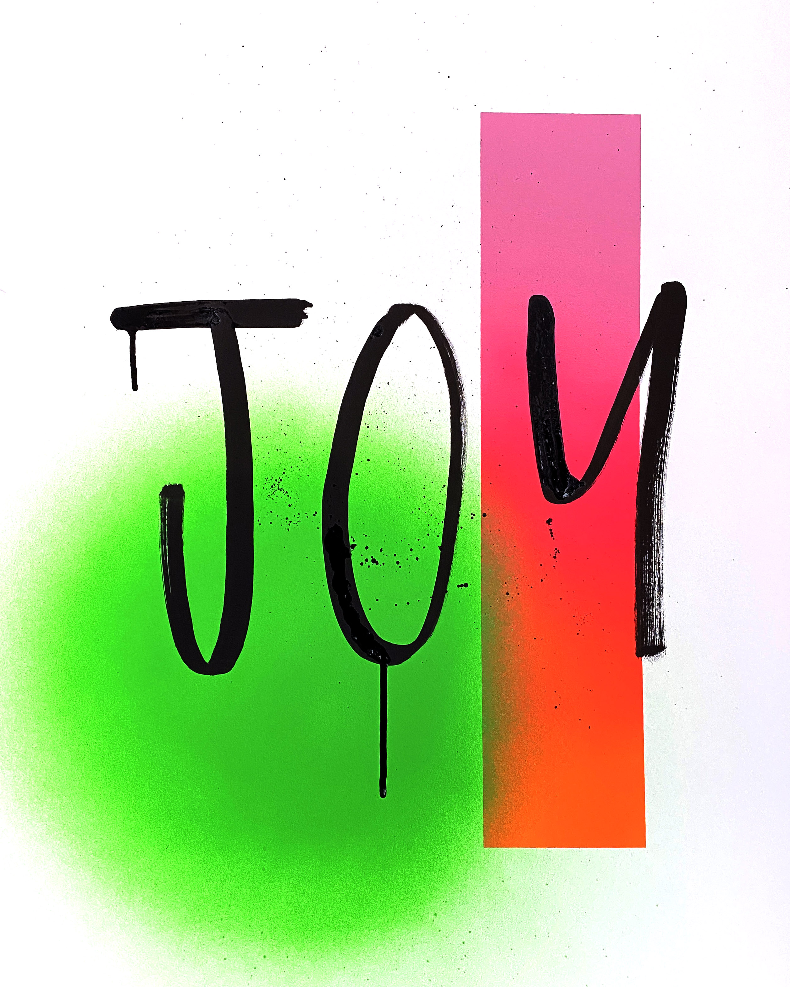
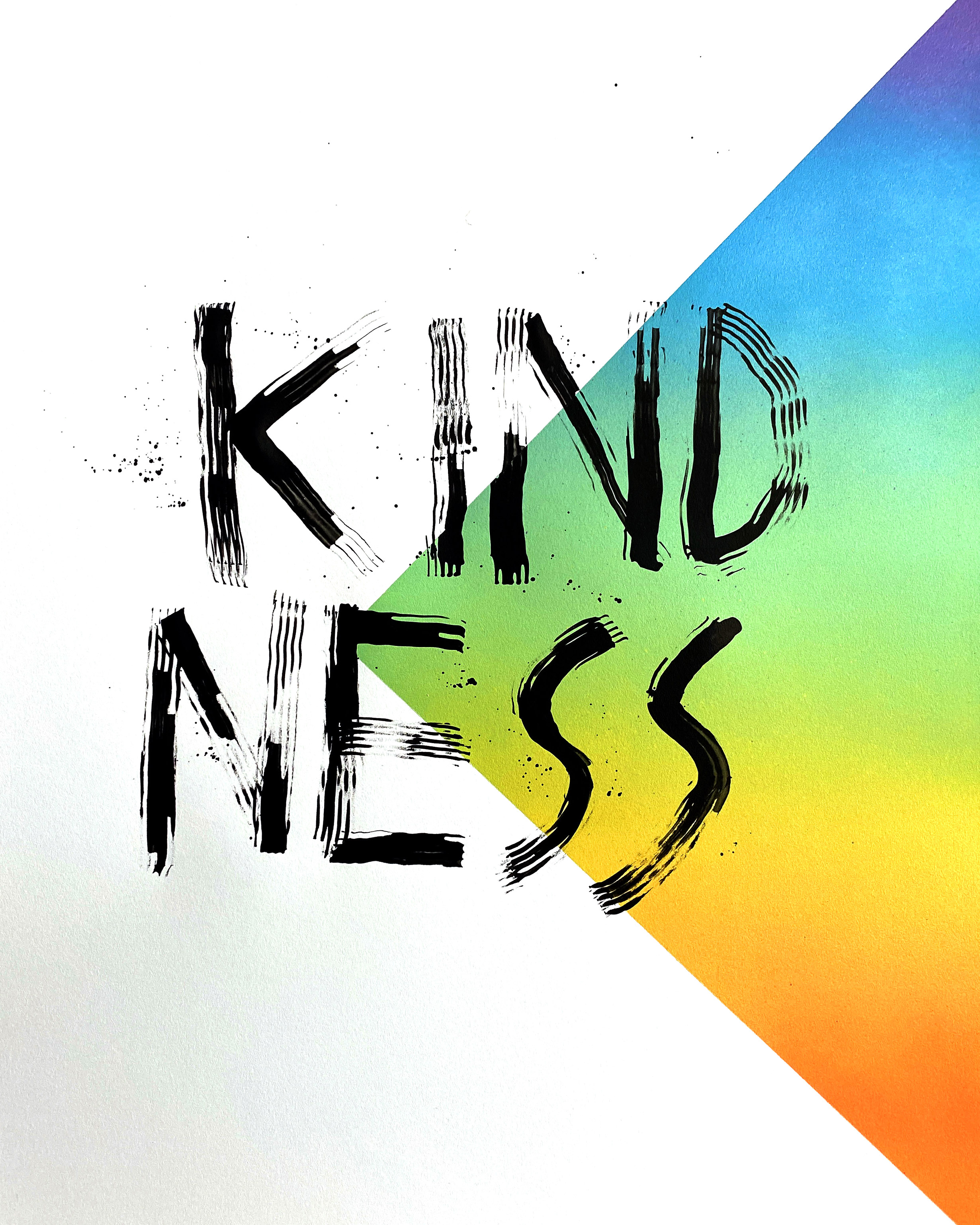
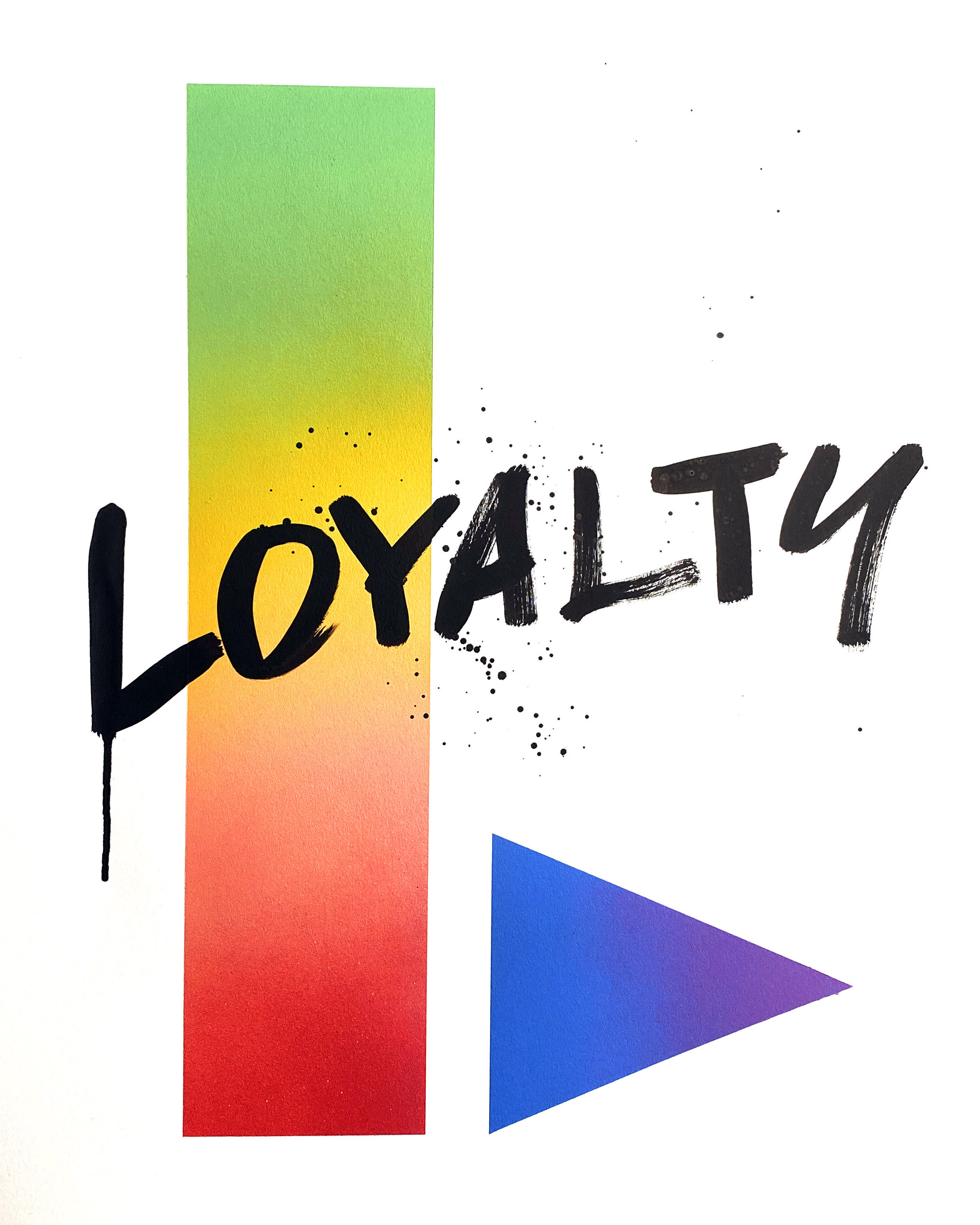
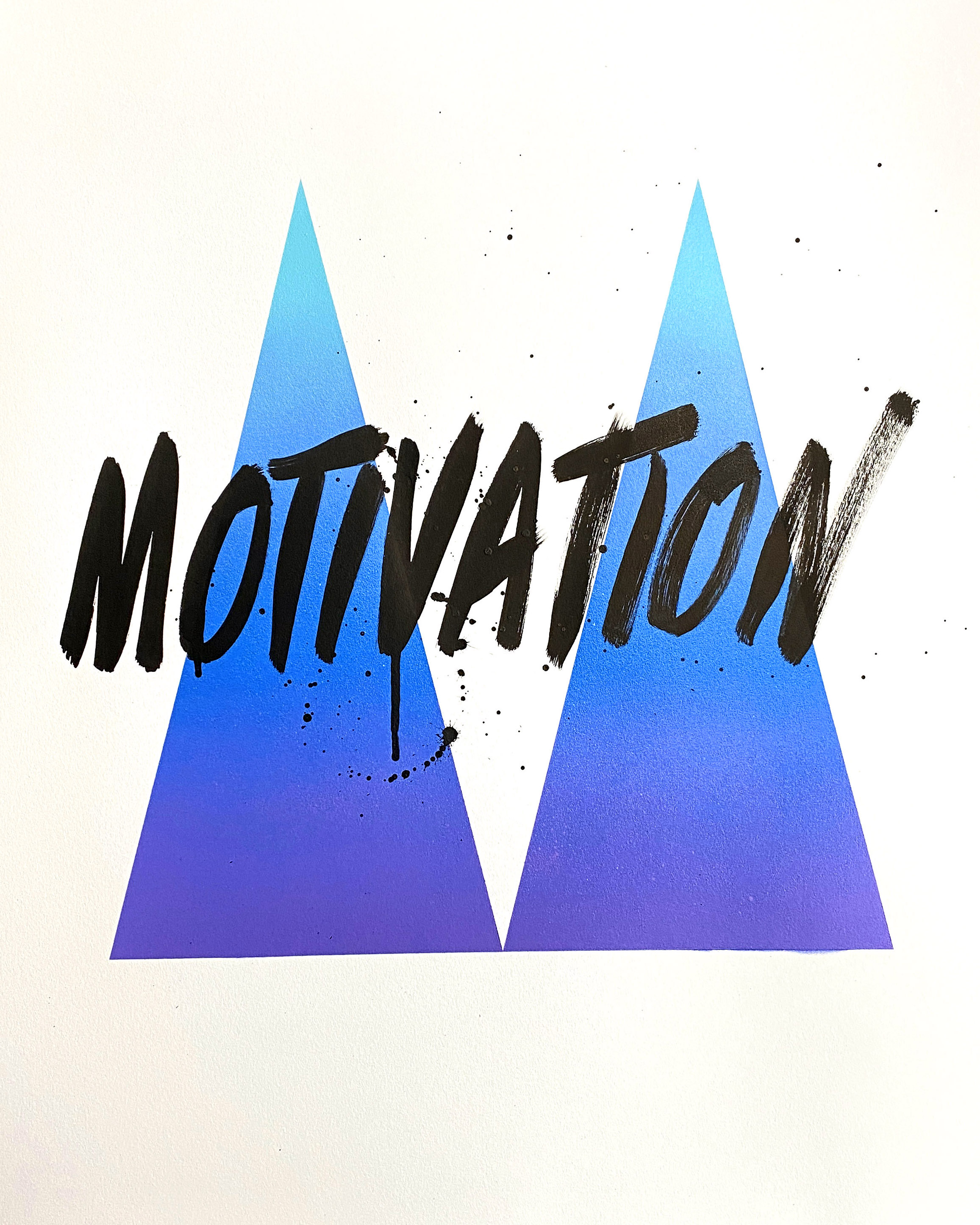
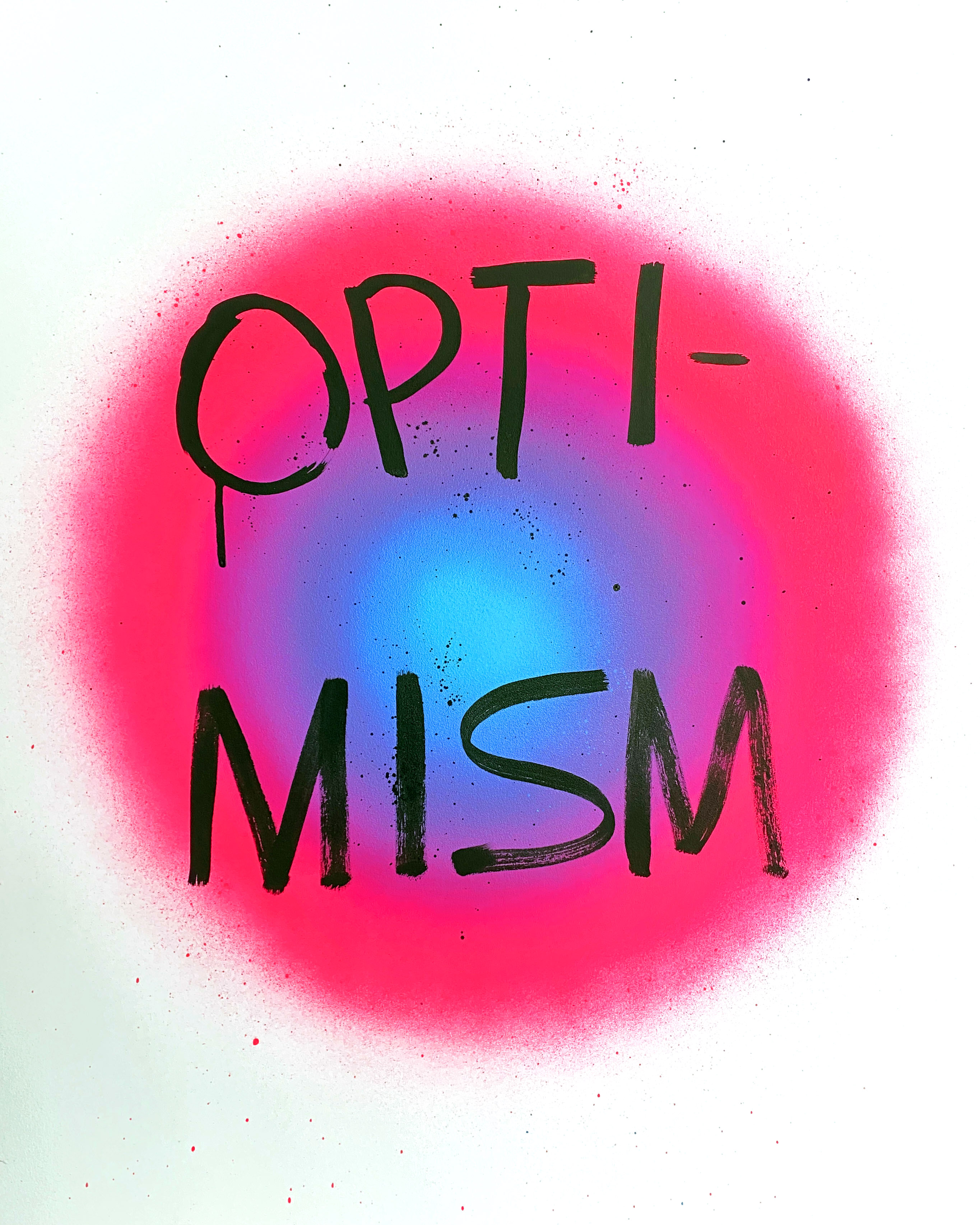
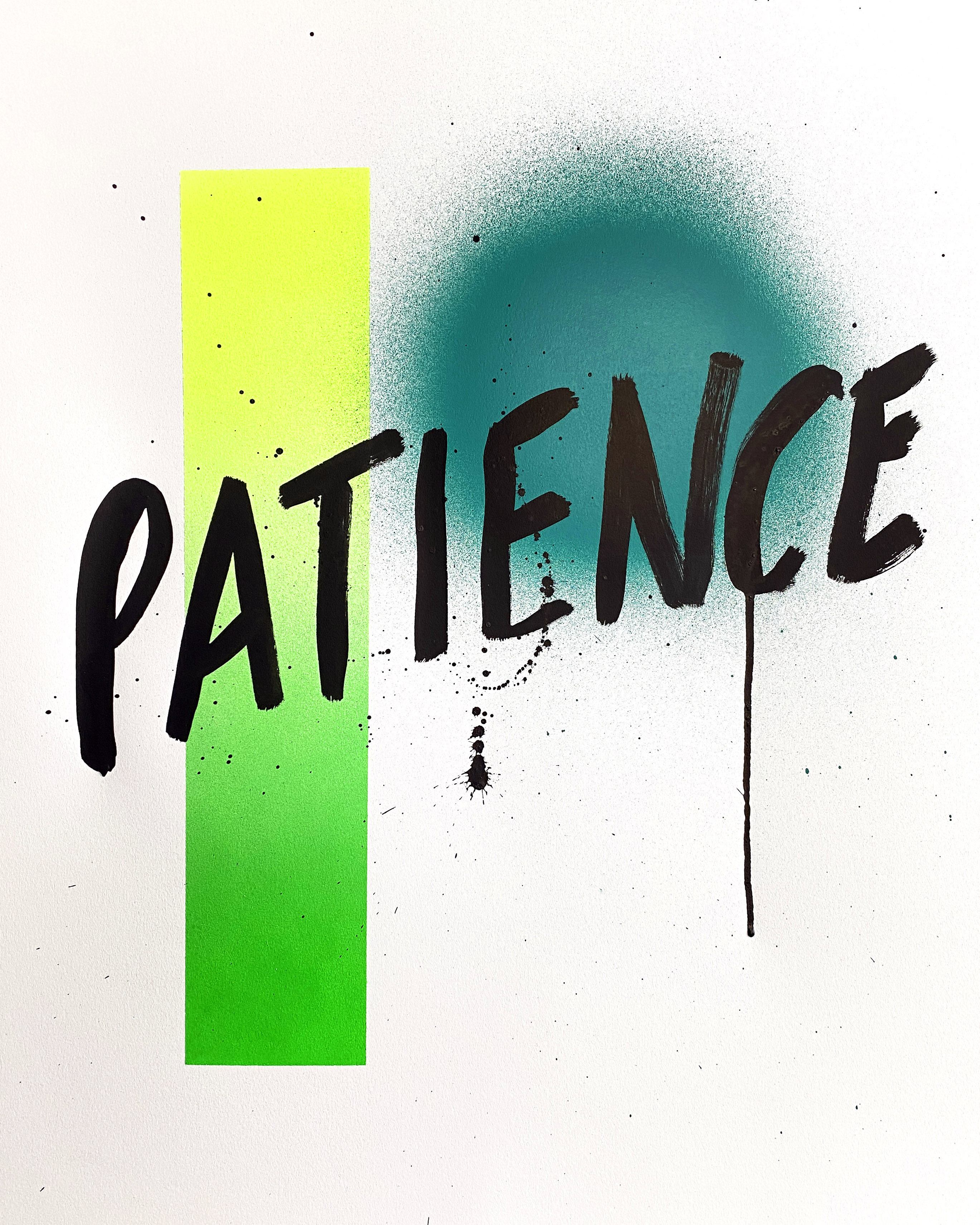
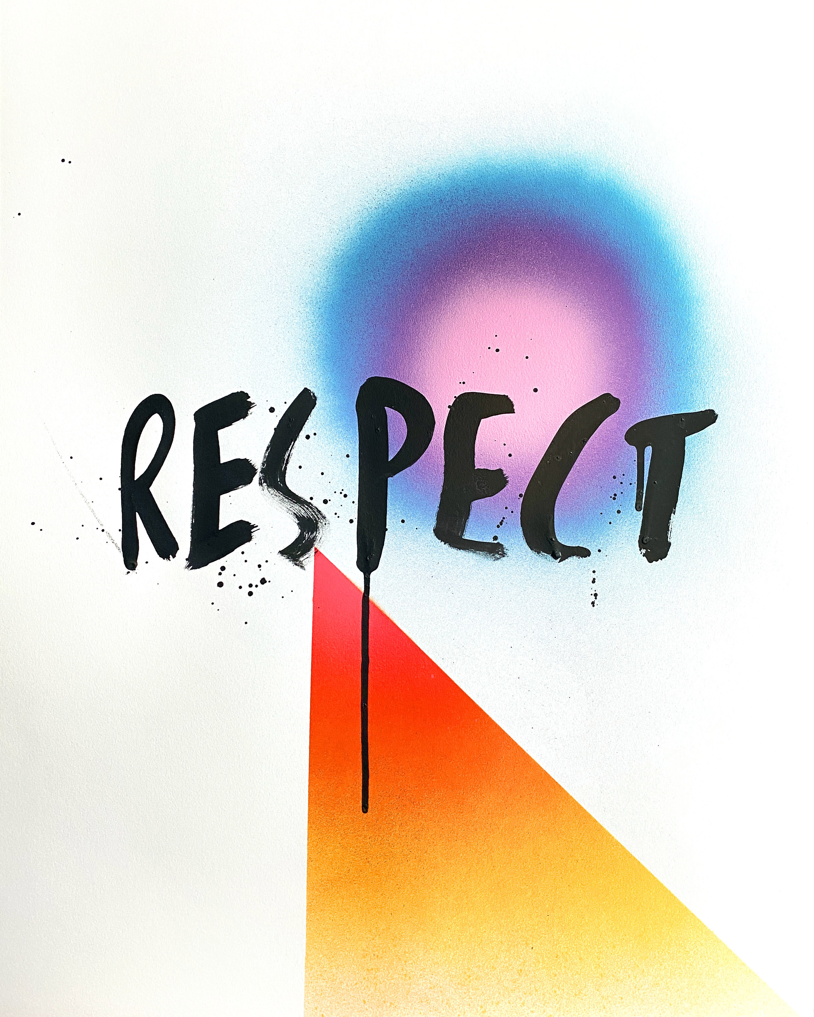
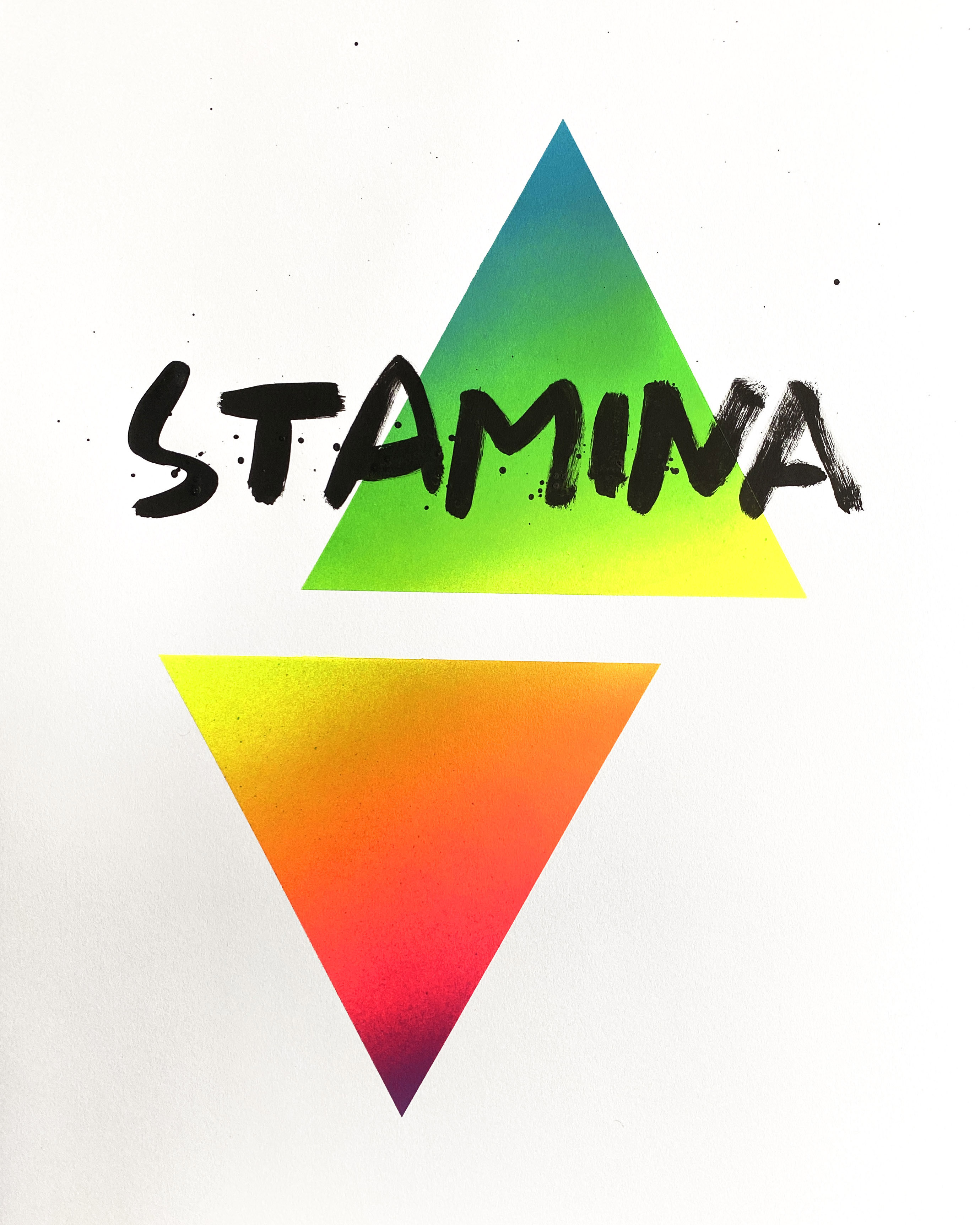
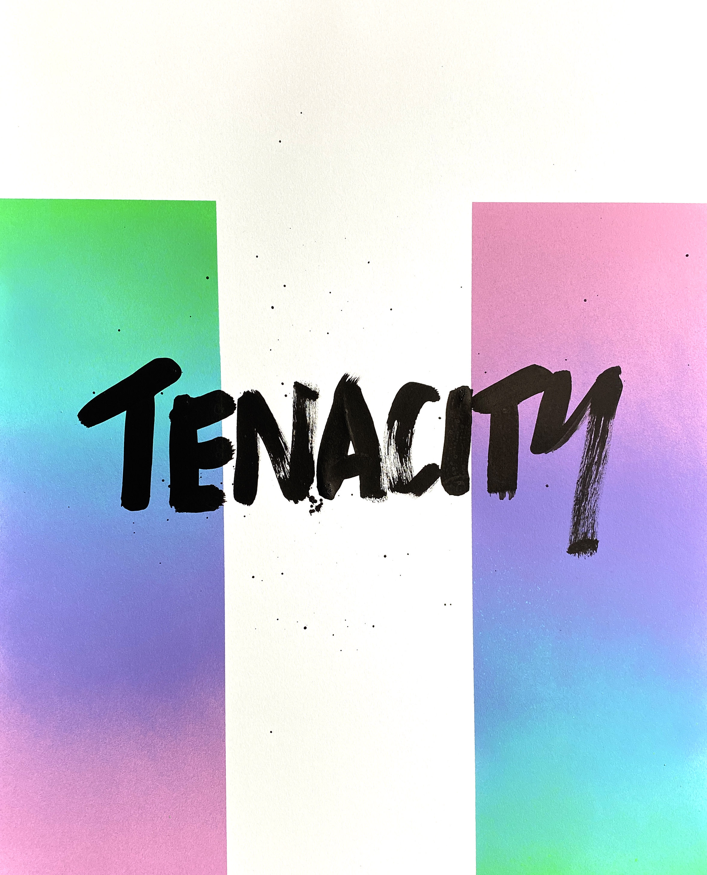
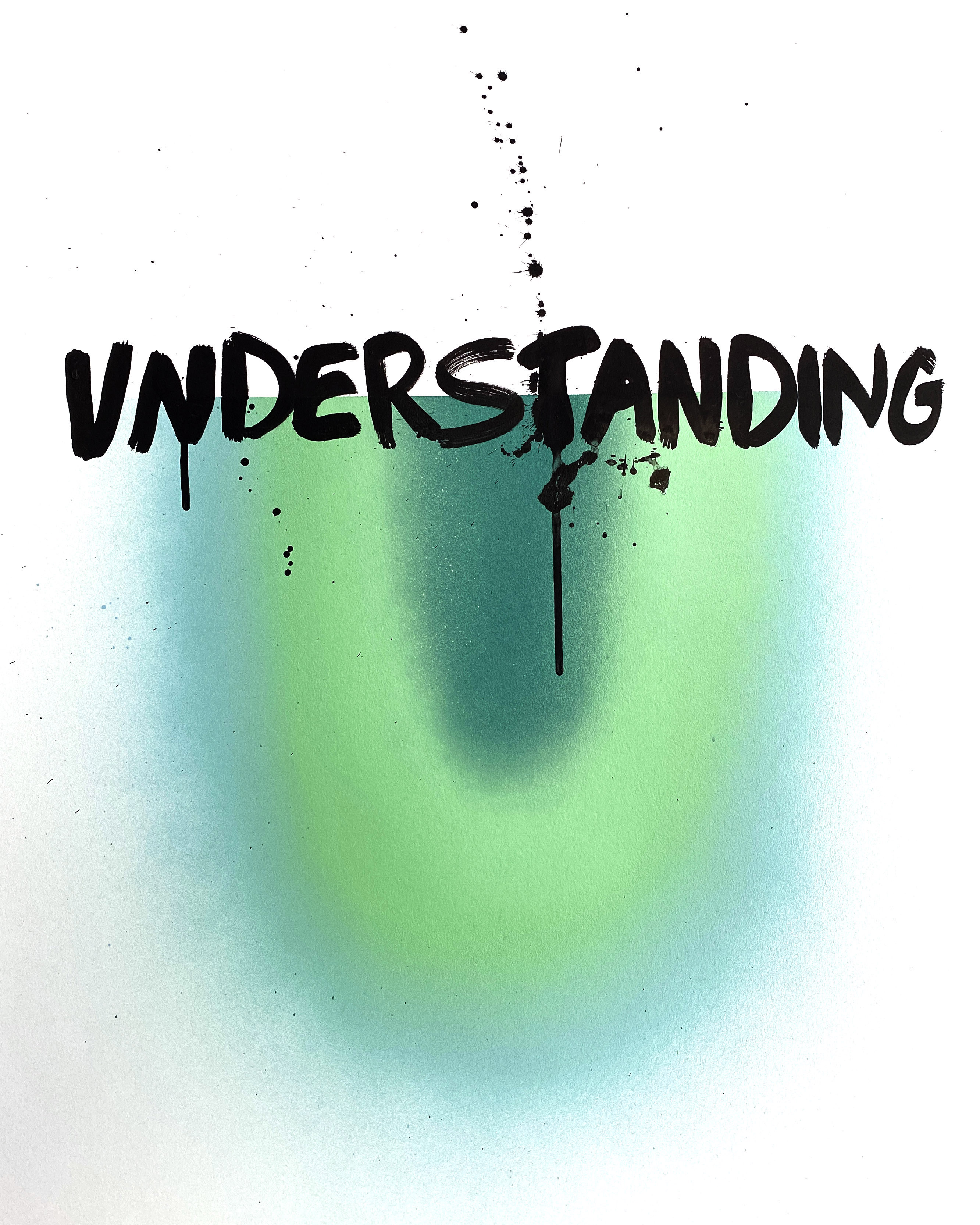
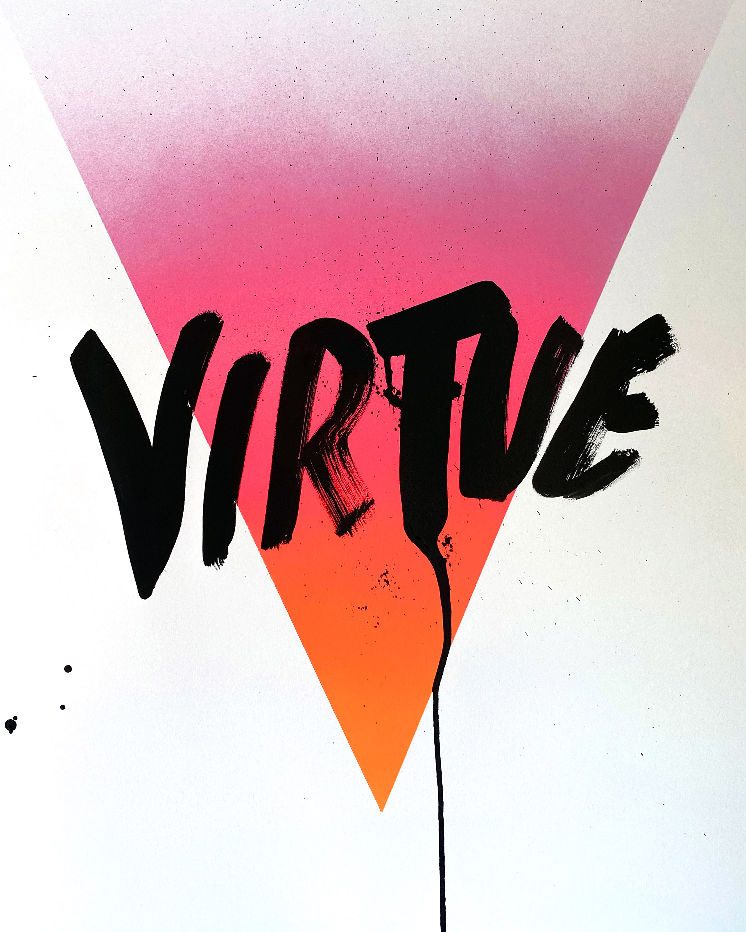
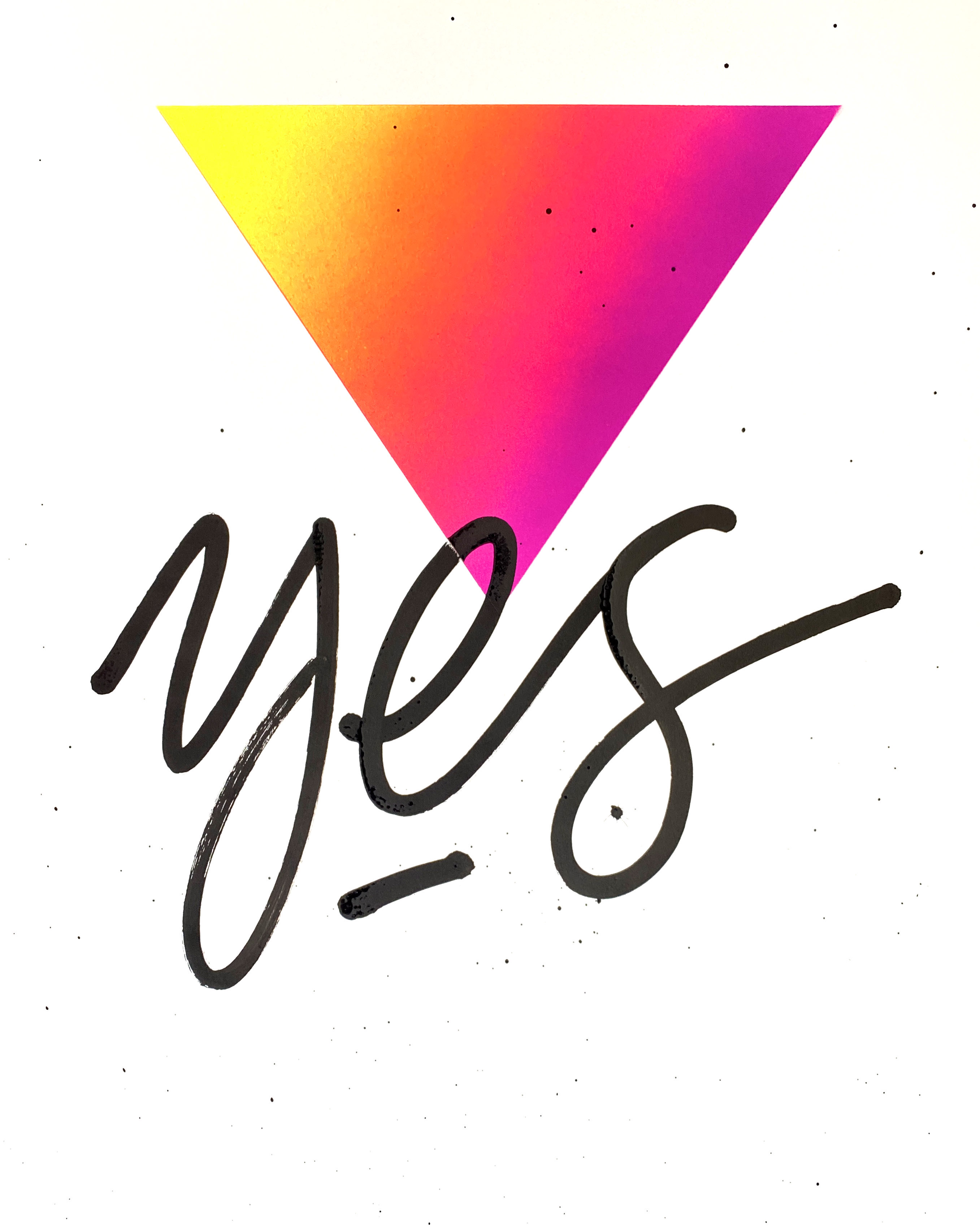
Recently, Brooklyn-based artist, designer, and One Club Member Jason Naylor took on the challenge, bringing his own stylistic twist, with his trademark vibrant color schemes and endless positive vibes. Each beautifully spray-painted letter has a corresponding word boldly written across it in black to create a collection of lettering and values.
We talked to Jason to get more details on his latest personal typography project.
How would you describe this creative journey through the alphabet?

This project was sparked by the 36 Days of Type Challenge and it is a series of 18x24 original paintings about personal values. Each piece has a word written in black paint that corresponds to the beginning letter, and an oversimplified geometric version of that letter painted with spray paint. I used masking tape and stencils to paint the letters, and filmed the process of painting and peeling to create satisfying content for social. The journey through the alphabet turned out to be quite rewarding, and visually I am proud of it. Of course, it did have a few challenges, like finding a word for the letter x.
Designing the letters was great, and not difficult. I enjoyed creating on the fly. I didn’t do tons of planning for the design of this series– I designed, cut, and painted each letter individually, as opposed to designing the entire alphabet and then refining it as a whole.
This enabled a lot of freedom, and since it is a personal project, I didn’t put too much weight on the cohesion of the geometric designs, because there were already several other unifying factors in play. I enjoyed the freedom of winging it on each letter and having fun. I used the negative shapes of the letters for some, and parts of the positive shape for others. I did get hung up on the letter L, which I wanted to be more unique– the negative shape of the L is so boring. A few of my favorite letters are the F, R, and K.
What was the end-game with this 36 Days of Type Challenge?
I have been wanting to create a project about values for a while, or valuable personality characteristics. This lettering series began with my desire to make work that wasn’t about aesthetics or visuals, but that could highlight my strengths as a human being. I always think, “as an artist, I am expected to make pretty things, but what about the other parts of me that are special, valuable, and marketable?” So I used this 36 Days of Type Challenge as the perfect opportunity to shout out some of my own strengths, but at the same time, tailor it to be a list of aspirational qualities for anyone.
"This lettering series began with my desire to make work that wasn’t about aesthetics or visuals, but that could highlight my strengths as a human being."
My goal is to highlight characteristics that define a good person and then tease the fact that maybe some of those things also help one to be a good artist or designer. To be honest, this whole series isn’t really about letters, it’s about good values. It’s not about design, it’s about the characteristics of a good person. I think that’s another reason why I didn’t overthink the design of each letter. I knew the definition of each word was what mattered.
Each letter has a word written across it in black paint. Why did you want to incorporate this element?
I used the letters to create a colorful background for each word because the project is about the words. I wanted to be literal and bold with the words to share these values as a simple list. In its entirety, it’s a list of personality traits that we should all aspire to embody– Respect, Kindness, Focus, Generosity... all of them are so important to me and are what really define people.
The overall message is about goodness and kindness. In my work, I strive to promote love and kindness as much as possible. This project was an opportunity to remind myself and others to be kind and to care for those around me, the community, and the world. I know this is basic stuff, like “How to be a good person 101.” We’ve all been to hell and back over the last year, and I don’t think there is ever a bad time to remind people to be their best selves. The world needs more positivity and goodness and this list will help us get there.
"This project was an opportunity to remind myself and others to be kind and to care for those around me, the community, and the world."
You incorporated a lot of negative space to create these letters. Why did you decide to include so much white space?
When you can use negative space to create an illusion of something else, there is always a magical aha moment when you get it right. I just love that, and I don’t use it too much in my work, so when I saw the opportunity arise as I was making these letters, I seized it.
"When you can use negative space to create an illusion of something else, there is always a magical aha moment when you get it right."
I love the variety too– some use it, some don’t, and that makes the letters that have negative space that much better. As far as the white space goes, I have been looking for the opportunity to do more work on a white background, because MOST of my work lives on dark or black backgrounds. While I love the black, I do occasionally want to branch out. This seemed like the perfect place to put some color onto a white canvas for a change. I think it turned out to be the right choice.
So what challenge is coming after 36 Days of Type?
My next challenge is to figure out how to incorporate some of these geometric gradient shapes into my murals. I did one last week with something similar and it felt pretty fresh, but I am not sure how it will persist in my work yet. I would like to put this style to use a bit more.
Why do you think 36 Days of Type is so popular among artists?
I think 36 Days of Type is such a hit because it gives us an ongoing prompt that is specific. It also has a vast range of possibilities because of how many different ways you can design each letter. It takes the, “what should I draw?” feeling away for six weeks. The lettering community on social media is a supportive community, and it’s a great way to get involved.
Are these letters going anywhere beyond your IG?
Yes, the collection will live on my website. Each painting is an 18x24 original and available for purchase.
One Club for Creativity Members get featured here on the One Club website and across our social media channels. Have a new project you'd love to share? An upcoming exhibition and you'd like us to help spread the word? Drop us a line at [email protected]. We always love to know what our One Club Members have been up to, so don’t forget to send us your cool work!