ADC Awards
ADC Annual Awards is the oldest continuously running industry award show in the world, with an incredible legacy of over 100 years. These awards celebrate the very best in advertising, digital media, graphic and publication design, packaging and product design, motion, experiential and spatial design, photography, illustration and fashion design – all with a focus on artistry and craftsmanship.

Category
Posters / Traditional - Series
Annual ID
ADC104_BCD015S
Background
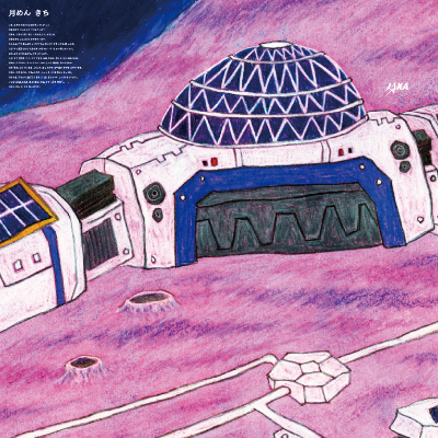
Amid the escalating global race for space development, Japan’s newly established Space Strategy Fund in 2024 aimed to bolster technological innovation on an unprecedented scale. However, a pressing hurdle lay in generating widespread awareness among potential stakeholders—from aerospace manufacturers to innovative university labs. They needed a unifying symbol that would emphasize collaboration between industry, academia, and government. The challenge was to create a compelling brand identity that not only reflected Japan’s heritage but also illustrated its commitment to conquering the increasing challenges in space exploration.
Creative Idea
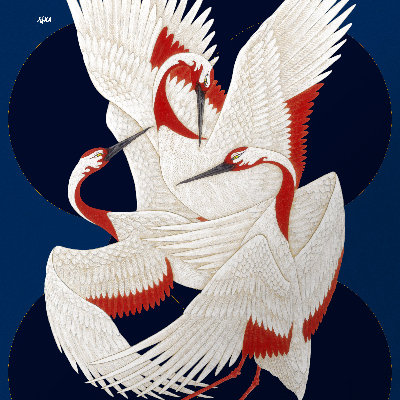
The creative spark came from the crane, a bird synonymous with Japan’s cultural legacy and symbolism of longevity and good fortune. By depicting three cranes flying in formation, we conveyed how industry, academia, and government can unite to pursue space development more effectively together. Storm clouds hovering overhead portrayed the hurdles they must overcome, highlighting the need for collective strength and resilience. By employing techniques inspired by traditional Japanese painting, we aimed to blend heritage with modern aspirations, thus making the concept both iconic and relatable.
Insights & Strategy
To maximize impact, we positioned the crane motif at the core of the brand identity and ensured that each stakeholder—industry, academia, and government—found an aspect of their role represented in this triple formation. We collaborated closely with Japan’s leading artist to merge traditional art elements with cutting-edge design principles, aligning history with innovation. This consistent visual strategy sought to instill pride, spark inspiration, and cultivate a sense of collective endeavor.
Execution
We unveiled the Space Strategy Fund’s new brand identity across multiple media channels. Posters featuring the stylized crane trio adorned stakeholder's offices. The website adopted the same imagery to create a seamless online presence, while promotional materials reinforced the aesthetic. Traditional painting techniques gave each piece a uniquely Japanese flair, resonating with audiences’ cultural sensibilities. By ensuring uniformity in design across platforms, we built immediate recognition and trust, encouraging stakeholders to explore and engage with the Fund’s offerings.
Results
The three-crane symbol became a powerful icon of national collaboration, sparking discussions about Japan’s evolving role in space. The brand identity not only boosted engagement but also anchored a sense of shared purpose for Japan’s space ambitions.
2025 Awards
Total Points: 21

Silver Cube

Credits
Agency
Dentsu Inc. / Tokyo
Agency In-House Production Company
Dentsu Creative Pictures Inc. / Tokyo
Art Director
Shotaro Takizawa
Composer
Hiroki Baba
Creative Director
Ryo Seki
Designer
Keita Asaoka
Director
Yuri Munakata
Illustrator
Yuki Yatsu
Producer
Koichi Shiba
Rie Kawase
Retoucher
Ryosuke Harashima
Related Awards