ADC Awards
ADC Annual Awards is the oldest continuously running industry award show in the world, with an incredible legacy of over 100 years. These awards celebrate the very best in advertising, digital media, graphic and publication design, packaging and product design, motion, experiential and spatial design, photography, illustration and fashion design – all with a focus on artistry and craftsmanship.

Category
Branding / Branding Systems / Identities - Integrated
Annual ID
ADC104_BCD034M
Background
Born in Italy in 1911, Fila has always been a fusion of Italian craftmanship and sports culture. A precursor to Sportswear, the brand gained major recognition in the 90s. But now that athleisure is everywhere, Fila needed to reaffirm its position and reignite Brand Love.
Creative Idea
The FILA Brand Identity system is a harmonious fusion of tradition and innovation, rooted in Italian craftsmanship and sports culture. Drawing from the brand's rich heritage, particularly its iconic stripes and Barretta logo, the system merges timeless design elements with modern sensibilities. Each element of the system, from its logo to typography, reinforces the brand's devotion to craft, disruption, and forward-thinking style.
Insights & Strategy
The brand's purpose is derived from the philosophy of Pierluigi Rolando, FILA’s legendary designer. His words are as relevant today to FILA as in 1973: To Unite Beauty with Sports Performance. We position Fila as an Italian Sports Couture who creates for champions and designs forever. Fila is confident, indulgent and unapologetic.
Execution
The Heritage stripes is inspired by FILA’s history famously worn by Bjorn Borg, the stripes act as the most valuable graphic element and icon of Italian Sport.
Inspired by the logo, the Barretta is a beautiful and precious shape. It is used for informative and technical language about the brand, a product, a promotion or CTA.
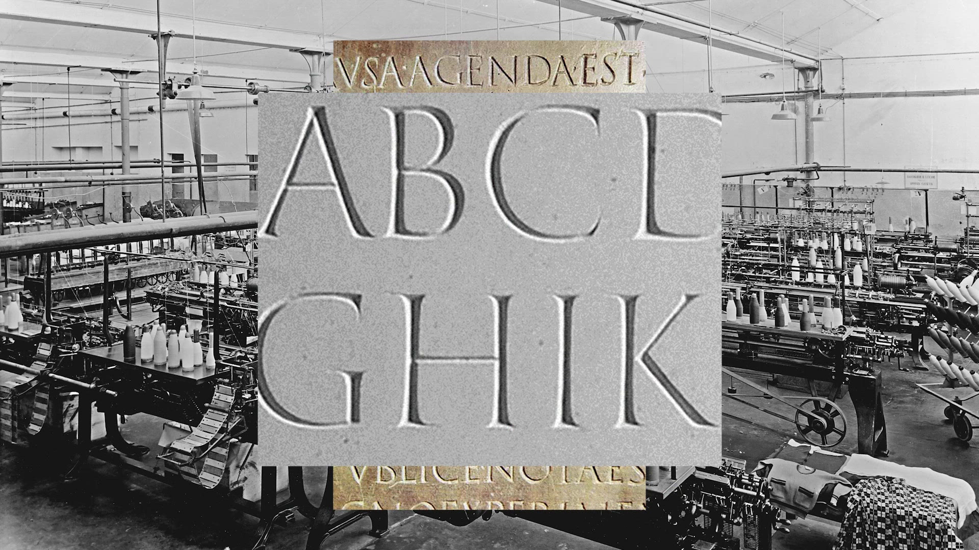
The choice of two distinct typefaces embodies the duality of Heritage and Modernity, creating a visual language that respects the past while pushing towards the future.
We created a special book that defines the fundamentals and establishes a solid and shared creative foundation. It is a methodical overview of the brand elements, their reason for being and their usage guidelines. It was offered to all the Fila's employees.
Inspired by the logo, the Barretta is a beautiful and precious shape. It is used for informative and technical language about the brand, a product, a promotion or CTA.
The choice of two distinct typefaces embodies the duality of Heritage and Modernity, creating a visual language that respects the past while pushing towards the future.
We created a special book that defines the fundamentals and establishes a solid and shared creative foundation. It is a methodical overview of the brand elements, their reason for being and their usage guidelines. It was offered to all the Fila's employees.
Results
The work unified and modernized the brand through a resonant strategy and design expression that made FILA stand out in a crowded category. The work positively impacted the brand externally as well as the internal culture of the company.
Lift in brand consideration from 43% to 53%
92% Increase in conversion on fila.com
85% increase in revenue from fila.com
Lift in brand consideration from 43% to 53%
92% Increase in conversion on fila.com
85% increase in revenue from fila.com
2025 Awards
Total Points: 3
Merit Honor
Credits
Agency
Sid Lee
Client / Brand
Fila
Art Director
Eleni Alafoginis
Manon Lebreton
Charlotte Boisclair
Associate Creative Director
Adrien Héron
Julien Hérisson
Content Creator
Elie Kimbembe
Misha Mulalu
Paulo Vivanco
Copywriter
Ryan King
Creative Director
Isabelle Allard
Lucas Tristão
Sara Phillips
Designer
Demien Bertels
Annie Yang
Executive Creative Director
Bruno Luglio
Producer
Joannie Tellier
Strategy Director
Mason Pereira
Natalie Rodriguez
Executive Producer
Vanessa Gervais
Account Director
Amy Longfellow
Account Executive
Gaëlle Paquet
Yasmine Uteene
Creative Director & Innovation Lead, Digital Design
Jean-François Lavigne
Digital Analyst
Rym Khouja
Graphic Artist
Jonas Land
Group Strategy Director, Digital
Jonathan Pallett
Head of Growth, USA
Annie Ly-Quan
Project Manager, Digital
Maud X Bessieres
Senior Director, Major Digital Accounts
Pier-Luc Beaulieu
Senior Vice President Marketing
Emily Maxey
VP, Head of Strategy
Melissa Cabral
Related Awards