ADC Awards
ADC Annual Awards is the oldest continuously running industry award show in the world, with an incredible legacy of over 100 years. These awards celebrate the very best in advertising, digital media, graphic and publication design, packaging and product design, motion, experiential and spatial design, photography, illustration and fashion design – all with a focus on artistry and craftsmanship.
Because you move forward.
Agency DENTSU INC. / Tokyo + WOIL inc. / Tokyo + SHOEI Inc. / Tokyo + ROBOT COMMUNICATIONS INC. / Tokyo

Category
Posters / Traditional - Series
Annual ID
ADC105_BCD032B
Background
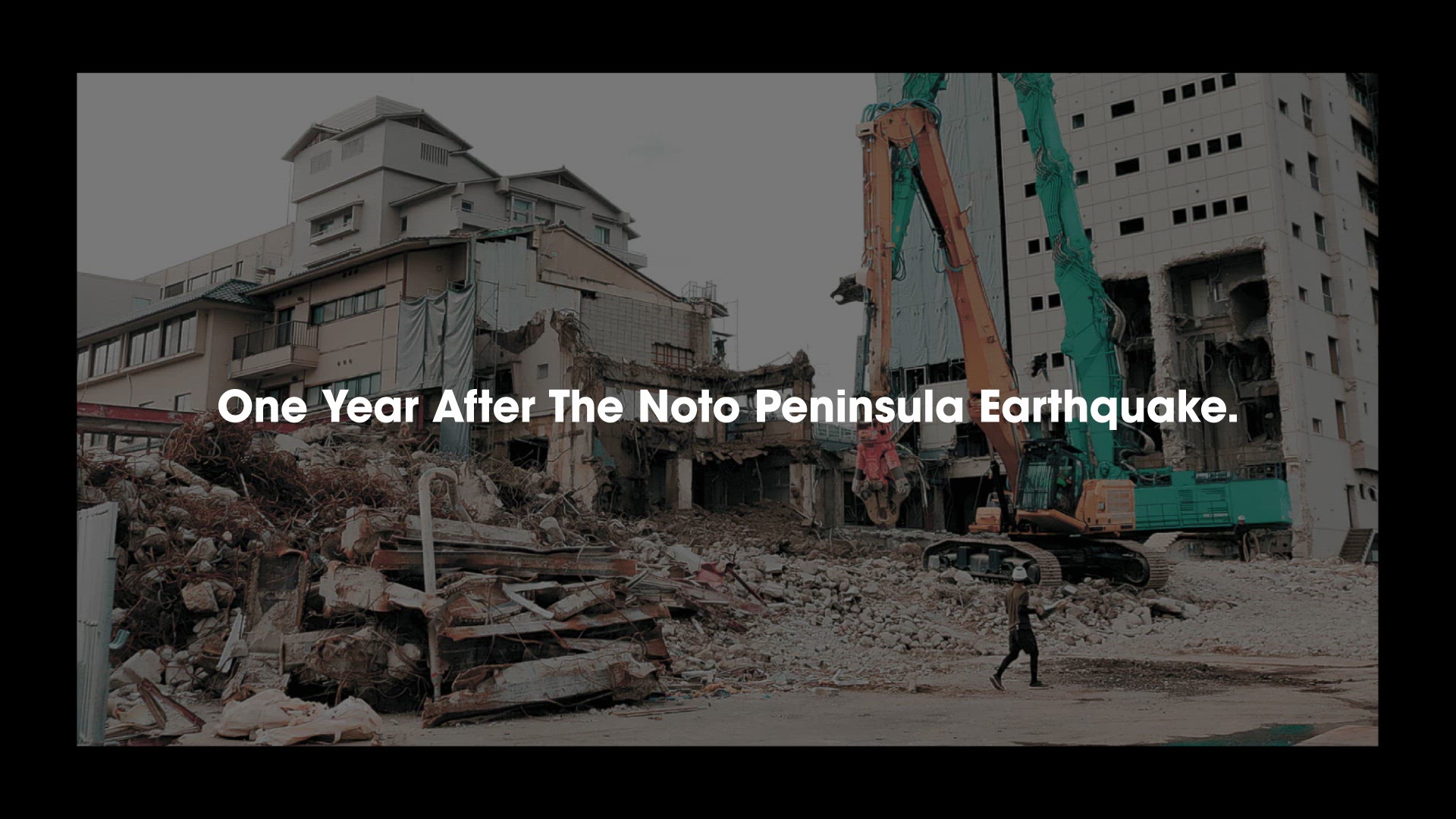
The Kanazawa High School Sumo Tournament is Japan's oldest amateur sports competition and an event that many residents of Ishikawa Prefecture eagerly look forward to. However, in January 2024, a powerful M7.6 earthquake struck Ishikawa, the home of the tournament. A year after the disaster, although recovery efforts were underway, many challenges remained. The community still faced a host of immediate issues. As a tournament deeply rooted in the local culture for over a century, it was expected to serve not only to support the athletes but also to lift the spirits of those affected by the earthquake. This included participants from the disaster-hit schools, as well as the local residents and visitors who came to watch.
Creative Idea
Advancing forward and colliding is both symbolic of sumo and represents a great challenge that requires immense courage.
The core idea is that facing stress, anxiety, and obstacles is proof of the strength of those moving forward. Visuals of sumo athletes crashing into walls are paired with copy such as “Anxious? Of course I am.” and “Doubt? Obviously, I do.” The main copy reads: “You’re confronting walls because you’re moving forward,” affirming negative emotions rather than denying them.
The composition is designed to encourage everyone facing challenges to keep moving forward. It highlights the athletes before their matches, showing their nervousness and tension, while also symbolizing the strength of the city's people in their recovery.
The core idea is that facing stress, anxiety, and obstacles is proof of the strength of those moving forward. Visuals of sumo athletes crashing into walls are paired with copy such as “Anxious? Of course I am.” and “Doubt? Obviously, I do.” The main copy reads: “You’re confronting walls because you’re moving forward,” affirming negative emotions rather than denying them.
The composition is designed to encourage everyone facing challenges to keep moving forward. It highlights the athletes before their matches, showing their nervousness and tension, while also symbolizing the strength of the city's people in their recovery.
Insights & Strategy
The slow progress of recovery caused frustration and anxiety. There was a sense of uncertainty about finding concrete solutions. A year after the disaster, while some recovery efforts were visible, many new challenges had become apparent. The community was still confronting these issues (“walls.”)
The athletes in the tournament felt the same way. In the lead-up to an important match, they too face tension, anxiety, and self-doubt. Despite all their hard work, the pressure of the moment often causes them to hit a wall. That’s why we wanted to send the message: “You’re confronting walls because you’re moving forward.” The sumo wrestler colliding with an opponent became the central visual, symbolizing not just the athletes but also the local residents struggling to rebuild their city. This message connects their shared experience and encourages both groups to continue their journey forward.
The athletes in the tournament felt the same way. In the lead-up to an important match, they too face tension, anxiety, and self-doubt. Despite all their hard work, the pressure of the moment often causes them to hit a wall. That’s why we wanted to send the message: “You’re confronting walls because you’re moving forward.” The sumo wrestler colliding with an opponent became the central visual, symbolizing not just the athletes but also the local residents struggling to rebuild their city. This message connects their shared experience and encourages both groups to continue their journey forward.
Execution
Craft
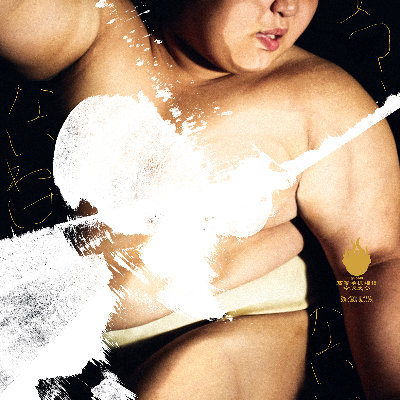
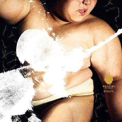
To capture the athletes’ raw expressions and the movement of their bodies, we photographed them colliding with, or throwing down, transparent walls and spheres designed to represent their opponents. The focus was not on the physical impact itself but on the determination to keep moving forward. The selected images showcase the athletes' strength and are enhanced by action painting to emphasize movement. (We also took precautions, including concealing the chest area, to ensure the images would not be interpreted in an inappropriate way.) The faint, scrawled writing symbolizes their internal struggles and anxiety.
Color & Tone
Sumo is a sport that relies upon the body. To highlight the athletes' bodies, which are trained for forward motion, the background was darkened to create a realistic, heavy tone. The focus was on simplicity and realism, with no unnecessary embellishments. The textures were layered in white, while the athletes’ inner thoughts were set in the tournament’s key color, ochre (yellow-brown), allowing them to appear subtly and be read with a slight delay.
Paper Quality
We chose rough gloss paper, which has a textured surface that also features a glossy finish on the printed side. This was intended to enhance the physicality of the athletes' bodies.
To capture the athletes’ raw expressions and the movement of their bodies, we photographed them colliding with, or throwing down, transparent walls and spheres designed to represent their opponents. The focus was not on the physical impact itself but on the determination to keep moving forward. The selected images showcase the athletes' strength and are enhanced by action painting to emphasize movement. (We also took precautions, including concealing the chest area, to ensure the images would not be interpreted in an inappropriate way.) The faint, scrawled writing symbolizes their internal struggles and anxiety.
Color & Tone
Sumo is a sport that relies upon the body. To highlight the athletes' bodies, which are trained for forward motion, the background was darkened to create a realistic, heavy tone. The focus was on simplicity and realism, with no unnecessary embellishments. The textures were layered in white, while the athletes’ inner thoughts were set in the tournament’s key color, ochre (yellow-brown), allowing them to appear subtly and be read with a slight delay.
Paper Quality
We chose rough gloss paper, which has a textured surface that also features a glossy finish on the printed side. This was intended to enhance the physicality of the athletes' bodies.
Results
On the day of the tournament, the paper reached around 300,000 people, mostly local residents, and attracted a crowd of approximately 10,000, filling the Utatsuyama Sumo Arena to capacity. From the athletes to the local supporters, we helped individuals who felt stuck in the face of a wall, to move forward with courage.
2026 Awards
Total Points: 9

Bronze Cube

Credits
Agency
Dentsu Inc. / Tokyo
Production Company
WOIL inc. / Tokyo
SHOEI INC. / Tokyo
Robot Communications Inc. / Tokyo
Art Director
Satoshi Kohno
Copywriter
Iori Anegawa
Kazuki Sato
Creative Director
Iori Anegawa
Photographer
Ryohei Takanashi
Agency Producer
Yuki Hashi
Account Executive
Yugo Kizukuri
Creative Producer
Koji Abe
Movie Director/Editor
Sho Tominaga
Printing Director
Shunichi Yamashita
Production Manager
Keijiro Iinuma
Retoucher
Ren Arai
Related Awards