ADC Awards
ADC Annual Awards is the oldest continuously running industry award show in the world, with an incredible legacy of over 100 years. These awards celebrate the very best in advertising, digital media, graphic and publication design, packaging and product design, motion, experiential and spatial design, photography, illustration and fashion design – all with a focus on artistry and craftsmanship.
Category
Experiential Design / Digital Experiences
Annual ID
ADC105_HTW004G
Background
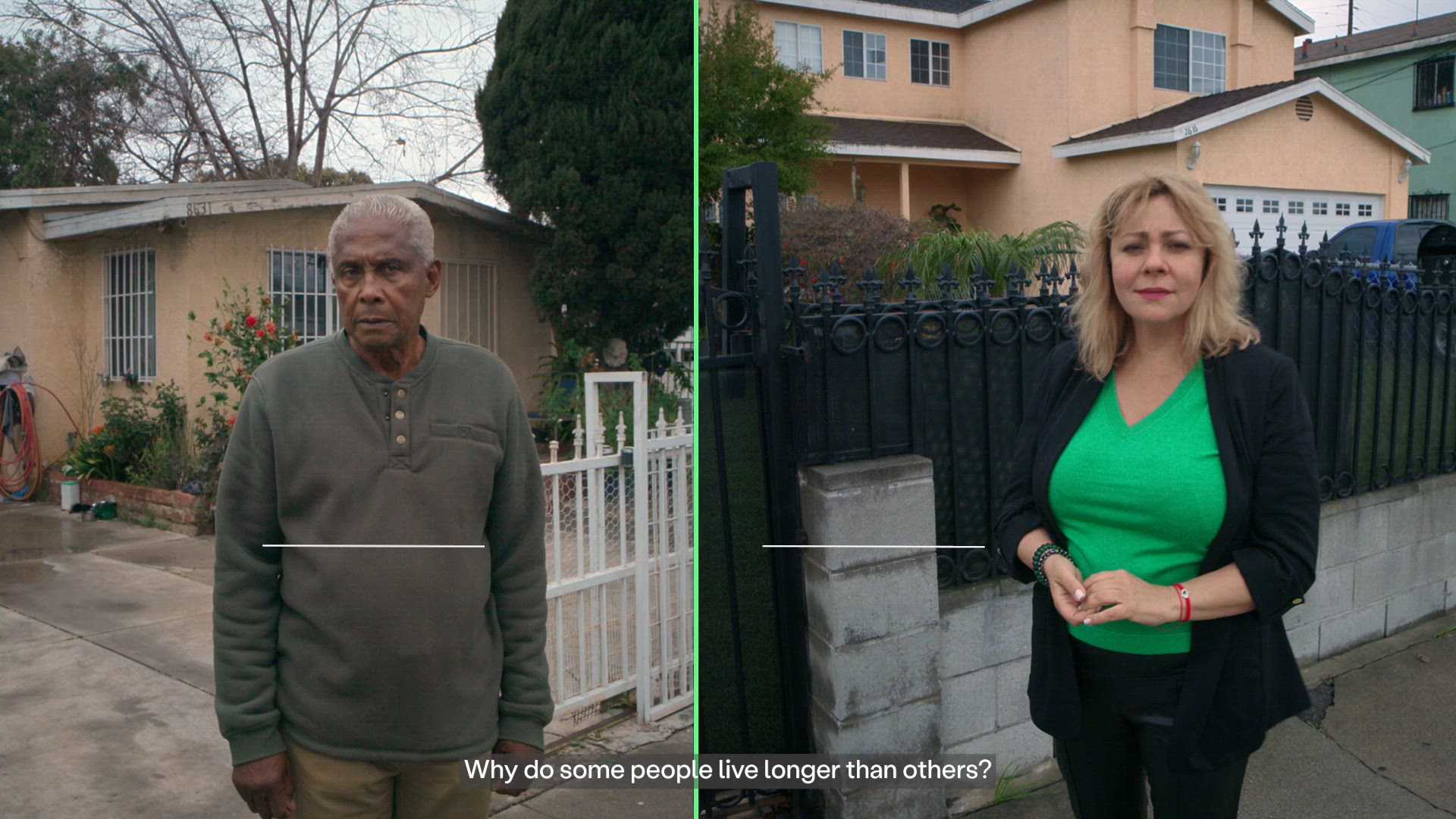
In America, your life expectancy can change by more than a decade simply by crossing a street. Adjacent zip codes—separated by rail lines, highways, and most of all, invisible economic borders—show life expectancy gaps of up to 14 years between people living in bordering neighborhoods. These disparities are not the result of genetics or personal choice, but systemic inequities: housing instability, food deserts, transit gaps, underfunded schools, and limited access to care.
Equality Health Foundation works inside underserved communities to close these gaps. But awareness of health inequity has become abstract—reduced to statistics, reports, and policy language. Meanwhile, public trust in institutions is eroding.
The challenge: Make systemic inequality feel immediate, local, and undeniable—and give communities a way to respond.
Creative Idea
We reimagined the health exam for the digital age.
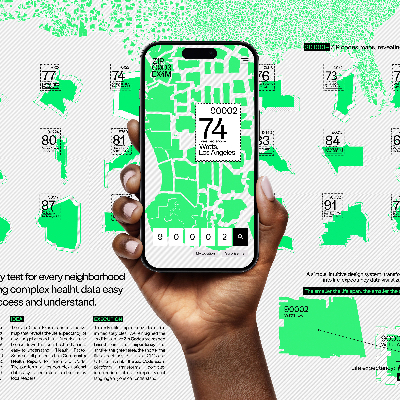
Instead of beginning with a stethoscope, The Zip Code Exam begins at zipcodeexam.com — a platform that turns your home address into a diagnostic tool. By entering a zip code, users receive a personalized Community Health Report that translates more than 900,000 public data points into a life expectancy score and a breakdown of the social determinants shaping it.
But this wasn’t a passive data experience. The platform was designed as an active exam: tools allow users to compare neighboring zip codes side-by-side, revealing how a single street can separate a 14-year life expectancy gap. Clean, restrained data visualization make complex inequities legible. With one click, reports can be downloaded or sent directly to town and county officials — transforming diagnosis into civic pressure.
To drive people to take the exam, we brought the data into the physical world. Hyperlocal “Inequality Billboards” were installed precisely on the geographic fault lines where disparities occur — at intersections, subway stops, and rail crossings that divide adjacent zip codes.
Headlines like:
“Cross this street, lose 10 years.”
“Get off at this stop, live to 70. Stay on, live to 84.”
The placements weren’t symbolic. They were exact.
The result was a physical-to-digital loop: shock in the street, proof online, action through the platform. The city exposed the problem. The website made it measurable — and made response possible.
Insights & Strategy
Most Americans believe health outcomes are determined by lifestyle and DNA. In reality, where they live- described by their zip code, is typically a stronger predictor of lifespan. And this reflects a number of implicit social issues.
Our insight: People can ignore statistics—but they cannot ignore the street they stand on and the place they live.
So, we identified life expectancy gaps between neighboring zip codes in six major U.S. cities and placed billboards directly on those fault lines. Each message was handcrafted with a hard hitting, message aimed at exactly the people who were exposed to it. After all, what could be more personal or urgent than knowing how where you live affects how long you can expect to.
Each message drove viewers to zipcodeexam.com, where the data was unpacked, explained and made even more relevant.
The strategy created a physical-to-digital loop: shock in the real world, proof online and a mechanism to start taking action in civic channels. Users could download their Community Health Re
port or send it directly to local officials, transforming awareness into agency.
Execution
zipcodeexam.com was designed as a digital diagnostic environment, not a promotional microsite. The interface is stark and geographical: a stripped-back map anchors the experience, allowing users to enter a zip code and immediately see a life expectancy score contextualized by Social Determinants of Health. Data visualization is clean, restrained, and comparative—side-by-side zip code analysis makes disparities undeniable. Reports are formatted to feel official, downloadable, and ready to forward to elected officials. The design language is clinical by intent: this is an exam, not an opinion.
Every interaction reinforces clarity. Complex public datasets are distilled into legible scoring systems and intuitive navigation, ensuring that disparate information resolves into a single, comprehensible story—one that leads naturally to action.
To drive engagement with the platform, we extended that same visual discipline into the physical world. The “Inequality Billboards” used stark typography, provocative headlines, and zero imagery to eliminate distraction. Each message displayed precise, hyperlocal life expectancy gaps at the exact geographic borders where they exist—subway stops, intersections, rail crossings—turning city infrastructure into evidence.
The tone across both mediums was deliberately clinical and confrontational. The placements were exact. The data was real. The experience was cohesive.
Together, the physical and digital executions formed a single system: the street exposed the disparity. The website diagnosed it. And the design made it impossible to misunderstand—or ignore.
Results
Within one week of launch:
• 200,000 visits to zipcodeexam.com
• 10,000+ Community Health Reports sent to local leaders
• Average time on site exceeded 3 minutes
Billboards were widely photographed and shared organically, sparking hyperlocal conversation across social platforms.
Most significantly, the City of Phoenix and the Borough of Queens have adopted the Zip Code Exam as part of their annual budgeting process—embedding the tool into civic infrastructure.
The campaign reframed public health from personal responsibility to systemic accountability.
2026 Awards
Total Points: 45
Gold Cube
Credits
Agency
Area 23 / New York
Media Agency
Rapport / New York
UM / New York
PR / Marketing Agency
Weber Shandwick / New York
Production Company
Dalmatian Cow / Los Angeles
Music / Sound Production Company
Bumblebeat / São Paulo
Post Production Company
Preymaker / New York
SRX / New York
Art Director
Taylor Cottrell
Chief Creative Officer
Tim Hawkey
Copywriter
Priscila Ramos
Group Creative Director
Victor Afonso
Renan Bulgari
Diego Tórgo
Executive Creative Director
Felipe Munhoz
Josh Grossberg
User Experience Designer
Franklin Williams
Mario Arias
Tati Cantar
Other
Paul Blake
Bill Hanff
Daniel Englert
Related Awards