ADC Awards
ADC Annual Awards is the oldest continuously running industry award show in the world, with an incredible legacy of over 100 years. These awards celebrate the very best in advertising, digital media, graphic and publication design, packaging and product design, motion, experiential and spatial design, photography, illustration and fashion design – all with a focus on artistry and craftsmanship.

Category
Beauty / Cosmetics / Personal Care - Series
Annual ID
ADC105_PKG017M
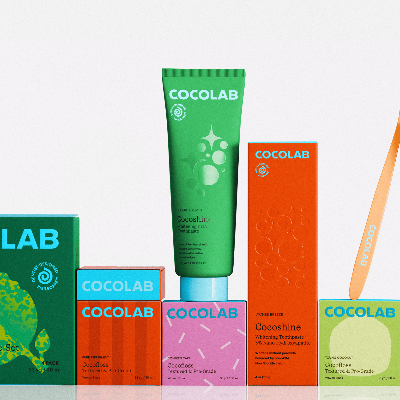
Cocolab’s packaging redesign reimagines oral care from purely functional into a moment of daily pleasure. Guided by the big brand idea of “Dental Dopamine”, the system injects joy into a category long dominated by clinical cues and emotional neutrality. Repositioning packaging as an active part of the experience.
The challenge was to redesign packaging that could disrupt visual conventions while retaining the trust expected of dentist-designed products. The system needed to communicate quality, flavor, and delight simultaneously, and to sit comfortably across pharmacy and beauty-forward retail environments.
The result balances thoughtful rigor with playful expression. Bold, controlled color differentiate products at shelf while maintaining cohesion across the range. Unexpected flavor offerings such as piña colada toothpaste, confetti cake floss, etc. are communicated through graphic, timeless illustrations that prioritize sensory appeal without veering into novelty or childishness. Information hierarchy is intentionally clear and restrained, allowing flavor and form to lead.
Typography balances credibility and play by pairing a refined serif with a modern geometric sans. The logomark’s distinctive blue is drawn directly from dental scrubs, a subtle reference to clinical trust, reinterpreted through a playful, contemporary lens.
The Cocolab packaging redesign reimagines an overlooked category through clarity, craft, and joy. Proving that even the most routine products can be elevated through thoughtful, expressive design.
2026 Awards
Total Points: 3
Merit Honor
Credits
Agency
Wedge Studio / Montreal
Chief Creative Officer
Sarah Di Domenico
Chief Design Officer
Justin Lortie
Designer
Élodie Trudel
Leo Maubert
Strategist
Nancy Chen
Account Director
Fredo Zavarella
Véro Lacoursière
Account Manager
Albert Sinotte
Design Lead
Gabrielle Lamontagne
Capucine Labarthe
Related Awards