ADC Awards
ADC Annual Awards is the oldest continuously running industry award show in the world, with an incredible legacy of over 100 years. These awards celebrate the very best in advertising, digital media, graphic and publication design, packaging and product design, motion, experiential and spatial design, photography, illustration and fashion design – all with a focus on artistry and craftsmanship.


Category
Wildcard
Annual ID
ADC105_PRD015M
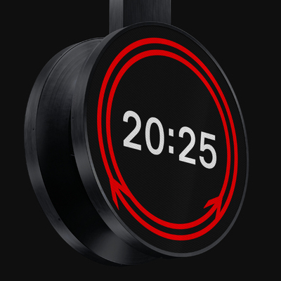
The innovation of Rail Clock lies in its simple yet elegant reappropriation of Gerry Barney's Double Arrow – the iconic symbol of the Railway in the UK. Tasked with commemorating 200 years of British rail, our challenge was to create an accessible, iconic clock that not only told time but emotionally reconnected the nation with its railway heritage.
At its core is the iconic double arrow symbol, brought to life through animation. We took a static symbol of direction and imbued it with the dynamic pulse of time. The two arrows, once fixed, now rotate in opposing journeys around the clock, momentarily converging every 30 seconds. This isn't just timekeeping; it's a constant, moving reminder of the journeys that define the railway.
Rail Clock transcends its physical form, seamlessly integrating across digital departure boards, customer information screens, and other network displays. This multi-platform deployment establishes a new standard for consistent, iconic public information design and brand coherence across an entire national infrastructure.
Unveiled at London Bridge, Rail Clock immediately became a national focal point. It stands as a powerful testament to how innovative media integration and dynamic design can unify a national infrastructure, profoundly enhance passenger experience, and imbue a functional object with deep cultural resonance.
Seamlessly integrated, subtly engaging, and beautifully simple, the Rail Clock transforms a beloved visual icon into a timeless story, marking time with the authentic British Rail identity.
2026 Awards
Total Points: 3
Merit Honor
Credits
Design Firm
Design Bridge and Partners / London
Client Partner
Suzanne Neal
Chief Creative Officer
Greg Quinton
Creative Director
Kevin Lan
Luke Burley
Design Director
Leanne Kitchen
Client Manager
Beth Burnage
Copy Director
Tom Tytherleigh
Creative Partner
Mark Wood
Senior Creative Developer
Paola Demichelis
Technical Director
Ben Davey
Related Awards