The One Show
The One Show is the world's most prestigious award show in advertising and design. For over 50 years, the Gold Pencil has been regarded as one of the top prizes in the creative industry. The One Show has a rich legacy of honoring some of the most groundbreaking ideas, created by some of the most remarkable minds in creativity.
You have exceeded your allotted number of views.
For full access to our extensive awards archive
Members Login Here
For full access to our extensive awards archive
Members Login Here
Category
Collateral Design / Promotion
Annual ID
11184D
About the Work
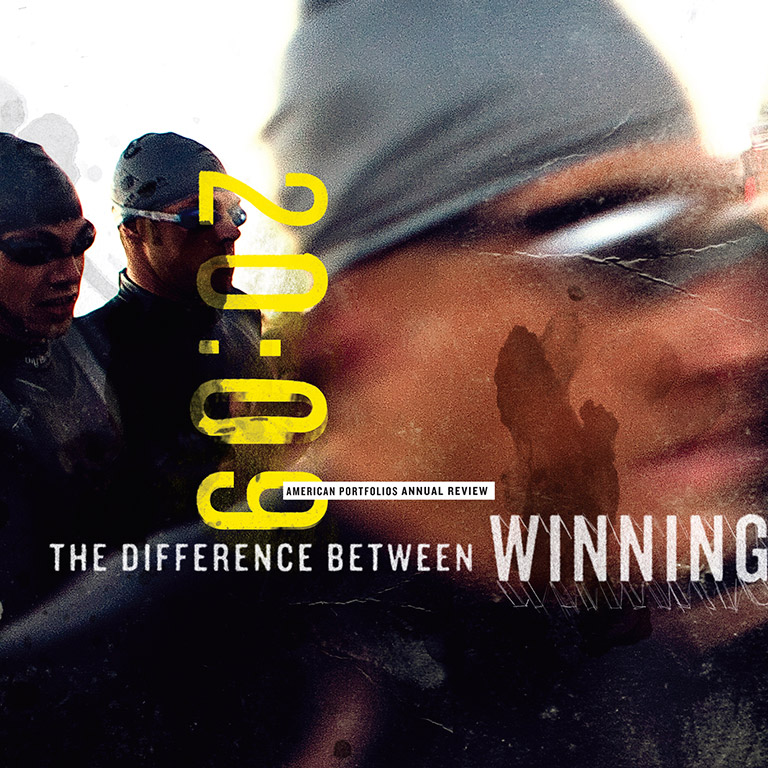
This project is an Annual Review for American Portfolios, a Long Island-based financial services company. The structure, unlike most annual reports or annual reviews is not divided into the traditional four sections for four quarters but into three sections. The honest answer is that the first concept we presented was using the metaphor of a marathon. The client said triathlons were more interesting. That presented obstacles and opportunities. We had to find a way to make the logic of three make sense in a world based on four. We saw they had three business units, American Portfolios Advisors, American Portfolios Investments and American Outsources, so we divided it into three based on business units, not quarters. That makes it unlike other annual report or annual reviews.
We used the triathlon metaphor because we had to come up with an evocative concept that could reflect 2009 was not only financial trying, but emotionally/physically draining . The budget was very limited and the turnaround was tight. The only way to get the shots we needed was to either stage a triathlon, attend one along with a photographer and also hope and pray it would be one of the few in history with a photo finish. The budget would not allow this. We approached a few photographers that specialize in shooting sporting events, after communicating with them for a bit we decided to use Robert Murphy. Working together with the photographer we were able to obtain the images we needed to tell the story of 2009 for the company. We used textures collected from our Senior web developers bike and an account executive?s running shoes as well as various other sources. We printed it using a conventional halftone on an economical stock so we would not appear flashy in light of the past year. We also pushed the grain and color of the images to obtain a rugged feel. The very last image was a cliff hanger. It is a well know triathlete and a well know finish It could have fallen apart if we couldn?t get the release to use his face. It is easily the most emotional and telling images in the the review.
We used the triathlon metaphor because we had to come up with an evocative concept that could reflect 2009 was not only financial trying, but emotionally/physically draining . The budget was very limited and the turnaround was tight. The only way to get the shots we needed was to either stage a triathlon, attend one along with a photographer and also hope and pray it would be one of the few in history with a photo finish. The budget would not allow this. We approached a few photographers that specialize in shooting sporting events, after communicating with them for a bit we decided to use Robert Murphy. Working together with the photographer we were able to obtain the images we needed to tell the story of 2009 for the company. We used textures collected from our Senior web developers bike and an account executive?s running shoes as well as various other sources. We printed it using a conventional halftone on an economical stock so we would not appear flashy in light of the past year. We also pushed the grain and color of the images to obtain a rugged feel. The very last image was a cliff hanger. It is a well know triathlete and a well know finish It could have fallen apart if we couldn?t get the release to use his face. It is easily the most emotional and telling images in the the review.
2011 Awards
Total Points: 5
Merit
Credits
Art Director
Carl Nielson
Creative Director
Scott Sugiuchi
Jonathan Helfman
Photographer
Robert Murphy
Writer
Eric Hartsock
Related Awards