Young Ones Student Awards
The Young Ones competition is one of the most acclaimed advertising, interactive and design student competitions. It has a tradition of excellence dating back to 1986.

Category
Typography / Branding / Identity
Annual ID
YO23_T035T
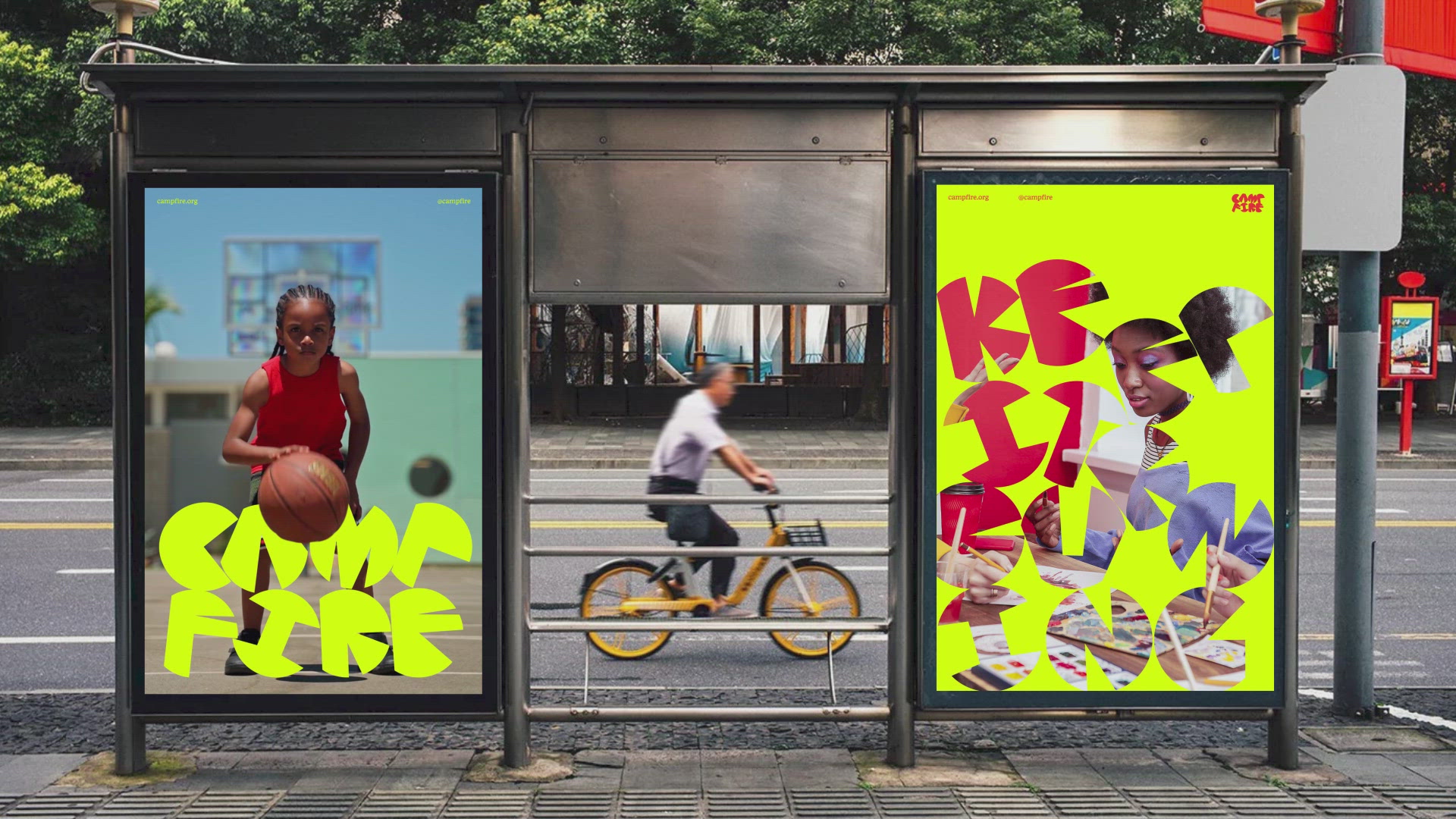
Camp Fire is a non-profit organization committed to providing innovative youth development programs and leadership camps, which empower young people to explore their passions and ignite their spark. In this project, I undertook the task of rebranding Camp Fire's identity by creating new typographic and visual systems, including a new robust and custom typeface. Guided by their mission and vision, I asked myself, "What is Camp Fire's role in the lives of today's youth, and how do they make an impact?" I came to the conclusion that they are like "fuel." Not only do they help young people discover their spark, but they also provide them with the motivation and passion they need to keep the fire burning through various programs, leading to a thriving life path.
To bring the concept of "fuel" to life, I developed a set of uppercase display letters that incorporates the shapes of wood fuels as a graphic motif. I chose wood fuel as the primary graphic because it is the first and most accessible fuel humans have used to make and maintain fires since the primitive era. Since Camp Fire is dedicated to being accessible to young children, I felt that this concept was a perfect fit for their mission. Furthermore, I added a motion behavior to the letters that fell down from the top and piled up like a stack of wood to activate the typeface and better convey the concept. The new typeface is paired with a friendly serif font, adding a delightful contrast to the system. My overall goal for the project was to create a playful identity that would shift public and donor perceptions of the organization and enhance growth opportunities.
To bring the concept of "fuel" to life, I developed a set of uppercase display letters that incorporates the shapes of wood fuels as a graphic motif. I chose wood fuel as the primary graphic because it is the first and most accessible fuel humans have used to make and maintain fires since the primitive era. Since Camp Fire is dedicated to being accessible to young children, I felt that this concept was a perfect fit for their mission. Furthermore, I added a motion behavior to the letters that fell down from the top and piled up like a stack of wood to activate the typeface and better convey the concept. The new typeface is paired with a friendly serif font, adding a delightful contrast to the system. My overall goal for the project was to create a playful identity that would shift public and donor perceptions of the organization and enhance growth opportunities.
2023 Awards
Total Points: 10
Student TDC Winner
Credits
Designer
Eun Soo Kim
College / University
School of Visual Arts / New York
Related Awards