Young Ones Student Awards
The Young Ones competition is one of the most acclaimed advertising, interactive and design student competitions. It has a tradition of excellence dating back to 1986.
Learn more about Young Ones 2026


Category
Packaging Design
Annual ID
YO25_A275M
Challenge
The Swedish grocery store ICA has its own under brands, where ICA Selection is the premium alternative. Our challange were to make ICA Selection the modern premium alternative with an innovative design that reflects expertise in taste and high-quality food – making ICA Selection stand out on the shelf among other premium products.
Our Solution
Our concept named “Redan Halvvägs” (Halfway There) means that ICA Selection helps consumers 'treat themselves to better tasting and higher quality meals' by providing meals that are nearly ready to eat. ICA Selection offers food that is easy to prepare while still being luxurious, delicious, and of high quality. Consumers only need to add a little extra. With their own personal touch, it feels like they have cooked the meal themselves — something they can take pride in.
Design & visualization
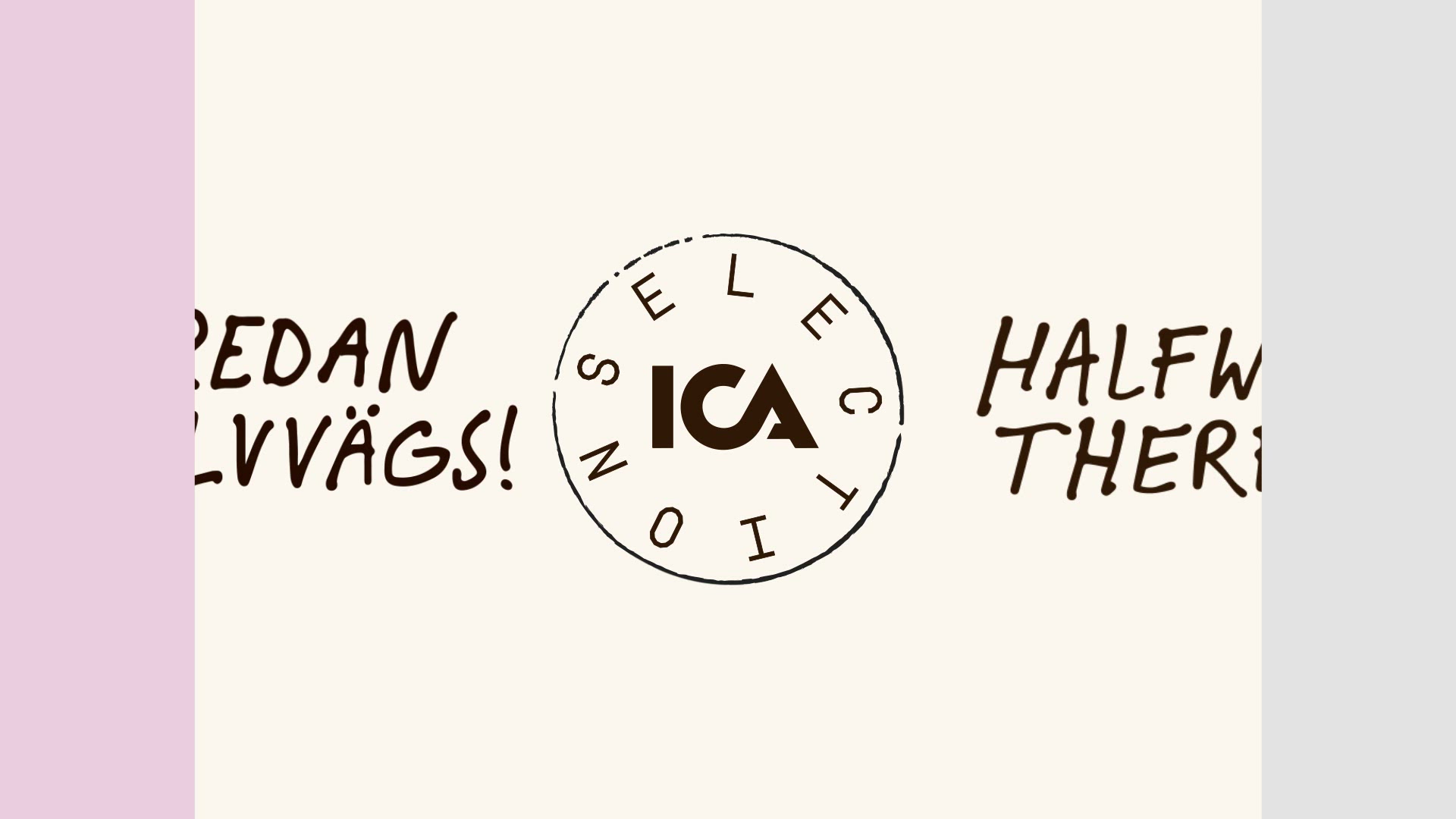
We have worked with “halfway” as a design principle, where one block represents the consumer and the other represents ICA Selection. The half that symbolizes ICA — is visualizing its trustworthiness and expertise through a minimalistic design and strict typography. The other half that represents the consumer, featuring playful illustrations that bring a human touch. The logotype and its seal stand for a long tradition of premium products, serving as a mark of quality.
The Swedish grocery store ICA has its own under brands, where ICA Selection is the premium alternative. Our challange were to make ICA Selection the modern premium alternative with an innovative design that reflects expertise in taste and high-quality food – making ICA Selection stand out on the shelf among other premium products.
Our Solution
Our concept named “Redan Halvvägs” (Halfway There) means that ICA Selection helps consumers 'treat themselves to better tasting and higher quality meals' by providing meals that are nearly ready to eat. ICA Selection offers food that is easy to prepare while still being luxurious, delicious, and of high quality. Consumers only need to add a little extra. With their own personal touch, it feels like they have cooked the meal themselves — something they can take pride in.
Design & visualization
We have worked with “halfway” as a design principle, where one block represents the consumer and the other represents ICA Selection. The half that symbolizes ICA — is visualizing its trustworthiness and expertise through a minimalistic design and strict typography. The other half that represents the consumer, featuring playful illustrations that bring a human touch. The logotype and its seal stand for a long tradition of premium products, serving as a mark of quality.
2025 Awards
Total Points: 4
Student Merit
Credits
Student Team
Amelie Borg
Clara Rollny
Maja Janson
Marco Taccola
College / University
Berghs School of Communication / Stockholm
Related Awards