Young Guns
Stephen Kelleher Rocks Out With His Crocs Out
YG8 winner reimagines iconic footwear brand's logo
YG8 winner reimagines iconic footwear brand's logo
Has there ever been a footwear brand as polarizing as Crocs? For some, the shoes' comfort and simplicity can't be beat, while others have a "kill it with fire" reaction to the foam resin clogs. Some wear them as a laugh, while others are clamouring to be seen in one of the company's collaborative efforts with famous artists and brands. Love of them or hate them, Crocs seem to be here to stay.
The Crocs logo, on the other hand, is something that could go, at least in the mind of Irish-born, New York-based designer and Young Guns 8 winner Stephen Kelleher. Stephen felt that it was time for a refresh, and took it upon himself to shake things up, much to the delight of the graphic design community. We had a chance to chat with him about the conceptual project.
First thing's first — what possessed you to tackle Crocs?!
 I think they are a truly great company! As a business they have been phenomenally successful and they make products that their customers really love. I myself bought my first pair only a few months ago after the birth of my son. Myself and my partner found ourselves on our feet a lot and in need of something comfortable to wear at home and in the studio. I immediately thought of Crocs, given their legendary reputation for comfort and fell in love as soon as I slipped them on.
Soon they were the only things I was wearing (Dad-mode in full effect). I became more curious about the company and started to do some research. I read several articles with their CEO Andrew Rees charting their trajectory and current rebirth as a favorite within the fashion world thanks to some high profile and surprising collaborations. Getting an understanding where the business is and intends to go had me wondering why their visual identity had never been updated to reflect this broadening appeal. They seemed like a company ripe for a logo refresh.
What was the thought process behind revamping the logo? How did you eventually settle on the direction you eventually went with?
I guess a large part of it was the creative freedom to flex on a conceptual project and have complete control — a rarity in my professional experience. There’s also a great opportunity with a well known brand like Crocs to surprise and delight an audience who is familiar with their products and aesthetic. Tonally I felt like their logo was friendly and fun, which I think fits well with their brand voice, but it also evoked a childishness that seemed at odds with their broad customer demographics and shifting reputation as a ‘cool’ brand.
I knew I wanted to maintain the crocodile mascot and could immediately see there were actionable technical issues around it scaling with so much detail. Once I began simplifying it and after my usual exhaustive sketching phase, the idea to use the iconic silhouette of a Croc shoe as the basis for their mascot appeared. By streamlining and unifying both into one simple mark I knew it would elicit an ‘aha!’ moment and hook the identity in the mind of the viewer. Then the real work of iterating, refining and testing began.
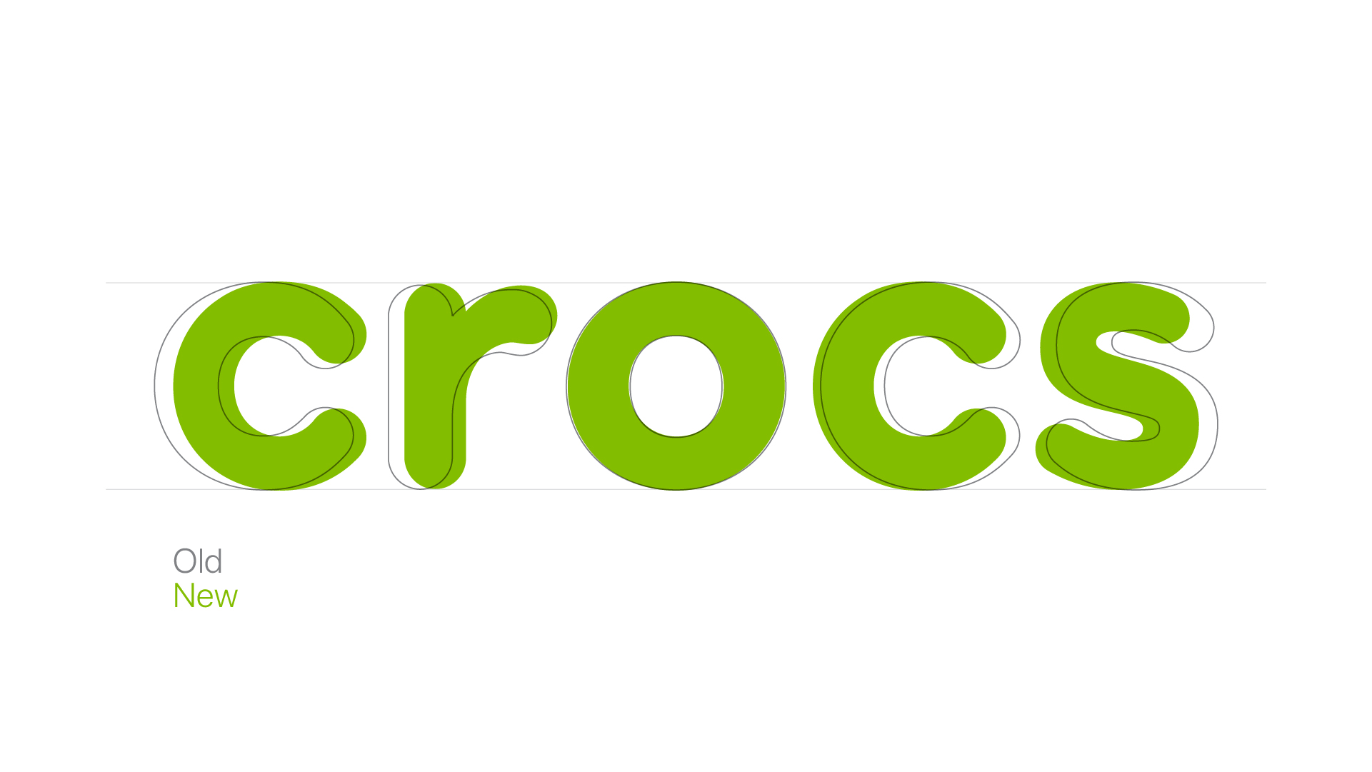
Of course everybody will notice the logo first, but you also made subtle yet significant changes to the wordmark....
I did want to be respectful of the equity that the Crocs brand had created and their wordmark is a huge part of that, moreso than the logo itself I think. At a glance they may seem identical, but I actually adjusted and created all new letterforms for the new wordmark. As a result it is kerned tighter but feels more open and optically balanced.
This is getting quite a bit of buzz. What are people saying about it? What do you think Crocs will say?
Honestly I’ve been blown away by the reception. It’s been shared and widely loved by Under Consideration, Logo Inspirations, Reddit, Creative Bloq, all across Twitter and Instagram. Maybe this might sound immodest but I’m be hard pressed to think of another conceptual rebrand which has received so much universally positive attention. Usually rebrands don’t go like that — the public tend to be quite defensive around the brands they love no matter what visual improvements have been made. I think because I really tried to retain and embody the spirit of the shoe in the logo that it creates an immediate familiar and positive connection with people.
I’ve seen so many people @ Crocs and say they’d love to see this adopted too. I would absolutely relish the opportunity to speak with and pitch my case study with the Croc’s leadership myself. What a great story that would be for everyone!
What else can we expect to see from you in the coming weeks and months? What are you working on?
I am wrapping up two separate identity projects that I’m excited about for two great creative companies. Please stay tuned to my Instagram for the latest! Other than that, sleep training my son whilst wearing my Crocs is all I have time for!
Wearing Crocs: ironically or unironically?
(laughs) Completely unironically! They are my favorite shoes! Get hip, people!
Young Guns winners and One Club for Creativity Members get featured here on the One Club website and across our social media channels. Have a new project you'd love to share? An upcoming exhibition and you'd like us to help spread the word? Drop us a line at [email protected]. Not yet a Member? Join today!