ADC Awards
ADC Annual Awards is the oldest continuously running industry award show in the world, with an incredible legacy of over 100 years. These awards celebrate the very best in advertising, digital media, graphic and publication design, packaging and product design, motion, experiential and spatial design, photography, illustration and fashion design – all with a focus on artistry and craftsmanship.
Learn more about ADC105

Category
Typeface
Annual ID
ADC104_TYP038M
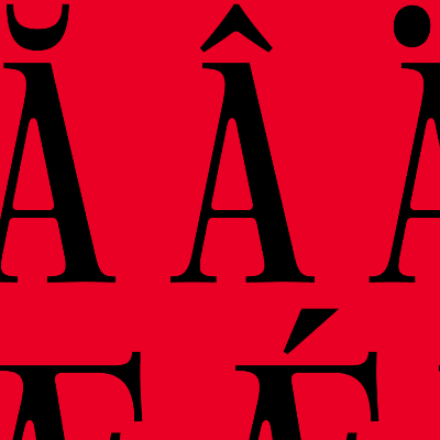
SFT Schrifted Serif was developed as a companion to the successful SFT Schrifted Sans, with the aim of expanding the Schrifted type family into new stylistic and functional territories. The challenge was to create a serif typeface that balances contemporary aesthetics with timeless appeal, suitable for a variety of applications ranging from editorial design to branding. The project was inspired by the distinct character of Stockholm, a city known for its harmonious blend of rational structure and romantic charm. The typeface needed to reflect this duality while maintaining clarity, elegance, and a unique identity.
The creative idea for SFT Schrifted Serif was rooted in the visual and emotional essence of Stockholm. Yulia Gonina immersed herself in the city's environment to capture its contrasts — soft pastel tones against cold, structured elements, and natural motifs juxtaposed with urban geometry. This duality is expressed through organic teardrop shapes, round forms, a pronounced tilt of oval axes, and dynamic italics. While the typeface retains a modern, minimalist structure, it incorporates subtle baroque details, giving it a warmth and versatility uncommon in contemporary serif fonts. The resulting design strikes a balance between rationality and emotion, making it both practical and expressive.
Alena Linnask continued to build on Yulia’s ideas while designing the specimen for SFT Schrifted Serif. The main goal was to underscore the typeface’s clean lines, elegant simplicity, and wide range of functionality. The usage examples were created not only to showcase its geometric foundation but also to highlight its most expressive and dynamic features, such as true italics with display-like nuances and highly contrasted uppercase letters.
2025 Awards
Total Points: 3
Merit Honor
Credits
Design Firm
Schrifteria Foundry / Belgrade
Artist
Yulia Gonina
Alena Linnask
Freelancer
Kirill Maslov
Related Awards