Portfolio
HNZ Constructions / HNZ Constructions
Submitted By HAO WEI TU
Description
HNZ Construction is a specialist shopfitter delivering high-end restaurant and retail fit-outs across Sydney and Melbourne, with ambitions to compete for international design–build work. Despite a strong track record, their brand identity had not kept pace with the calibre and scale of their projects. The existing presence lacked a single, decisive mark that could stand out in the cluttered, real-world contexts where HNZ is most visible: construction sites, hoardings, vehicle fleets, safety gear, and bustling hospitality precincts.
The initial brief was clear and unusually focused. Leadership wanted the identity built around their name—specifically the three letters “HNZ”, so the brand could be recognised instantly without relying on descriptors, icons, or long wordmarks. They asked for an identity that carried depth and gravitas, reflecting the seriousness of their craft and the precision required in shopfitting: tight tolerances, complex coordination, and meticulous attention to detail across materials, trades, and timelines. At the same time, the brand needed to feel contemporary and forward-looking, signalling confidence for overseas-facing proposals and global partnerships.
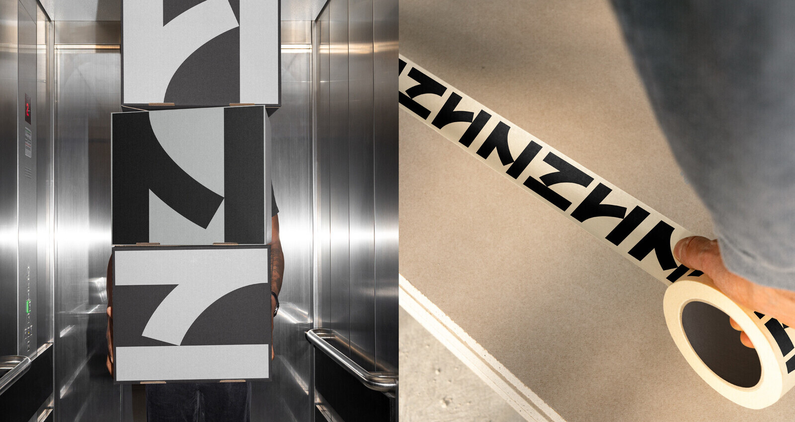
HNZ also emphasised the need for a system, not just a logo. It had to scale from massive environmental graphics (site signage, hoist covers, trade-show backdrops) to the smallest touchpoints (business cards, proposal headers, social avatars) without losing clarity or authority. Operationally, the identity needed to reduce complexity: straightforward to apply by internal teams and external suppliers, with minimal risk of inconsistent execution.
Culturally, the brand had to speak to a discerning audience, architects, interior designers, and hospitality operators, who assess credibility quickly. The identity needed to feel as resolved as the interiors HNZ builds: engineered, restrained, and quietly confident rather than trend-driven or flashy.
Objective
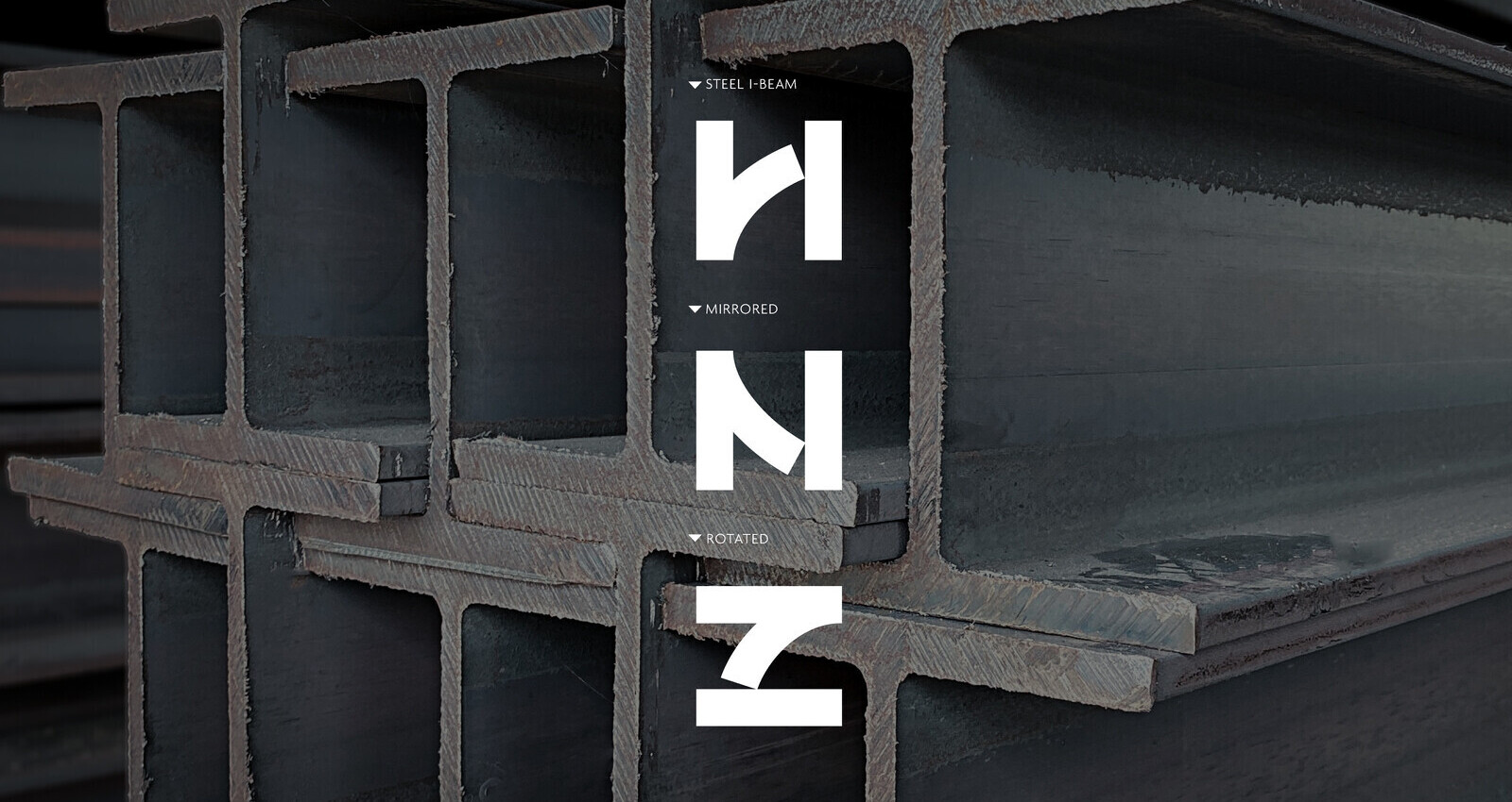
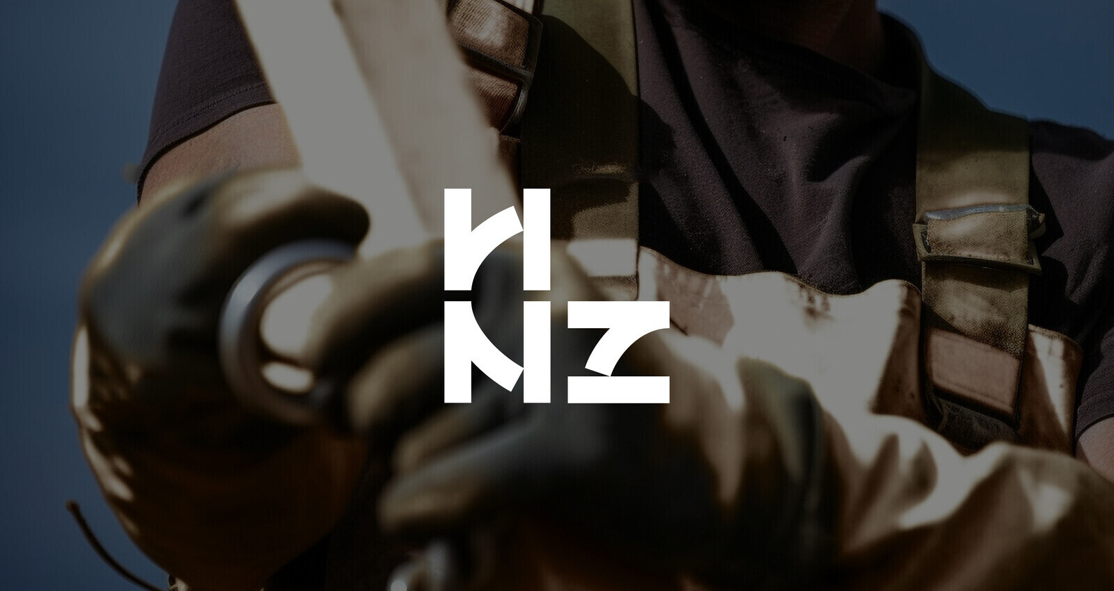
The creative idea was to transform “HNZ” into a single, engineered symbol that behaves like a structural component: simple in form, precise in geometry, and powerful in repetition. Rather than treating the initials as static typography, we studied the structural anatomy of the letters H, N, and Z, reducing them to their most elemental strokes: verticals, diagonals, and right angles.
This revealed a shared geometric framework across all three letters, analogous to the modular logic of construction, trusses, I-beams, and interlocking assemblies. From that insight, we designed a single abstract glyph that can be rotated or mirrored to read as H, N, or Z. The result is a monogram that feels both intelligent and inevitable: it doesn’t “illustrate” construction; it embodies construction thinking.
The mark’s multi-reading quality creates a subtle visual tension: at first glance, it is a bold, confident emblem; on closer inspection, it becomes a small puzzle, an architectural logic that rewards attention. This mirrors HNZ’s own work: what looks effortless to a client is supported by invisible precision and deep technical coordination.
Importantly, the symbol was conceived as the nucleus of a broader visual system. Because it is built from rigorous geometry, it naturally extends into patterns and grids. When tessellated, it produces a rhythm reminiscent of scaffolding, façade panels, and plan drawings, allowing the identity to shift from monolithic (single mark) to environmental (repeat pattern) without introducing additional graphic decorations.
In short, the creative idea was to turn three letters into one adaptable, self-contained construction language —a mark that stays unmistakably HNZ at any scale while expressing the brand’s core promise: precision craftsmanship delivered with structural intelligence.
Technical Challenge
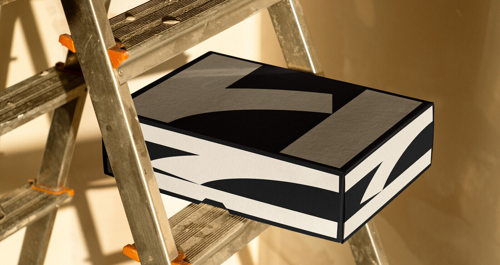
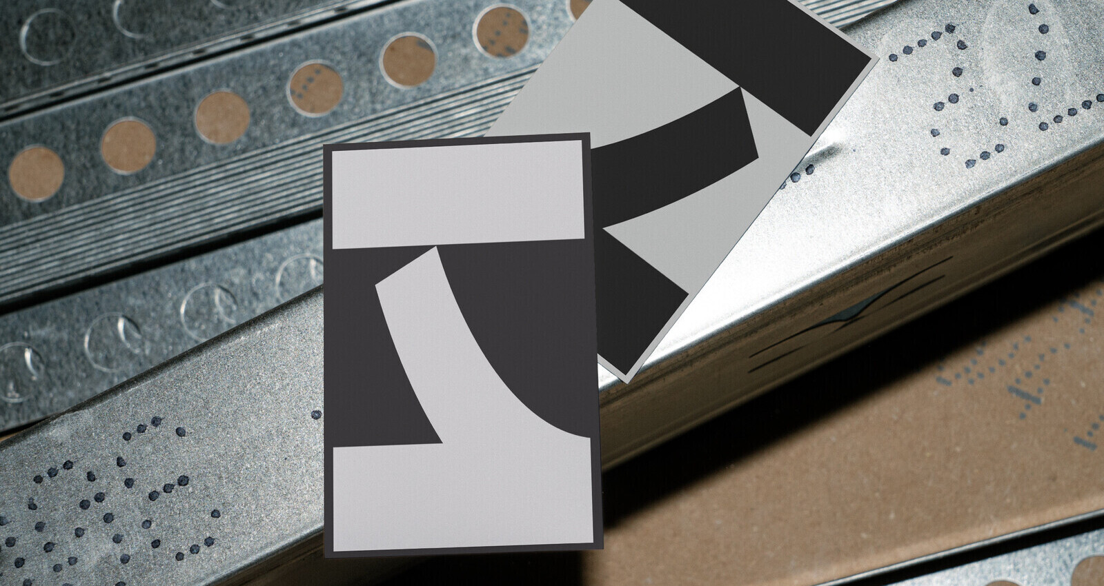
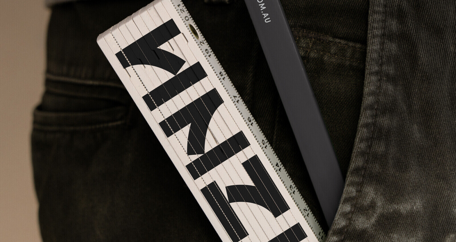
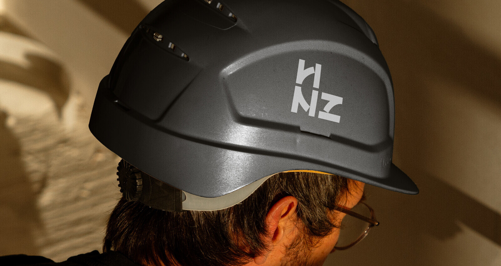
Execution centred on craft, scalability, and disciplined restraint. The monogram was constructed on a precise geometric framework to preserve clarity at both macro and micro scales. Stroke weights, internal angles, and negative spaces were tuned to remain legible when applied as a hard-hat decal or a small digital avatar, while still feeling bold and architectural when enlarged across hoardings and hoist wraps.
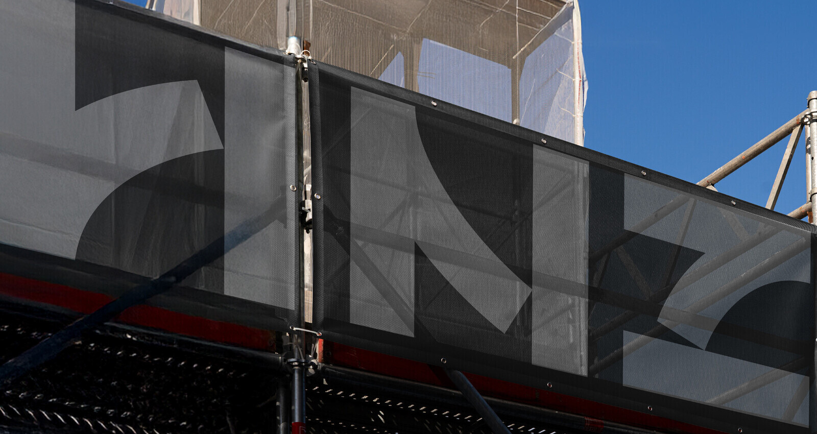
The mark was then extended into a modular pattern system. By tessellating the glyph through repetition, rotation, and offset, we created a family of textures that reference architectural grids and scaffolding without literal illustration. This gave HNZ a flexible visual tool for large-format applications, site barriers, trade-show backdrops, vehicle liveries, where the pattern can deliver impact even when the full wordmark is not present or when viewing distance is significant.
Colour was deliberately limited to deep charcoal and dove grey. This ensured high contrast for maximum legibility on-site, while allowing a refined tonal hierarchy in proposals and printed collateral. The palette also reduces production risk across vendors: fewer inks, fewer variables, fewer inconsistencies.
Tone of voice and layout principles followed the same logic: measured spacing, strong alignment, and confident negative space. Instead of relying on visual effects, the identity communicates professionalism through proportion and restraint, mirroring how HNZ delivers high-end interiors: clean joins, precise detailing, and seamless integration.
To support rollout efficiency, the system was designed to be easily artworked by multiple suppliers. The geometry provides straightforward rules for placement and spacing, and the pattern applications are repeatable without custom illustration. This ensures that whether the identity appears on safety vests, wayfinding, proposal decks, or social media templates, it retains coherence and feels unmistakably HNZ, engineered, practical, and premium.
Client
HNZ Constructions
Media
Design
Market
Constructions
Credits
Art Director
Hao Wei Tu
Director
D&D Creative
Views
8