.png)

Member News
In-Progress Lettering Series: Kunel Gaur
One Club Member creates lettering inspired by architecture and package design
One Club Member creates lettering inspired by architecture and package design
One Club Member Kunel Gaur is the Founder and Creative Director at Animal – an independent creative agency – and he is in the process of creating a type series dedicated to the melding of architecture and brand packaging.
Simply put, the title for this project is "In-Progress Type Series," alluding to Kunel's lettering exploration. So, we got the scoop from Kunel about his in-progress-project
How would you describe the style of your "In-Progress Type Series?"

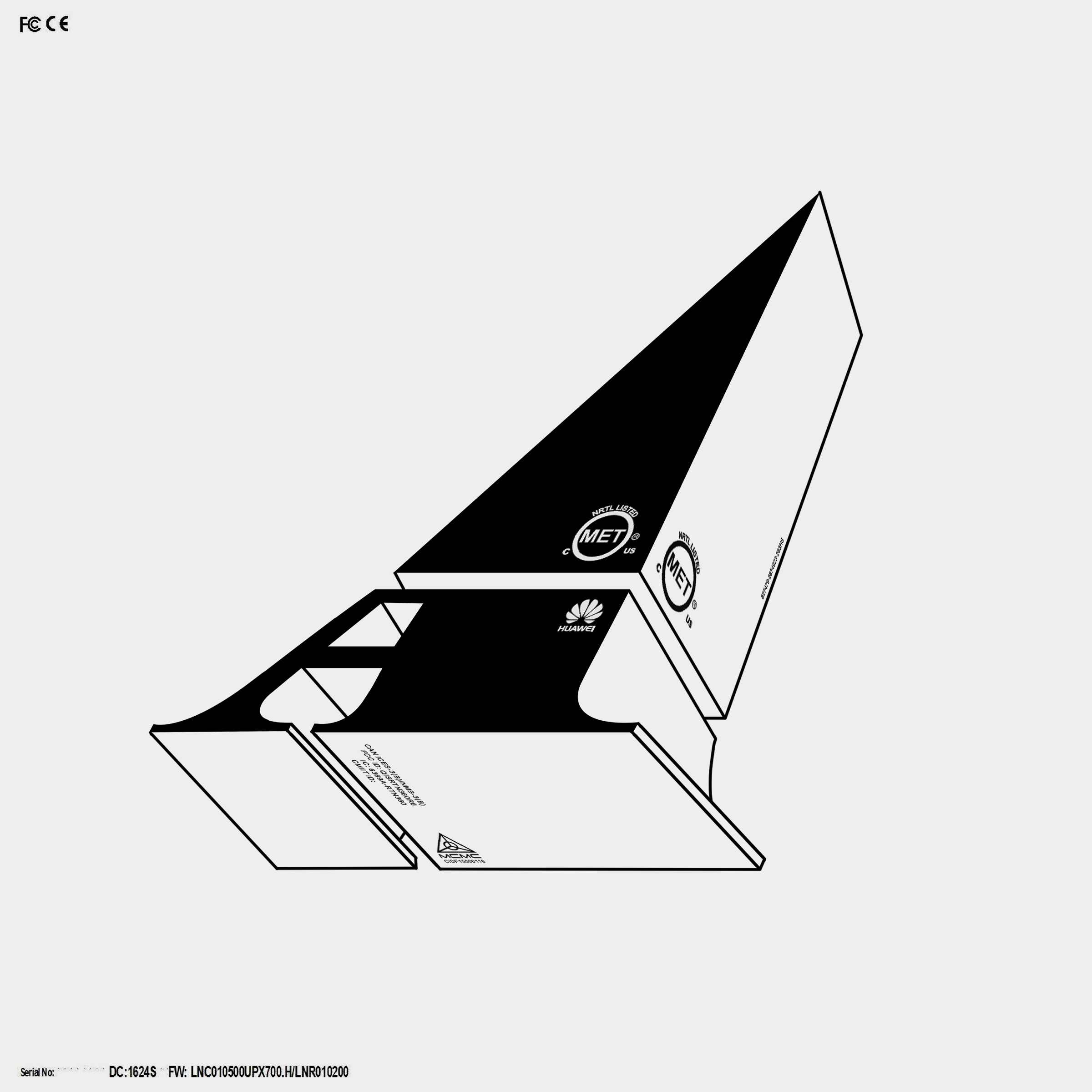
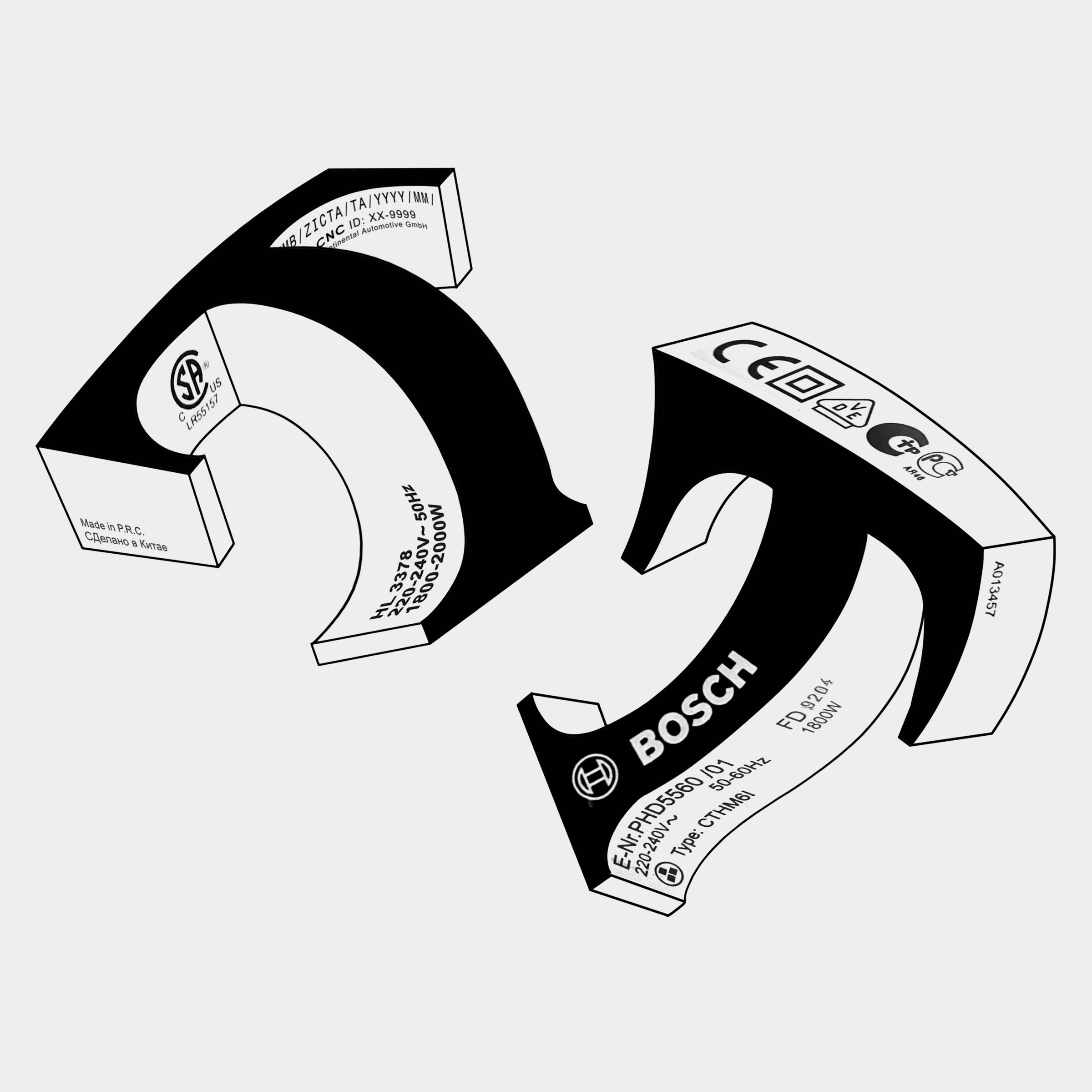
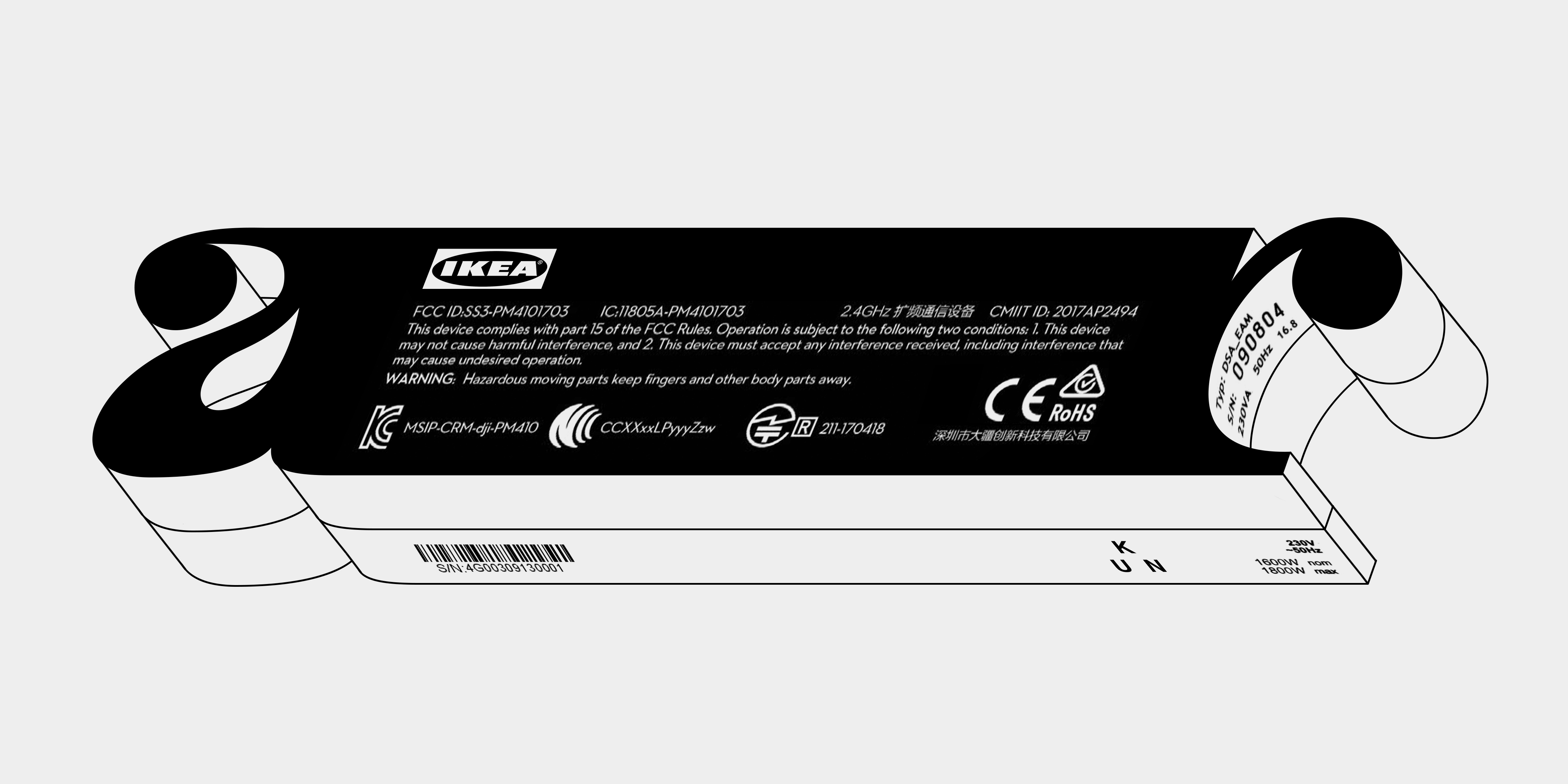
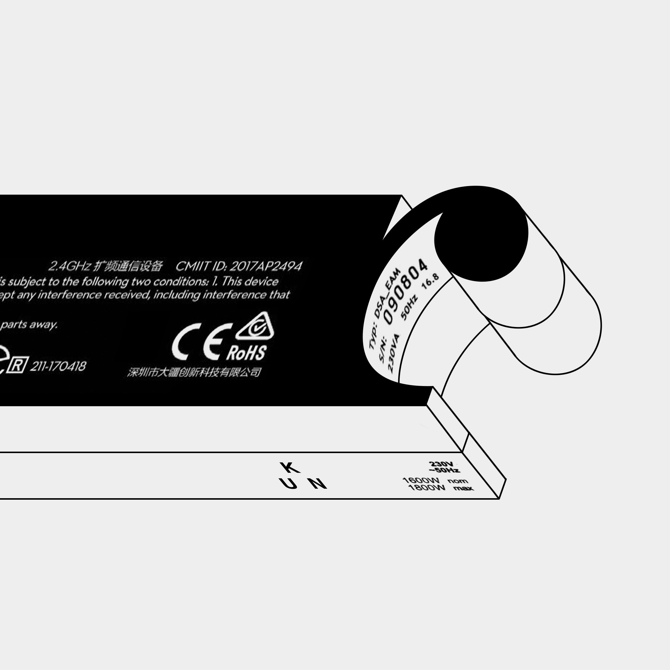
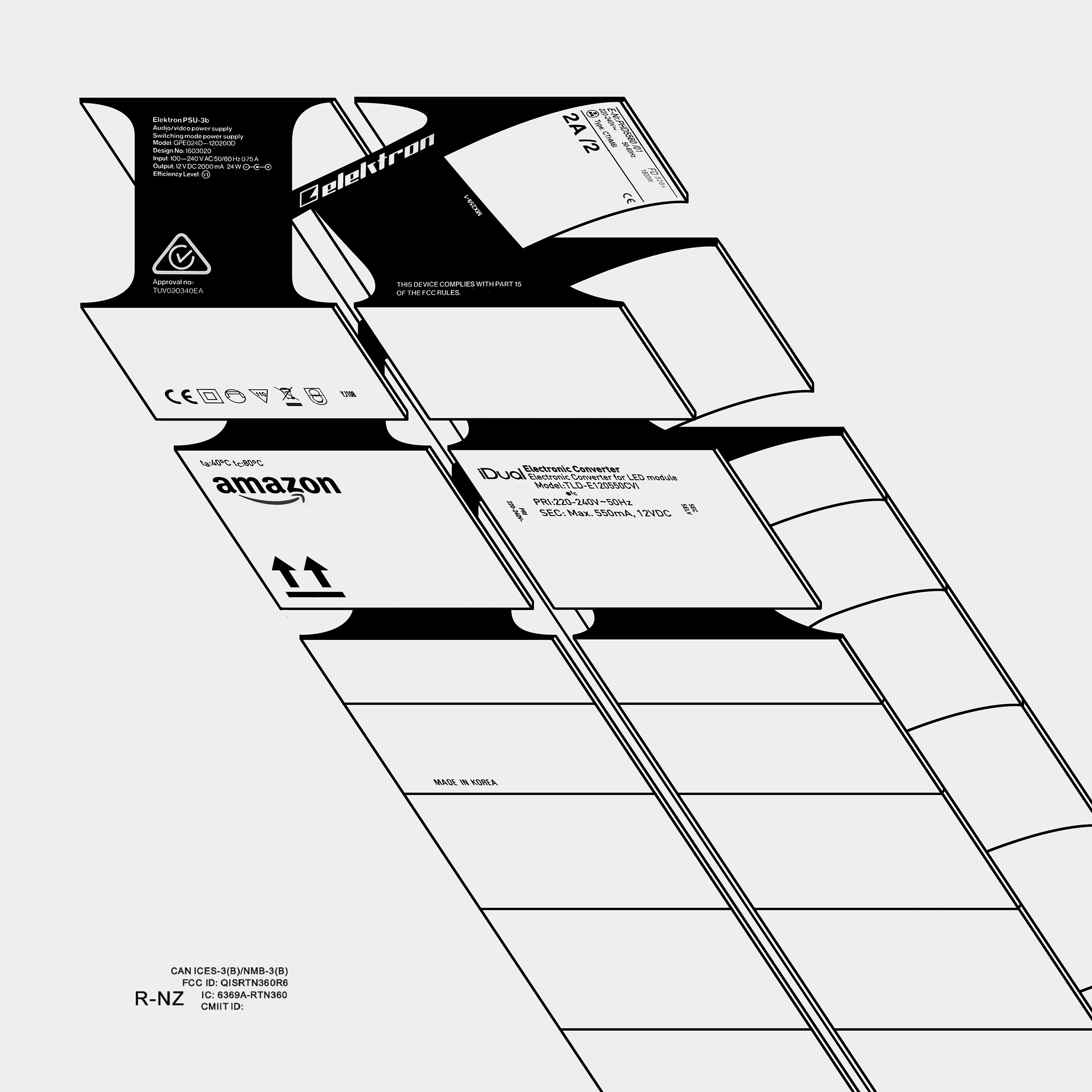
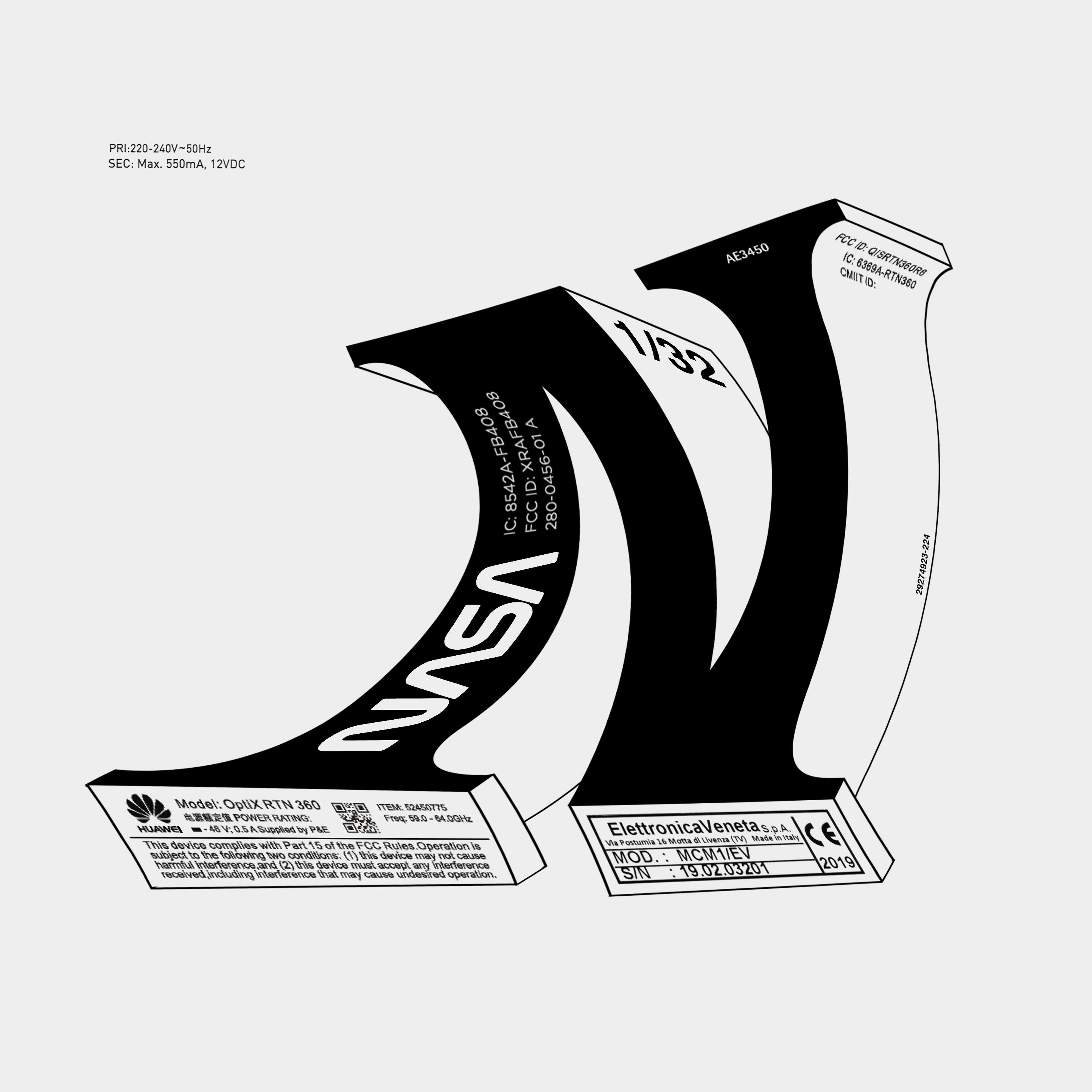
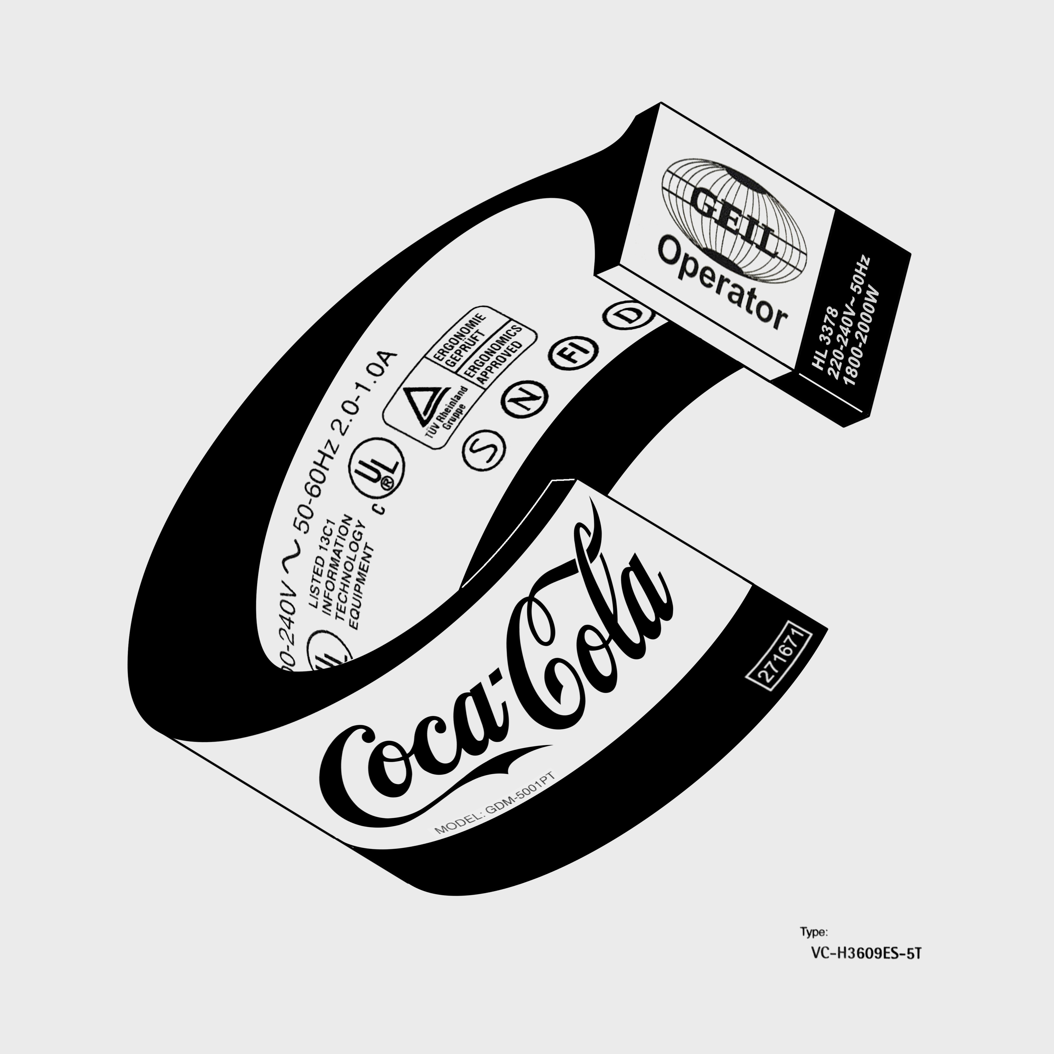
The series is an exploration that merges architecture, packaging, and typography, and then thrown into a limbo where isometric, often incorrect perspective (because it is first hand-drawn, measured visually, and digitized as is) makes it interesting to observe.
Architecture inspires me. I relate to Brutalism because it is invisible – it gives me space and time to experience the elements– light, shadows, music, and the passing of time, without interfering with my thoughts or forcing aesthetics on me. I draw a parallel to the Brutalist sensibility in type and iconography by referring to the mandatory, product-level information on packaging, shopping tags, shipping labels, tickets, and other printed materials that I collect when I travel. Merging these different elements gives these pieces a unified identity– one that I’m still working to evolve and experiment upon.
"I relate to Brutalism because it is invisible– it gives me space and time to experience the elements – light, shadows, music, and the passing of time, without interfering with my thoughts or forcing aesthetics on me."
I chose black and white as the core palette to keep it close to the original and the basic sensibility that I’m trying to build in the work. The series is more a beginning than an end– I’m still exploring.
How do you craft each letter?
I have been making letters for a long time– on any surface– a notebook during a call, a piece of paper, a magazine, or my hand. Sometimes, the letter looks interesting, and then I save them to scan or build on later. Once I like a few, I scan or shoot them and digitize them before moving to add the other elements on the different nooks and corners of the composition.
"I’m not professionally trained in type, or the different terminology that comes with it. I just put my collective sensibility to use and create type that resonates with me and all that I have observed over the years."
There’s no process for the typography that I work with. I’m not professionally trained in type, or the different terminology that comes with it. I just put my collective sensibility to use and create type that resonates with me and all that I have observed over the years. That’s possibly what works in this case, specifically because I don’t have to try to unlearn the technique.
Ikea, Adidas, Bosch, Sony, Pepsi, Coca-Cola, Nokia, Amazon, etc. What made you decide to represent these specific brands in your type?
These brands (and then some more) are so iconic that I could write them in Helvetica and you will know who I’m talking about, which is what I did with another series of work I produced a while back. Since I’m from the brand world, I think it comes naturally to use brands I know and to interact with them in the work I produce.
Do you have a letter in the alphabet that is your favorite to create?
I like the form of the letter ‘A’ which I end up making a lot. There are a lot of ‘A’s’ in my notebooks, and I also end up using the number ‘1’ a lot too. I doubt there’s any connection between both of them being the first units in their respective systems. It’s more the form and the fact that they’re first-level, basic, and ‘less traveled,’ if I were to think about the alphabet as a journey from A to Z or 1 to 10.
After looking at the letters, I couldn’t resist the temptation to hold them in my hands, so as the next step in this series, I’m making unique single-edition letters using wood.
"After looking at the letters, I couldn’t resist the temptation to hold them in my hands, so as the next step in this series, I’m making unique single-edition letters using wood."
As an artist, what motivates you and what discourages you?
As a creative, the process of creating motivates me the most. When I get an idea, I go full throttle flow-state into it and try to churn the best possible outcome. At most times it’s not what I set out to achieve, but something entirely different, which is both a rewarding experience and a learning curve.
This year, I want to continue working on some new half-baked ideas and finally start work on self-publishing my book.
One Club for Creativity Members get featured here on the One Club website and across our social media channels. Have a new project you'd love to share? An upcoming exhibition and you'd like us to help spread the word? Drop us a line at membernews@oneclub.org. We always love to know what our One Club Members have been up to, so don’t forget to send us your cool work!